Introduction
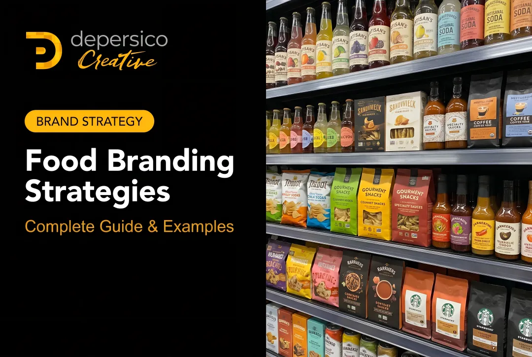
A shopper walking a grocery aisle makes purchase decisions fast — DePersico Creative's packaging work is built around the reality that brands have roughly 4 to 6 seconds to earn attention and trigger a trial purchase at the shelf. That's the window your logo needs to work in.
For food brands, that pressure is different from almost any other industry. Your logo isn't just on a website or a business card — it's surrounded by dozens of competitors on a crowded shelf, printed across wildly different substrates, and evaluated by shoppers who have never tasted your product.
This guide covers what food brand logo design actually requires: the core principles that hold up under real retail conditions, the specific design elements that influence purchase decisions, and the shelf realities that most general design guides overlook entirely.
Key Takeaways
- Food brand logos must signal personality and category fit within 4–6 seconds at shelf
- Simple, timeless design outperforms trendy or complex logos in CPG retail environments
- Color, typography, and iconography carry distinct signals and must function as a unified system
- A logo that works in a single color before adding complexity will perform across every packaging format
- Tropicana lost 20% of unit sales after a 2009 redesign stripped away familiar brand cues, proving logo equity can disappear fast
Why Your Food Brand Logo Matters More Than You Think
A logo is the visual anchor of your brand identity. For a first-time shopper, it's the single element that tells them whether your product is worth picking up before they've read a word of copy or tasted a bite.
Food brands face a specific version of this challenge that service businesses don't. Your logo lives on a physical package competing against 15, 20, sometimes 50 similar products in the same shelf section — all fighting for the same narrow band of attention.
The Stakes at Shelf
NielsenIQ benchmarks report that shoppers take roughly 19 seconds to make a purchase decision and notice only about 15 of 450 in-store marketing materials. The numbers may vary by category, but the conclusion doesn't: the window is short, the competition is dense, and your logo is doing much of the work before anything else.
The Tropicana case makes the cost of getting this wrong concrete. When PepsiCo replaced Tropicana's familiar orange-and-straw packaging in 2009, unit sales fell 20% and dollar sales dropped roughly $33 million in under two months. Shoppers reported they couldn't find the product — the visual cue they relied on had disappeared.
A food brand logo serves two jobs at once: it keeps loyal shoppers reaching for the same product week after week, and it earns the split-second trial decision from shoppers who've never seen it before.
Core Logo Design Principles for Food Brands
Simplicity and Memorability
Simple logos outperform complex ones in food retail for three practical reasons:
- They reproduce cleanly at small sizes — a jar label, single-serve pouch, or ingredient panel callout demands that the mark hold at thumbnail scale
- They're easier for repeat shoppers to recognize quickly, which matters when someone is moving through an aisle at speed
- They hold up consistently across every medium, from in-store shelf talkers to digital ads to trade show banners
Simplicity doesn't mean generic. Campbell's iconic red-and-white label has been the brand's visual anchor since 1898 — a simple system that's immediately ownable and still working more than 125 years later. Tabasco, founded in 1868, carries similar staying power in its diamond logo mark.
Both succeeded because they built simplicity around a genuine brand identity — not a trend. That distinction is what separates a mark that lasts from one that needs to be replaced.
Timelessness Over Trends
Trend-chasing in food brand logos creates a specific, expensive problem: packaging that feels dated within three to five years, forcing a redesign that risks confusing loyal shoppers who relied on visual familiarity to find the product. Timeless food logos are grounded in the brand's story and values — not what's currently popular in design.
That doesn't mean they never change. Subtle refinements can keep a logo feeling current without abandoning the equity built over years of shelf presence:
- Adjusting a font weight for cleaner reproduction
- Cleaning up line work for digital formats
- Slightly modernizing a color without abandoning the original palette
The key is evolving the mark, not replacing it.
Versatility and Scalability
A food brand logo must perform across a range of applications that most other industries never encounter:
- Small ingredient panel callout or back-of-pack secondary mark
- Primary display panel on retail packaging
- Corrugated shipping box printed in one color
- Social media avatar at 60×60 pixels
- Trade show backdrop at 8 feet wide
One practical test covers all of these: the logo must work in a single color — black or white — before any color is introduced. If a mark only functions in full color, it will fail in embossed closures, foil-stamped premium packaging, monochrome shipping formats, and economical one-color print runs. Build it to work without color first, and the color becomes an enhancement rather than a dependency.

Design Elements That Influence Food Purchase Decisions
Color Psychology for Food Brands
Color does real work in food marketing — though the relationship is more nuanced than simple rules suggest. Research reviewing 20 studies on packaging color found that lighter packages often increased perceived healthiness but could simultaneously reduce expected tastiness and purchase intent. Color effects are product-dependent, audience-dependent, and category-dependent.
That said, some category conventions exist for a reason:
| Color Direction | Common Category Signal |
|---|---|
| Red and yellow | Energy, appetite stimulation, urgency — snacks, condiments, fast food |
| Green | Natural, organic, health-conscious positioning |
| Blue | Trust, cleanliness — dairy, seafood, water |
| Warm earth tones | Artisan, premium, heritage quality |
These aren't universal laws. They're starting points for understanding what shoppers in a category expect — and what your logo can either align with or deliberately break from.
Practical guidance: Limit the logo palette to one or two colors. This keeps production costs manageable across all substrates and formats, ensures the mark can translate cleanly across packaging types, and makes the brand easier to recognize consistently.
Typography
In a food brand logo, the typeface communicates personality before the consumer reads a single word:
- Bold sans-serif signals energy, accessibility, and everyday value
- Refined serif conveys premium quality, heritage, or craft
- Hand-lettered script suggests artisan production, warmth, or small-batch authenticity
- Clean geometric sans-serif reads as modern, health-forward, and direct
The strategic question behind every choice: what does this product need to convey before the shopper picks it up?
One principle holds regardless of category: legibility on pack is the floor, not the ceiling. A beautiful typeface that becomes unreadable at small sizes, in reverse against a dark background, or when printed on a textured substrate fails its primary job. Limit logo typography to no more than two complementary fonts, and establish clear hierarchy through weight and size — the brand name must be immediately findable.
Imagery and Iconography
Food brands often benefit from descriptive logo elements — icons or illustrations that reference the key ingredient, product category, or brand origin. For newer brands without established recognition, a visual cue that tells shoppers what this product is helps them evaluate it at shelf without extra effort.
The trap is defaulting to the obvious. These icons appear on thousands of food logos and differentiate none of them:
- Forks and knives
- Chef hats
- Wheat stalks
- Smiling suns
- Generic farmhouse silhouettes
The better approach: find the specific visual angle that belongs to this brand's story or origin, not the category's generic shorthand. A visual element rooted in actual brand heritage is both more defensible and more memorable than an icon that could belong to any of 200 competitors.
Designing for the Shelf: How Food Packaging Changes Everything
A food logo doesn't exist in isolation. It lives on a package surrounded by direct competitors, evaluated by shoppers moving at grocery-aisle speed. The shelf is where logo design theory meets retail reality.
Understanding Logo Hierarchy on Pack
The brand logo anchors the visual identity system at the top level of a food package. Below it, a cohesive hierarchy governs how the remaining information communicates:
- Brand logo — visual identity anchor
- Product name — what it is
- Flavor or variant callout — which version
- Key claims — organic, non-GMO, gluten-free, protein content
- Product photography — appetite appeal and product expectation

These elements must work as a unified system. When they compete instead of collaborating, the package loses coherence and shoppers lose confidence. Logo design that doesn't account for how it will coexist with these elements will create problems at the packaging design stage.
The Shelf Test
One practical evaluation method: mock up the logo and packaging in a realistic retail context — a row of competing products — and evaluate it from several feet away. Ask:
- Does it read clearly at shelf distance?
- Does it stand out from adjacent products, or disappear into the category?
- Does it communicate brand personality at a glance, or require close inspection?
This is standard practice in professional CPG packaging development. NielsenIQ's BASES methodology, for example, tests packages against category competitive sets — typically 11 or more competing products — using eye-tracking and consumer modeling specifically because packaging is a comparative evaluation, not an absolute one.
That comparative lens is where category-specialized agencies earn their value. A general design firm can produce attractive work; a food-focused agency brings knowledge of what the category shelf actually looks like and how your design performs within it.
DePersico Creative's SWIFI process — Strengths, Weaknesses, and Ideas for Improvement — is structured around this kind of competitive shelf analysis. With over 45 years of food and beverage work spanning startups to national brands like Kellogg's, Campbell's, and McCormick, the shelf-context perspective is built into how they evaluate every project.
Common Logo Mistakes Food Brands Make
Leaning on Category Clichés
Generic food imagery is the most common visual trap in food logo design. Forks, chef hats, wheat stalks, and smiling suns appear across thousands of food brand logos. None of them differentiate — or tell a shopper anything specific about the brand behind the product.
When a logo looks like every other logo in the aisle, it forces the brand to compete on price — because no visual identity is doing the work of creating preference.
Designing for Screen, Not for Print
Logos built in vibrant RGB color can look noticeably different once converted to CMYK for packaging production. The RGB gamut is wider than CMYK, meaning certain bright colors — electric blues, vivid greens, neon oranges — shift in print. Designers unfamiliar with food packaging specs may deliver files that look nothing like expected once they appear on a label, pouch, or carton.
This is one concrete reason food-specific design experience matters. Knowing how a color system behaves across flexographic printing, digital printing, and foil-stamped closures isn't general design knowledge — it's category-specific expertise that determines whether the final package matches the approved design.
The Two Extremes: Blending In vs. Breaking Out
The shelf is where two opposite mistakes converge. One is blending so completely into category conventions that the brand is invisible — it looks like every other product in the section and gives shoppers no reason to choose it. The other is breaking conventions so dramatically that shoppers can't tell what the product is or don't trust it belongs in that category.
The right position is a logo distinctive enough to be remembered but grounded enough to signal the right category. That balance requires understanding what the category conventions actually are — which is why competitive shelf analysis is the right starting point, not a finishing step.

Frequently Asked Questions
What are the basics of logo design?
Logo design basics involve creating a mark that is simple, memorable, and versatile — built from color, typography, shape, and iconography to communicate brand identity quickly and consistently across every context where it appears.
What are the three golden rules of logo design?
The three core principles are simplicity (easy to recognize and reproduce at any size), versatility (works across all media and formats), and memorability (distinctive enough to stick after a brief exposure). Food branding puts all three under pressure — a logo that fails any one of them gets lost on a crowded retail shelf.
What are the 7 types of logo design?
The seven types are wordmark, lettermark, pictorial mark, abstract mark, mascot, combination mark, and emblem. Food brands frequently use combination marks and emblems because they communicate both the brand name and a visual identity cue — useful on packaging where shoppers need quick product recognition.
What are the 5 P's of brand identity?
The 5 P's — Purpose, Positioning, Personality, Perception, and Promotion — are the strategic pillars that inform every visual design decision, including the logo. For food brands, they keep packaging choices grounded in how shoppers actually read and respond to a product on shelf.
How is logo design for food brands different from other industries?
Food brand logos must perform on physical packaging in a crowded retail environment, work within food-specific color and visual expectations that vary by category, and align with category conventions while still standing out from direct competitors. Those requirements — particularly the physical shelf and print production constraints — go well beyond what most general logo design guidance addresses.