Introduction
Walk down any grocery aisle and you'll notice something immediately: your eyes don't scan products evenly. They land, linger, then move on — often within seconds. For food brands, that micro-moment is the entire game.
Package graphics are the primary tool that either stops a shopper or loses them. Not the product inside. Not the price. The visual design on the surface of the pack — color, imagery, typography, layout — does the selling work before a single word is consciously read.
The stakes extend well beyond aesthetics. Package graphics influence first trial, shape brand perception, drive repeat purchase, and factor into retail buyers' shelf placement decisions.
According to FMI, the average US supermarket carried 33,248 items in 2025. Your packaging competes against tens of thousands of alternatives, often within inches of each other, in a store where no salesperson exists.
That's the environment. This article breaks down what effective food package graphics actually require, and how to make choices that move product.
Key Takeaways
- Food package graphics — color, typography, imagery, layout — must communicate brand value and product promise within seconds
- Color, photography, and visual hierarchy drive purchase decisions — they are commercial tools, not decoration
- Graphics must be designed for the actual shelf context and competitive set, not in isolation
- FDA labeling compliance is non-negotiable — errors are one of the most common triggers for food product recalls
- Category-specialist agencies outperform generalists — food packaging must hit specific FDA requirements, shelf triggers, and consumer psychology cues that general designers rarely understand
What Are Package Graphics for Food Brands?
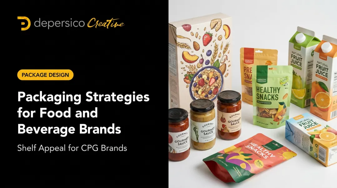
Package graphics are the complete set of visual design elements applied to a food product's packaging: color palettes, typography, imagery, logos, icons, claims, and label layout. Together, these elements attract shoppers, communicate product identity, and drive purchase decisions at the point of sale.
Packaging structure (the physical format and materials — a pouch, a box, a jar) and packaging graphics (the visual layer on the surface) are separate disciplines. This article focuses on graphics, because that's where the selling happens.
Understanding what package graphics are is the easy part. Understanding why they carry so much weight in food specifically requires a closer look at how grocery shoppers actually make decisions.
Why Food Is Different From Almost Every Other Category
Food purchasing is highly emotional and impulse-driven.
A 2025 Vestcom survey of 2,000 US consumers found that 72% reported making unplanned purchases prompted by in-store messaging — a finding that spans retail and CPG broadly but reflects a real pattern in grocery behavior.
Visual cues like color, food photography, and typography carry direct commercial weight because they trigger appetite response before rational evaluation kicks in. Shoppers don't decide to feel hungry. Packaging either creates that response or it doesn't.
Core Elements of Effective Food Package Graphics
Visual Hierarchy and Layout
Hierarchy is the arrangement of elements — brand name, product descriptor, key claim, image — that guides a shopper's eye from attention to interest to desire. Strong hierarchy leads the eye intuitively to the most persuasive information first. Poor hierarchy produces packaging that feels "busy" and gets ignored.
The principal display panel (the front face of your package) should answer three questions in sequence:
- What brand is this?
- What product is it?
- Why should I want it?
If a shopper has to work to find the answer to any of those questions, the pack has failed.
Color Psychology for Food
Color choices in food packaging are not purely aesthetic — specific hue families influence perceived healthfulness, indulgence, premium positioning, and appetite response. Research context matters here:
| Color Family | Common Food Association | Evidence Note |
|---|---|---|
| Green / Blue | Healthfulness, natural, fresh | Supported by a 2023 systematic review of 20 studies |
| Black | Premium positioning, higher willingness to pay | Strongest in organic and specialty categories |
| Warm orange | Indulgent, vice foods, impulse appeal | Supported in 2024 research vs. green in tested categories |
| White / Light | Perceived lightness; may reduce expected tastiness | Context-dependent |

Color has a competitive function beyond aesthetics: your palette must stand out against the actual shelf set, not just look good in a design presentation. A beautiful package in the wrong color territory disappears on shelf.
Food Photography and Appetite Appeal
Professionally photographed, styled food imagery is one of the highest-impact elements of package graphics. A 2025 study in the Journal of Retailing and Consumer Services found that food images arranged with symmetry, order, and balance increased perceived naturalness — which in turn improved perceived healthiness and purchase intention.
There's a real risk here, though: packaging that implies a better product than what's inside ultimately hurts satisfaction and repeat purchase. Great food photography creates a craving response that's credible — not just aspirational.
Photography must be technically print-ready as well: correct resolution, accurate color profiles, and styling calibrated for the product's positioning.
Typography and Messaging
Fonts must balance brand personality with legibility at small sizes, from a distance, and across multiple SKUs. A typeface that looks elegant at large scale can become unreadable on a side panel or at arm's length.
The copy itself — product names, descriptors, claims — deserves the same strategic intent as the visual design. This is where creative linguistics comes in: identifying the specific words and phrases that create the fastest and strongest connection with the target consumer.
Claims matter commercially too. Research on frozen-food packaging found that "clean label" claims like "no artificial ingredients" or "no GMOs" improved perceived healthfulness and purchase intent more than standard nutrient claims.
Brand Consistency Across a Product Line
When a food brand has multiple SKUs, graphics must function as a system. Each product should be clearly related to the others through consistent visual language while being easily differentiated by flavor, variety, or sub-line.
Inconsistent visual systems weaken brand recognition, make it harder to own visual shelf space, and slow down new SKU launches. A well-designed graphic architecture lets a brand extend its line quickly — and makes a stronger visual block on shelf that's harder for competitors to break up.
Key Factors When Choosing Food Package Graphics
Your Target Consumer and Their Buying Triggers
Graphics must be designed for a specific consumer archetype — not for everyone. The imagery, color, and tone that resonate with a health-conscious millennial differ significantly from those that appeal to a busy parent or a value-driven buyer. Broad designs that try to appeal to all buyers typically resonate with none of them.
Consumer observation, in-store shelf tests, and focus groups remain the most reliable ways to validate whether graphic choices are actually landing with the intended audience. Insight drives design — not the other way around.
Shelf Context and Competitive Set
Effective package graphics must be designed with the competitive context in mind. A product needs to stand out on the actual shelf where it will be sold — not just look good in a vacuum.
This requires mapping what competitive products look like and identifying visual opportunities to differentiate. Key areas to audit in the competitive set include:
- Color territories — which palettes are already saturated in the category
- Typography conventions — dominant type styles that feel generic or overused
- Photography style — lifestyle vs. product-forward, studio vs. natural light
- Structural cues — certifications, claim badges, and icon placement patterns
What competitors already own tells you exactly where the whitespace is for your brand.
Retail buyers also assess packaging in their planogram decisions. Packaging that commands visual shelf space gives a brand stronger footing in those conversations.
Regulatory and Labeling Compliance
Compliance requirements aren't separate from the creative process — they're part of the design architecture. FDA labeling rules include:
- Nutrition Facts panel — current format, serving size emphasis, added sugars, vitamin D and potassium
- Allergen declarations — sesame became the ninth major allergen effective January 1, 2023
- Net quantity — placed on the principal display panel, bottom 30%, with both US customary and metric units
- Ingredient statements — with allergen source names in parentheses or a "Contains" statement

Packaging Digest documented numerous 2024 and early-2025 food recalls involving label omissions and artwork errors — confirming that label errors trigger recalls, not just revisions. Build required FDA content into the design layout before creative is finalized, not after.
Scalability Across SKUs and Formats
Graphics developed for a single SKU often fail when extended across a product line. Different package sizes, shapes, and formats require a graphic system with flexibility built in from the beginning.
A well-structured graphic system makes new SKU launches faster and less expensive. Without that flexibility built in from the start, each new variety can trigger near-complete redesign work — eroding visual consistency and adding avoidable cost.
How DePersico Creative Can Help
DePersico Creative is a three-generation, family-owned food and beverage branding agency founded in 1977, with over 45 years of experience working exclusively on food and beverage brands — from startups to national names like Kellogg's, Campbell's, Ball Park, and McCormick. Food package design is their sole focus, which means every process and capability is calibrated specifically for the demands of food branding.
The agency's SWIFI process (Strengths, Weaknesses, and Ideas for Improvement) is a structured visual perception assessment that evaluates existing package graphics against both the competitive set and consumer perception. It identifies where the greatest opportunities lie before any design decisions are made.
In one documented case, the process revealed an opportunity for the DaVinci pasta brand to differentiate through bold purple — a color territory none of its major competitors (Barilla, De Cecco, and Ronzoni) had claimed.
Key DePersico differentiators:
- In-house test kitchen and photography studio produces food photography with genuine, credible appetite appeal
- Creative linguistics — led by James DePersico ("The Wizard of Words") — identifies the words and phrases that build fast consumer connection
- All services handled in-house: brand analysis, package design, food photography, and marketing materials with no vendor coordination gaps
- Direct access to the company President on every project, not a rotating account manager
- Project-based pricing accessible to both startups and established national brands

That integrated model matters in food packaging because the decisions made in brand strategy, photography direction, typography, and compliance all affect each other. Keeping them under one roof reduces errors, closes communication gaps, and ensures the finished package tells one consistent story on shelf.
Conclusion
Choosing the right food package graphics is one of the highest-leverage decisions a food brand makes. The goal isn't the most elaborate design — it's the most strategically aligned design for the specific product, consumer, and retail context. A package that stops the right shopper and communicates the right promise, quickly and credibly, outperforms any amount of creative complexity.
Packaging is also not a set-it-and-forget-it asset. Markets shift, competitive sets evolve, and consumer preferences move. NIQ's packaging research notes that 9 in 10 redesigns make no meaningful market difference. That's an argument for doing the strategic work before committing to a new direction, not for avoiding change altogether.
Brands that periodically reassess their graphics against current benchmarks — rather than revisiting them only when sales slip — are the ones that stay ahead. The strategic groundwork done before a redesign is what separates packaging that performs from packaging that simply refreshes.
Frequently Asked Questions
Frequently Asked Questions
What is packaging graphics design?
Packaging graphics design is the process of creating visual elements applied to product packaging — color, typography, imagery, logos, and layout. The goal is to attract consumers, communicate brand identity, and drive purchase decisions at the point of sale. In food, it functions as the brand's primary salesperson at retail.
What are the 4 types of graphic packages?
In food, the four broad categories are primary label graphics, secondary packaging graphics (outer box or wrap), point-of-sale display graphics, and digital/e-commerce product imagery. Each requires a related but distinct visual approach.
What is an example of a graphics package?
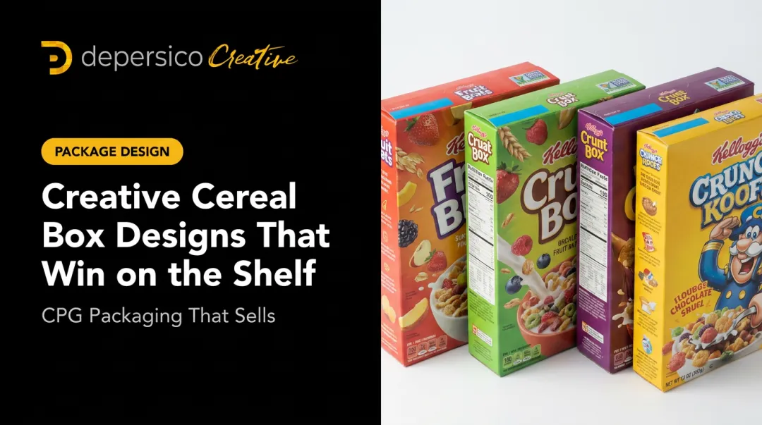
A cereal brand like Kellogg's illustrates this well: the complete graphics package includes the front panel artwork, back panel storytelling, side panel nutritional layout, and brand logo system. All visual elements function as a unified system rather than individual pieces.
How often should food brands update their package graphics?
Most competitive food brands revisit packaging every three to five years, or sooner if sales are underperforming, a significant competitor has disrupted the shelf, or a brand repositioning is underway. Refresh decisions should be trigger-based, not purely calendar-based.
What makes food package graphics stand out on a crowded shelf?
The key drivers are: strategic color differentiation from the competitive set, strong visual hierarchy that communicates the core product promise in seconds, and appetite-evoking food photography that creates an immediate craving response.
How much does custom food package graphics design typically cost?
Costs vary widely based on scope (single SKU vs. full product line), the agency's experience level, and services included such as photography, brand strategy, and compliance review. Agencies like DePersico Creative use project-based pricing to make professional-grade design accessible to brands at any stage — from startups launching their first SKU to national brands refreshing a full product line.