
OVERVIEW OF THE CHALLENGE

Sea Best® already had one of the best-tasting, highest-quality seafood lines on the market—but consumers were passing it up in the grocery store. The brand needed our help to clearly position its products as restaurant quality because its current design wasn’t conveying the message.
PACKAGE DESIGN REFRESH
Before we could create modernized package designs highlighting Sea Best®’s restaurant-quality products, we needed a new logo that didn’t look decades old. Our redesigned logo used the same color scheme of pale yellow and crimson with updated script, a simple outline of a seagull, and the words “restaurant quality” right under the brand name.
To brighten up the package design and catch shoppers’ attention, we traded the dark black and blue color scheme for sunset imagery and a cream-colored background for our product photos. We minimized the copy on the packaging to avoid overwhelming consumers and showcased the most important product features using creative linguistics.
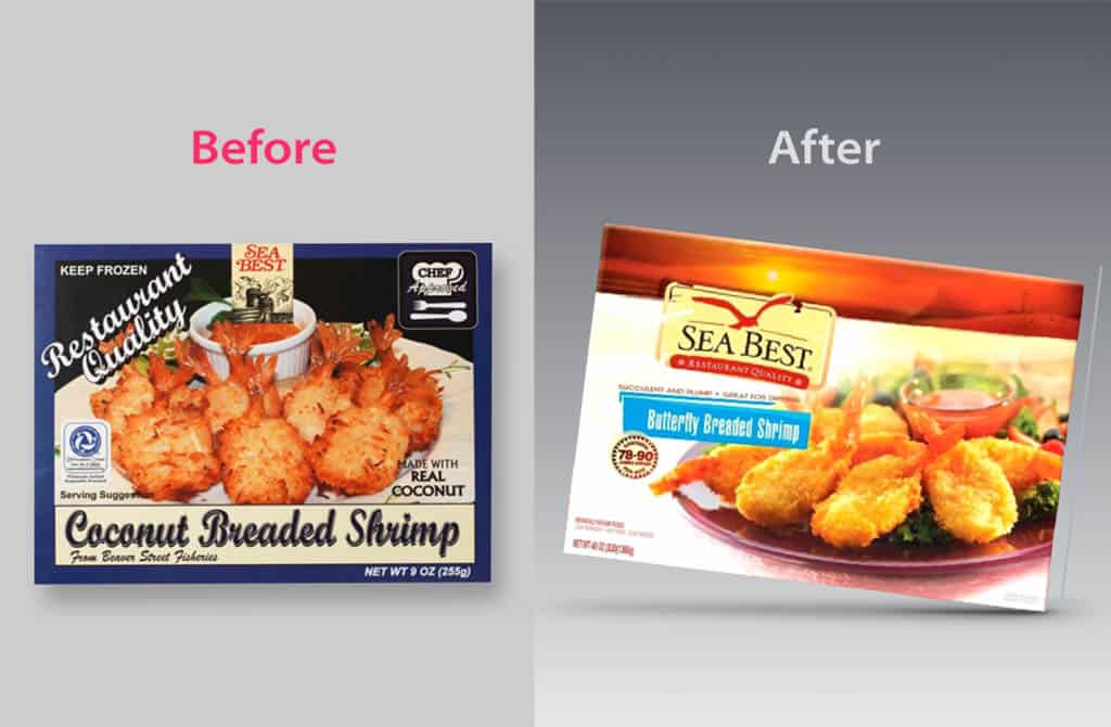
Before & After Design Refresh
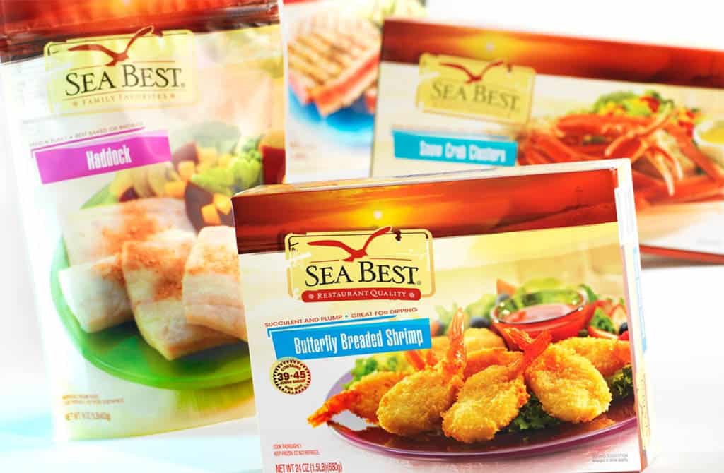
Sea Best Completed Design
FOOD PHOTOGRAPHY
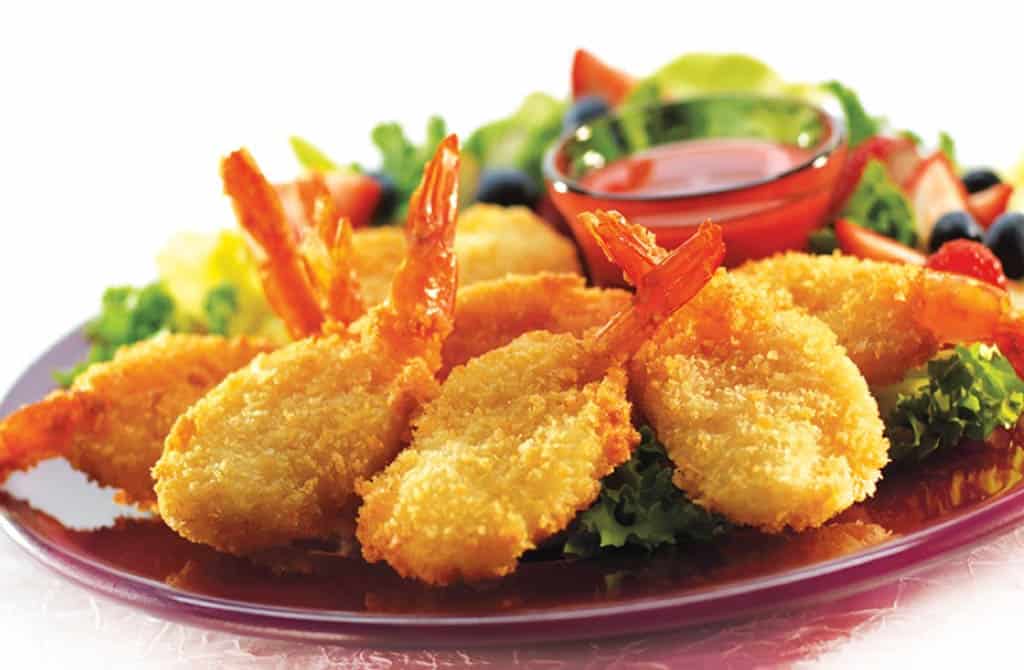
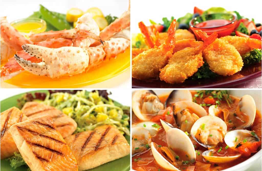
The best way to communicate a product’s quality is to show consumers—not just tell them. That’s why we focused on capturing mouthwatering food photos that looked like they could have come from a high-end restaurant. We let the freshness of Sea Best® products shine against brightly colored dishes and light backgrounds so shoppers could see the quality at first glance.
We photographed 34 varieties of Sea Best® seafood to use on each product’s packaging and finalized our designs for launch.

LINE EXPANSION
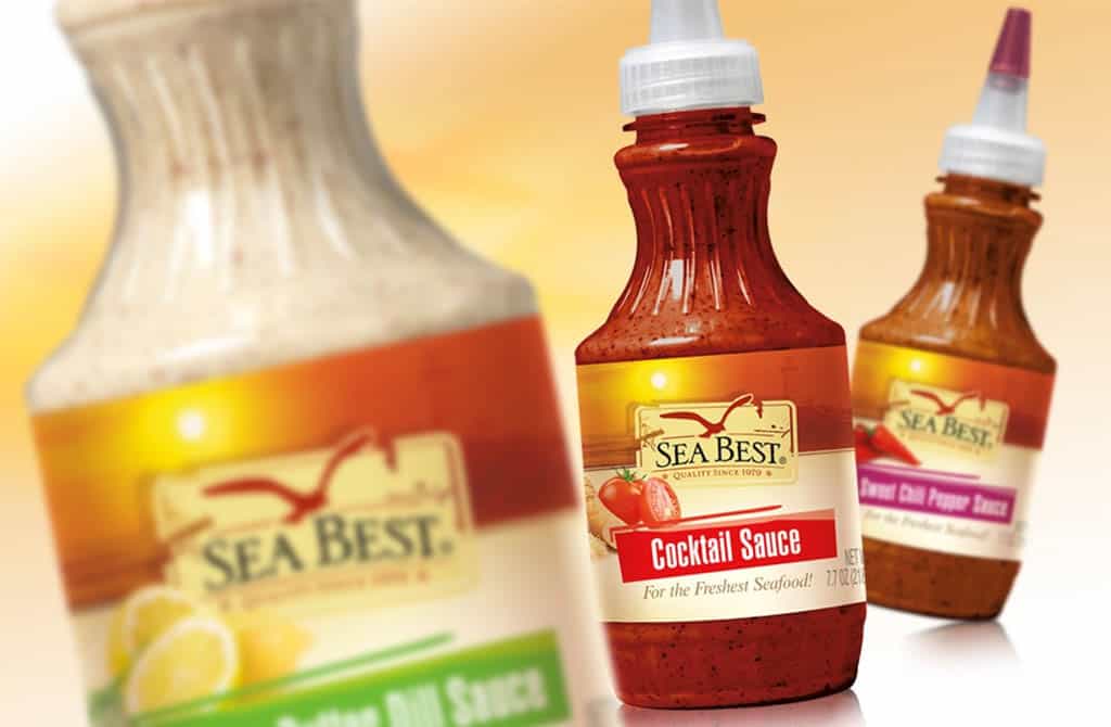
After we designed new packaging for Sea Best®’s frozen seafood products, the brand decided to add sauces to its product line. We used the same imagery and colors to create a cohesive brand identity and shelf appeal.
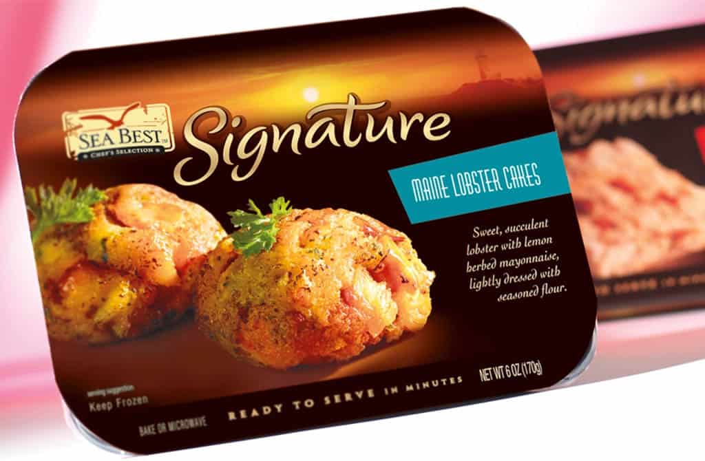
Our team also helped Sea Best® unveil a premium line of premade dishes with an elevated design and appealing product descriptions.

CUSTOM MARKETING MATERIALS
DePersico Creative helped generate interest in the newly redesigned Sea Best® line with integrated marketing materials.
MASCOT DESIGN
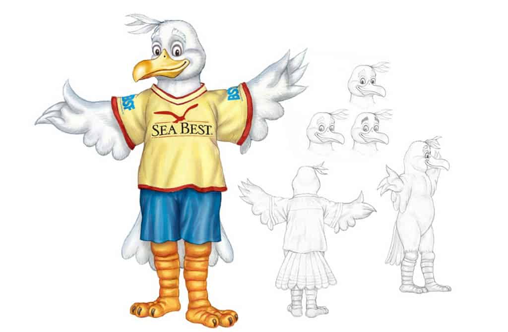
We designed Fisher the Sea Best® mascot to add an element of playfulness to the brand’s new image.
SUPPORT MATERIALS
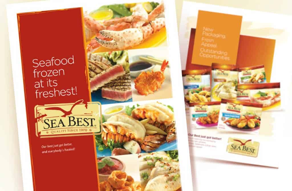
Our one-page support materials advertised Sea Best®’s new look and shared a few key benefits alongside professional product photos.
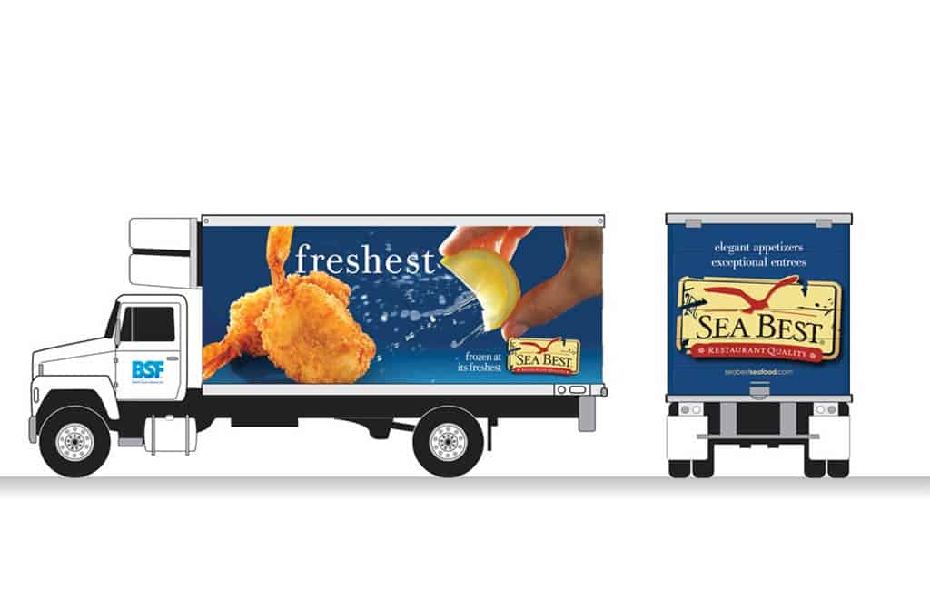
TRUCK GRAPHICS
We designed the bold blue background and larger-than-life breaded shrimp coated with a spritz of lemon to capture attention—so all we needed to finalize our truck graphic was one word: “freshest.”
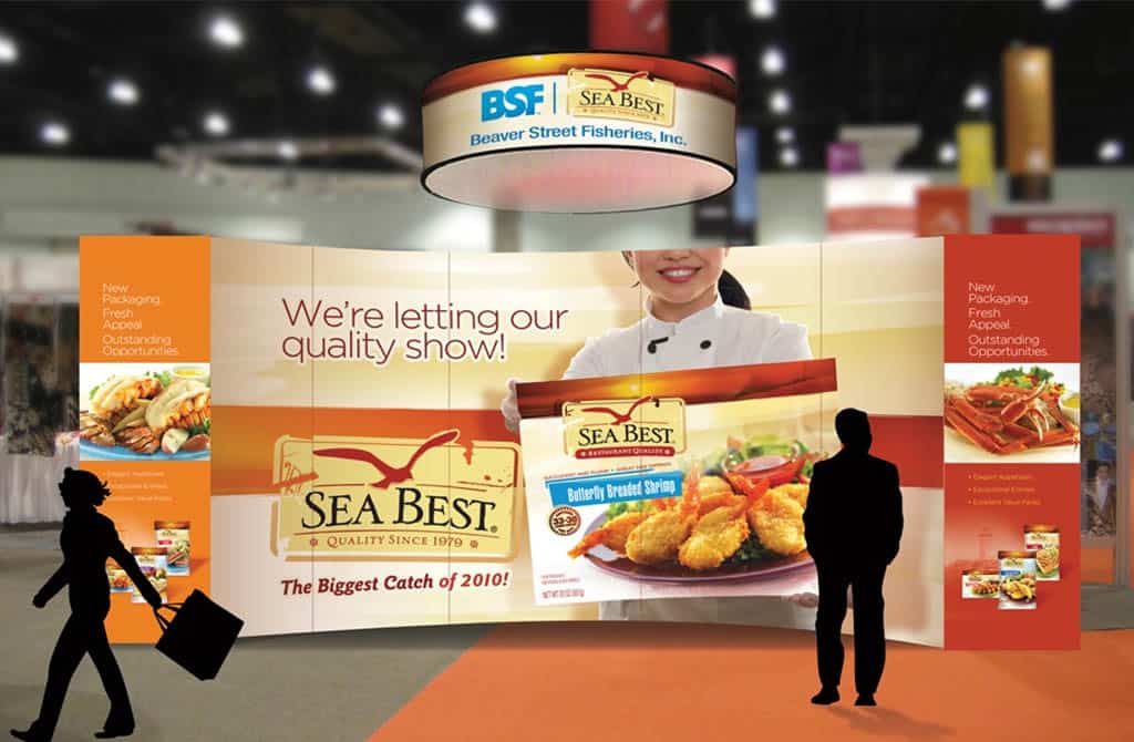
TRADE SHOW BOOTH
We helped Sea Best spread the word about its revamped packaging with a custom-designed trade show booth that matched the new brand image.
RESULTS

Our upgraded brand look and package design fueled geographic expansion and helped Sea Best® distribute their products in the Northeast for the first time.
After seeing the initial success of its rebrand, Sea Best® expanded its line from nine to 34 products and added two sub-lines to its collection.
