
OVERVIEW OF THE CHALLENGE

Previous Competitor Comparison
For the past five years, the DaVinci® pasta brand had noticed declining sales. World Finer Foods turned to us to revitalize DaVinci® and make it stand out on the shelf to inspire purchase decisions.
We performed a SWIFI brand analysis and gathered as much available research as possible to help shape our strategy.
DISCOVERY AND CREATIVE STRATEGY
Using our insights from the initial research phase, we developed strategic creative ideas and a product positioning plan that would make DaVinci® stand out in a “wall of pasta.”
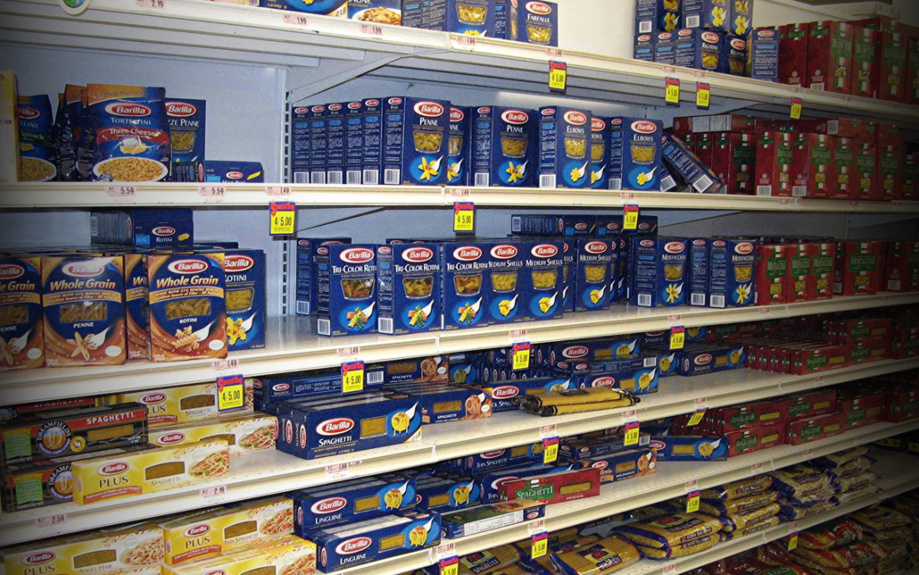
Wall of Pasta
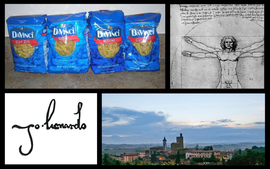
CONCEPTS & DESIGN DIRECTION
During our brainstorming phase, we created a plan to visually communicate the revitalized product messages of creativity and authenticity through imagery, copy, and typography. Our biggest goals were to:
- Leverage the DaVinci® look by using handwritten script—just like Leonardo used in his famous journals.
- Leverage the town of Vinci and imagery of the Italian countryside to create an authentic feel.
LOGO MAJOR DESIGN UPDATE
Based on the creative strategy, create logo designs that improve the communication of the brand message.

Before
Positioning: Be creative with DaVinci Pastas from Italy.
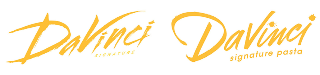
After Options 1 & 2
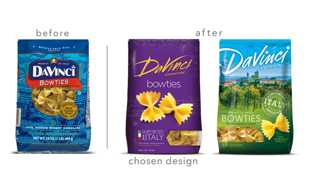
Before & After Options 1 & 2
PACKAGE DESIGN FACE
Create package face designs that capture and visually depict the creative strategy and design directions. Create a visual flow of messages in accord with the correct & approved hierarchy.
COMPETITIVE REVIEW
Stand out in the category with easier to identify pasta shapes, a fun creative look, bold brand color & contrast and authentic “Imported from Italy” lock-up.
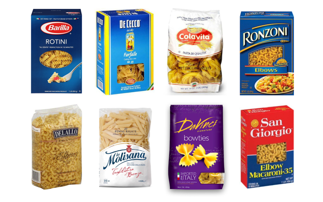
Comparison against a variety of Competitors
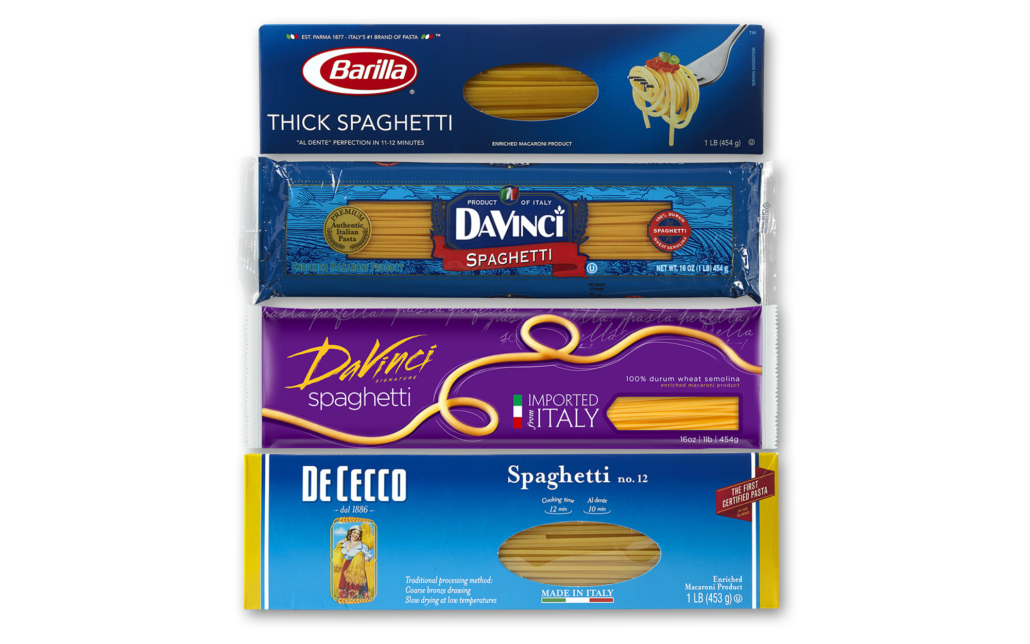
DaVinci long pasta next to its biggest competitors.
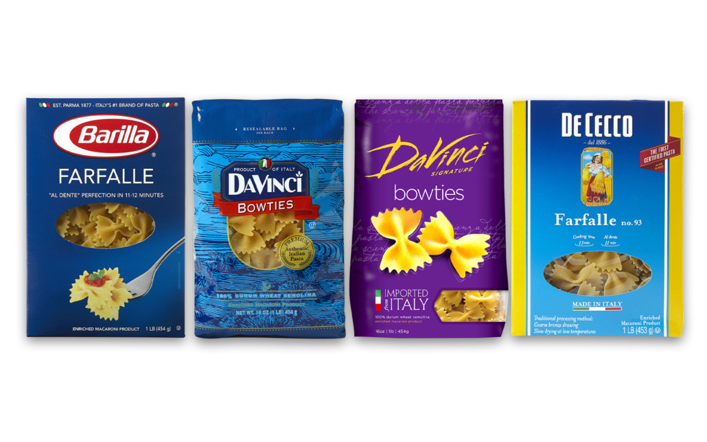
DaVinci bowties next to its biggest competitors.
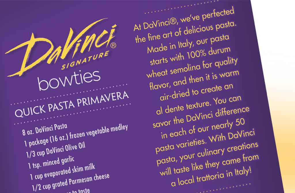
BACK PANEL BRAND & PRODUCT STORY
Once we nailed down the perfect look for the front of DaVinci®’s boxes and bags, we crafted a compelling brand story explaining the unique process behind their pasta. Our creative linguistics emphasized the variety and Italian restaurant quality that made DaVinci® a superior product. We rounded out the back packaging with simple recipes to help inspire shoppers at the store.
FINAL ART & DIGITAL FILES
After finalizing our designs for 50 different pasta varieties, we delivered the final art, product renderings, and integrated marketing materials to help DaVinci® advertise its bold new look.
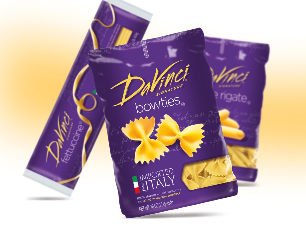
Design brings casual fun to the category!

7 of the 50 varieties that easily differentiate on shelf.
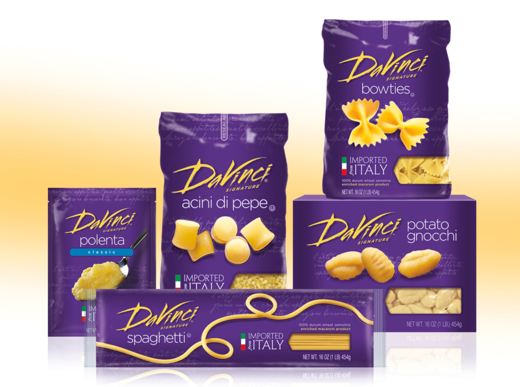
Different Pouch, Bag, and Box package forms

Identity close up
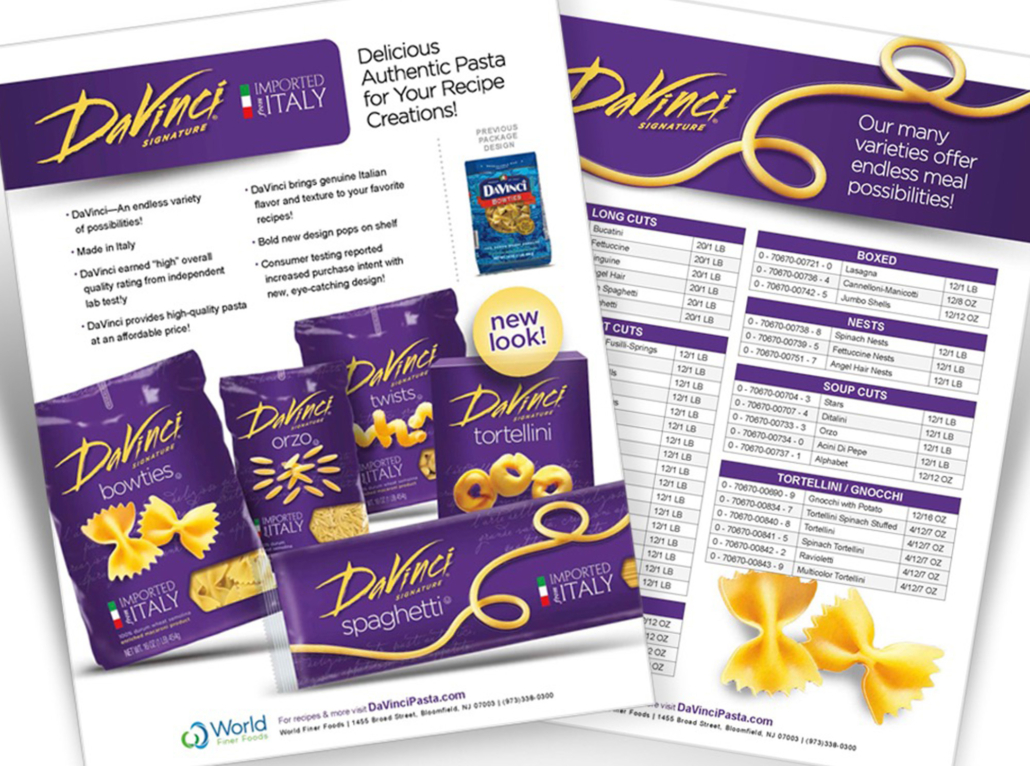
Sales support materials
