
Designing a Label for Your Target Audience

Label design goes beyond looking good. It is about speaking directly to the people you want to buy your product and making the decision to choose you feel easy. Whether they are browsing a crowded shelf or scrolling through an online store, your audience is making quick decisions, and your label needs to earn their attention. If you want to know how to design a label that truly fits your shopper, you need to start with them in mind from the beginning.
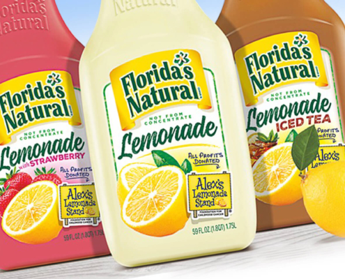
Why Audience-Centered Label Design Drives Sales

People do not buy a carton or a bottle, they buy what it promises to solve, express, or enhance in their day. A parent may be looking for a calmer morning, a wellness shopper may want better choices that still feel enjoyable, a foodie may want a flavor that feels worth anticipating. Your label sits right at that decision point, carrying both information and identity at the same time.

The information side covers the essentials, such as product name, flavor or variety, ingredients, certifications, nutrition, format, and pack size. Identity shows up in color, typography, imagery, and tone of voice. When you think about how to design a label for a specific person rather than a general shopper, those elements start to work together. The result is packaging design that is easier to find in a busy set, easier to understand at a glance, and easier to trust enough to try.

Start With Buyer Psychology Before Aesthetic Trends

Strong packaging design starts with people, not palettes. Before you explore colors or fonts, define who you are really talking to. What does this buyer care about in this category, such as clean ingredients, bold flavor, convenience, price, sustainability, or a sense of indulgence. How quickly do they shop, and where do they usually encounter your product, in a grocery aisle, a natural channel, a club store, or an online marketplace.

The first step in how to design a label for your audience is understanding the balance between emotion and proof in their decision. Some buyers rely more on appetite, mood, and impulse, others focus on safety, performance, or health outcomes. Many sit somewhere in the middle. A health-conscious parent needs reassurance and simplicity. A Gen Z snacker looks for personality and novelty. A luxury ingredient seeker pays close attention to sourcing, craft, and detail. Each of those mindsets calls for different visual and verbal choices on pack.

Translate Audience Insights into Visual Direction

Once you understand who you are speaking to, audience insight belongs in the creative brief, instead of staying in a research document. This is where tips for designing custom product labels start to shape concrete decisions about color, typography, hierarchy, and composition.

Color Palettes That Match Mood & Category

Color is often the first thing a shopper notices, so it should reflect the mood and role of the product. A light, fresh palette supports balance or clarity, as in functional beverages or better-for-you snacks. Rich, warm palettes support desserts or comfort foods. Bright, high contrast color stories help kids’ products and impulse snacks catch the eye across an aisle.

Category conventions matter as well. Each shelf develops visual shorthand that helps people navigate quickly. A successful palette feels at home in that world while still giving your brand a recognizable block on the shelf. These choices turn how to design a label into a conversation about how your product should feel in context, rather than a loose exercise in picking interesting colors.

Typography That Feels Familiar (But Ownable)

Typography shapes readability and personality at the same time. For family staples, approachable sans serif type with a clear hierarchy makes labels simple to scan. For trend-driven snacks and beverages, a more expressive display font for the product name, paired with a simpler supporting font, can convey energy without sacrificing clarity. For premium or specialty items, refined serif or geometric sans serif choices can support a sense of care and craft.

Whatever system you choose, it should feel familiar enough to trust and distinct enough to feel like you. When a shopper sees your lineup together, the type choices should look like a deliberate part of your brand, not decoration added at the last minute.

Label Layout That Speaks Their Language

Layout controls what gets seen first and what fades into the background. It should mirror your buyer’s priorities. If a health-focused shopper cares most about “organic,” “low sugar,” or “high protein,” those cues need prime space on the front panel. If pack size and flavor matter more, those should lead. Details such as “artisan-crafted,” “slow simmered,” or “cold-brewed” can then support the main promise.

A practical way to apply this is to choose one core promise to highlight, place the brand and product name where the eye naturally lands, group key claims and certifications, and use imagery to reinforce appetite, convenience, or occasion. These steps turn how to design a label from guesswork into a clear sequence of choices that support the way your shopper actually reads a pack.

Ready to connect with your audience before they even open the package? Design choices that start with your buyer can turn every label into packaging that tells a story they care about. Let’s design a label that sells.

Balance Brand Identity With Consumer Expectation

Designing for your target audience also means respecting the cues they rely on to navigate a category. A frozen meal should still read as a frozen meal; and sparkling water should still read as a beverage, not a household cleaner. If you lean too far away from category expectations, people may hesitate because they cannot tell what you are offering. If you match the shelf too closely, your brand can disappear in the noise.

The goal is a balance between recognition and distinction. Keep the structural signals that help people identify product type and use, then elevate them through more intentional color, composition, and storytelling. Add a few signature elements, such as a color block, illustration style, or framing device, that become uniquely yours across products and branding packages. When shoppers can recognize the category quickly and still feel a clear sense of brand, they can move to the decision faster.

Test, Refine, Repeat

Even with a clear strategy, you will not know how a new label behaves until you put it in front of real buyers. Simple testing can reveal how your label works in the contexts that matter most for your brand. Mock shelf sets, quick interviews, and A/B testing in digital channels all show how people notice, interpret, and respond to your packaging.

The questions should stay practical. Would the right buyer notice the pack in this environment? Would they pick it up or click to learn more? Does the label match the quality and price point you intend? What detail helped them decide? Those answers point directly to refinements in hierarchy, contrast, copy, or imagery. A team that understands data and creative execution can turn those refinements into packaging design that performs reliably at print, in store, and online.

Design With Your Buyer in Mind

The strongest labels feel personal to the people they are meant to reach. They reflect real priorities, daily routines, and the small decisions that shoppers make every week. When you base label design on your target audience, you get packaging that consistently improves brand perception, shelf visibility, and buyer decision-making across retail and e-commerce.

Over time, this approach gives you a practical framework for future launches and refreshes. It becomes easier to brief new projects, extend successful ideas across a line, and build packaging that tells a story in a few focused seconds.

DePersico Creative helps food, beverage, and wellness brands turn audience insight into labels that perform, from first concept through cohesive branding packages and ongoing refinements that keep your products feeling current and clear.

Let us design a label that gets noticed and chosen.

More Like This

Woman chooses packing eggs in supermarket
