Introduction
Consumers decide whether to pick up a product — or scroll past it — in roughly 13 seconds in-store and 19 seconds online, according to Nielsen research tracking CPG purchase behavior. For baking brands, that window is almost entirely visual.
The challenge? Baked goods are among the hardest food categories to photograph well. Browns, tans, and matte textures don't jump off a screen the way a bright red strawberry or glossy sauce does. Without the right light, a fresh croissant looks flat. A perfectly textured sourdough crust looks like cardboard.
This guide covers the four disciplines that separate brand-worthy baking images from the rest: lighting, composition, food styling, and post-processing. Whether you're shooting for packaging, e-commerce, or social media, each section gives you specific, actionable techniques you can apply to your next shoot.
Key Takeaways
- Natural side lighting is the single highest-impact change you can make to baking photography immediately
- Angle selection should follow the physical structure of each baked good, not personal preference
- Food styling techniques matter more than camera settings for separating amateur from brand-quality images
- Treat every background and prop as a branding decision: keep them intentional and minimal
- Consistent editing style is as much a brand asset as your logo or color palette
Lighting: The Foundation of Stunning Baking Photography
Brown foods are difficult to photograph because color alone provides almost no visual variation. What sells a croissant or a sourdough loaf is texture — and texture only exists in photography when light creates it. Every lighting decision you make either reveals that texture or kills it.
Natural Light: Where to Start
Start by positioning your subject near the largest window in your space. Turn off every overhead light — artificial bulbs and daylight have different color temperatures, and mixing them creates color casts that are hard to fix in editing.
A few natural light fundamentals:
- Use indirect or diffused daylight, not direct midday sun. North- or east-facing windows, or early morning and late afternoon light, give the softest, most directional results.
- Diffuse harsh sunlight by taping white diffusion paper or hanging a sheer curtain across the glass. You keep the direction; you lose the harshness.
- Shoot consistently. Cloud cover changes light fast. If your brand needs matching shots across multiple sessions, note your window, time of day, and diffusion setup.
Side Lighting vs. Back Lighting
These two approaches produce very different results:
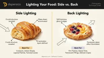
- Side lighting rakes across the surface of the food at a low angle, creating highlight-shadow transitions that reveal crumb structure, lamination layers in pastry (the thin, layered folds in croissants), sugar crystals on a crust, and the sheen of a glaze. For most breads, croissants, muffins, and cookies, side lighting is the right choice.
- Back lighting places the light source behind the subject, creating a soft glow. It works well for translucent glazed elements — honey drizzle, a sugar glaze, fruit fillings — but can flatten solid matte surfaces if used alone.
Controlling Light With Simple Tools
You don't need a professional kit to manage light effectively:
- White foam core board placed opposite the light source reflects fill light back into shadows without washing out the texture side lighting creates
- Black card on the opposite side deepens shadows deliberately — useful for moody, indulgent brand aesthetics (dark chocolate, artisan breads)
- 5-in-1 reflector panel offers multiple options in one tool, including silver for stronger fill and translucent white for diffusion
Artificial Light as a Secondary Option
When natural light isn't reliable, continuous LED panels with daylight-balanced bulbs (around 5600K) are the standard reference point, per B&H's food photography lighting guide. The critical rule: never mix artificial and natural light in the same shot without setting a custom white balance. Color casts from mixed sources require significant correction in post and often can't be fully resolved — a real problem when you need consistent imagery across a product line.
Composition and Angles That Sell Baked Goods
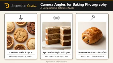
The right angle depends on the physical structure of what you're shooting — not aesthetics, not platform conventions. Research from the Institute of Culinary Education and Canon confirms three primary approaches, each matched to specific product geometry.
The Three Angles
| Angle | Best For | Why It Works |
|---|---|---|
| Overhead (90°) | Cookies, tarts, pies, pastries with decorative tops | Emphasizes pattern, shape, and repetition across flat subjects |
| Eye level (straight-on) | Layer cakes, stacked cookies, sandwich bread, croissants | Height and layers become the story |
| Three-quarter (≈45°) | Individual pastries, plated desserts, most single-serving items | Shows both top surface and depth simultaneously |
When you're unsure where to begin, default to three-quarter. It reveals enough of the top to show decoration and enough of the side to communicate height — covering both dimensions most baked goods rely on to look appetizing.
Rule of Thirds and Negative Space
Once you've locked your angle, grid placement determines whether the shot feels deliberate or accidental. Divide your frame mentally into a 3×3 grid and place the hero subject at one of the four intersections rather than dead center. The slight offset creates visual tension that makes the composition feel intentional.
For baking brands specifically, negative space is a functional tool, not just an aesthetic one. Open areas in the frame allow product names, taglines, or copy to be added in post-production — making your photography work across packaging, social media, and trade materials without requiring reshoots.
Solving the Visual Drama Problem
Some baked goods are naturally flat or small. Fix this with:
- Stack cookies, brownies, or pancakes to create height and visual rhythm a single piece can't deliver
- Cut a muffin in half or snap a cookie to expose interior texture — the crumb structure and color inside often outperform the exterior
- Frame close enough that small subjects fill the shot; surface detail becomes the story at macro distances
Depth of Field
A wider aperture (lower f-stop number) blurs background elements and isolates your hero subject — ideal for single-item shots. Canon photographer Linda Lomelino typically works in the f/1.8–f/3.2 range for hero shots and moves toward f/5.6–f/8 for flat lays where more of the scene needs to stay sharp.
On a smartphone, Portrait mode applies a similar blur effect. The practical outcome matters more than the mechanism: a well-isolated subject draws the viewer's eye to the product first, which is exactly what brand photography needs to do before any copy or logo appears.
Food Styling Tricks That Make Baked Goods Irresistible on Camera
Getting the exposure right is only half the job. For baking brands, food styling is where most images either earn a craving or lose one — and it's a skill that lives entirely outside the camera menu.
The Fresh-Baked Window
Baked goods often look their best for a brief window immediately after coming out of the oven. Steam, glossy surfaces, and melty elements can all disappear within minutes. Practical techniques to extend or restore that appearance:
- Briefly microwave a cookie (10–15 seconds) to re-melt chocolate chips before shooting
- Apply glaze or honey drizzle immediately before the shot, not before setup — glazes settle and lose their visual movement quickly
- Powdered sugar and turbinado crystals photograph beautifully because they catch light and add visible texture — dust them on just before shooting
Once you've captured that fresh-baked moment, garnish choices determine how much story the frame tells.
Strategic Garnishing
The goal is to add visual information without distracting from the hero product:
- Flour scattered on a work surface communicates handcrafted authenticity
- Fresh berries or citrus zest introduce color contrast against warm brown tones
- A broken piece placed beside a whole item creates texture storytelling without staging
With garnishes in place, composition determines what the eye lands on first.
Hero vs. Supporting Cast
The main baked good should be the sharpest, most prominent element in the frame. Props and garnishes exist to support the mood — they should occupy secondary visual weight only.
Raw ingredients (chocolate chips, walnuts, fresh fruit) work especially well as contextual props: they reinforce the visual composition while signaling ingredient quality.
Color Theory in Baking Photography
Baked goods trend warm and brown. To create visual vibrancy, introduce contrast:
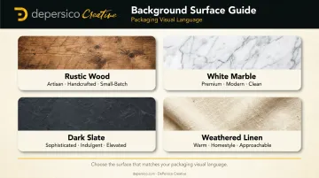
- Cool backgrounds — slate, white marble, cool-toned linen — push warm subject tones forward
- Complementary garnishes — green herbs, citrus, fresh berries — work because they sit opposite warm orange-brown tones on the color wheel
Orange with teal is a well-established pairing in food photography for exactly this reason. A practical rule: limit any scene to two or three colors total. For baking photography, that typically means one warm background, your baked subject, and one cool or contrasting accent.

Backgrounds and Props That Reinforce Your Brand
Background selection is a branding decision. Every surface texture and color you place behind your product communicates something to the consumer before they read a single word.
What Each Background Communicates
- Rustic wood boards → artisan, handcrafted, small-batch
- White marble → premium, modern, clean
- Dark slate → sophisticated, indulgent, elevated
- Weathered linen → warm, homestyle, approachable
The real question is which background aligns with your packaging visual language and what your target consumer already expects from your brand.
The Minimal Prop Rule
Brand product photography is not lifestyle food blogging. Keep props intentional and limited — typically 1–3 supporting elements maximum. A linen napkin, a single vintage fork, a small ramekin of flour. That's enough.
When more than three props appear in frame, the product stops being the focal point — the image becomes a scene, and scenes lose selling power.
Consistency as a Brand Asset
Kantar's Brand Imprint research, based on 10,500 interviews, identifies consistent distinctive visual assets as mental shortcuts that reinforce brand recognition over time. In practice for baking brands, this means defining a small set of backgrounds, textures, and color palettes — then using them across every shoot.
When a consumer sees your product on Instagram, then on a retail website, then on shelf packaging, the visual consistency creates recognition that no single image can build alone. DePersico Creative builds these visual choices into a defined, repeatable system from the first shoot — so every image you produce strengthens the same brand memory.
Editing and Post-Processing for Professional Results
Essential Adjustments
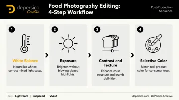
Every baking photography edit should address these in order:
- White balance — confirm whites are neutral, not blue or yellow. Mixed light sources during shooting make this correction more complex
- Exposure — brighten without blowing out highlights on glazed or reflective surfaces, where detail matters most
- Contrast and texture — gentle contrast increases make crust structure and crumb definition more visible
- Selective color correction — ensure the product color in your final image accurately represents the real product. For food brands, color accuracy is a consumer trust issue, not just an aesthetic one
Editing Style as Brand Asset
Choose a signature editing direction — warm and golden, cool and bright, rich and moody — and apply it consistently across every image. That consistency creates the same visual cohesion as a logo or color palette. Accessible starting points:
- Adobe Lightroom — Full RAW editing with precise white balance and color controls; Photography plan from $19.99/month (includes Photoshop and 1TB storage)
- Snapseed — Free mobile option with RAW editing and manual white balance; solid for quick brand-consistent edits on the go
- VSCO — Starter free; Plus at $29.99/year, Pro at $59.99/year
When to Work With Professionals
For brands whose images will appear on packaging, major retail websites, or national campaign materials, DIY photography carries real risk. Inconsistent lighting, inaccurate color, or compositions that don't account for copy placement can require costly reshoots.
Working with a professional food photography team — one with a dedicated studio, prep kitchen, and experience across packaging and digital applications — ensures images are technically optimized and brand-consistent from the first shot. DePersico Creative handles photography in-house alongside brand strategy and package design, so every image is coordinated with how it will actually be used on shelf or online.
Frequently Asked Questions
What is baking photography?
Baking photography is a specialized branch of food photography focused on capturing breads, pastries, cakes, cookies, and similar products in ways that highlight texture, freshness, and color. It's used for cookbooks, social media content, brand marketing, and product packaging.
What lighting is best for baking photography?
Natural side lighting near a large window is the most accessible starting point — it reveals surface texture and adds warmth to matte, brown-toned baked goods. Place a white foam core board on the opposite side to fill shadows without losing the contrast that defines texture.
What camera settings should I use for baking photography?
For isolated hero shots, a wide aperture around f/1.8–f/3.2 blurs backgrounds and draws focus to the subject. Flat lays benefit from f/5.6–f/8 to keep more of the scene sharp. Keep ISO as low as possible to minimize grain, and use a tripod if shooting below 1/125 second.
How do I make baked goods look fresh and appealing in photos?
Photograph immediately after baking when possible. Briefly microwave cookies to restore melty chocolate. Apply glazes and powdered sugar just before shooting. Use flour scatter and raw ingredients in the frame to suggest handmade freshness to viewers.
What props and backgrounds work best for bakery brand photography?
Choose backgrounds that match your brand's visual identity — rustic wood for artisan positioning, marble for premium. Keep props to 1–3 items maximum so the product stays the clear focal point. Consistency across shoots matters more than any single background choice.
How do I maintain a consistent visual style across my brand's food photography?
Set a fixed lighting direction, a small group of backgrounds and textures, and a consistent editing preset, then apply them across every shoot. Visual consistency builds brand recognition the same way a logo does: through repeated, reliable exposure over time.