Introduction
Walk down any grocery aisle and watch how shoppers actually behave. They're not reading labels — they're scanning. A product gets a fraction of a second to register before attention moves on. The average supermarket now carries over 33,000 items, and in most categories, a dozen or more competitors are stacked within arm's reach of your product.
For food and beverage brands, this creates a specific, high-stakes problem: your packaging is your primary salesperson, and most brands have no idea whether it's working.
This guide is for three types of F&B brands:
- Startups preparing to launch their first SKU into retail
- Regional brands entering new retail accounts and needing shelf-ready visuals
- Established brands whose packaging hasn't been formally reviewed in years
This guide walks through what a brand visual audit is, which elements to assess, how to run the process, and what to do with what you find.
Key Takeaways
- A brand visual audit diagnoses where your visual system works and where it breaks down — before you commit to a redesign
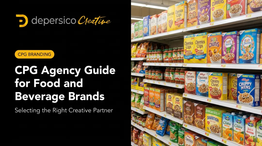
- F&B audits must evaluate packaging within its actual competitive shelf context, not in isolation
- The five core elements to assess: logo application, front-panel hierarchy, color system, food photography, and typography/copy
- A structured 5-step process moves from asset collection through competitive benchmarking to prioritized action
- Over 50% of package redesigns fail to increase purchase preference, which is why pre-redesign diagnosis matters
What Is a Brand Visual Audit for Food and Beverage Brands?
A brand visual audit is a comprehensive assessment of every visual element a brand uses — from primary packaging to social media imagery — evaluated against a clear set of criteria: consistency, clarity, shelf differentiation, and appetite appeal.
The critical distinction: an audit is diagnostic, not prescriptive. It doesn't start with design solutions. It starts with an honest look at what you have, how it's performing, and where the gaps are. Only after that assessment can you make informed decisions about what to change and why.
Why F&B Brands Skip It
Most food brands don't skip visual audits because they don't care about their packaging. They skip them because growth doesn't wait for structured review.
A brand launches one SKU, adds two more flavors six months later, hires a different designer for the secondary packaging, and three years in has a visual system held together by circumstance rather than strategy.
The result is brand fragmentation — each individual decision seemed reasonable at the time, but the cumulative drift adds up fast. Common symptoms include:
- Logo treatments that vary in weight or color across SKUs
- Photography styles that shift between product lines
- Color applications that no longer match across packaging tiers
That drift erodes consumer trust on-shelf — and internal teams rarely catch it, because they're reviewing assets one at a time rather than side by side.
An audit forces that side-by-side view. What looks cohesive in isolation often reveals a fractured system when everything is on the table at once.
What Makes a Visual Audit Different for Food and Beverage Brands?
A generalist brand audit evaluates consistency. An F&B brand audit evaluates performance — and those aren't the same thing.
The Shelf-Performance Dimension
A tech company's visual identity lives on screens. An F&B brand's identity has to win on a physical shelf, surrounded by competitors designed to appeal to the same shopper at the same moment.
Research bears this out. NielsenIQ BASES data shows that optimized package designs generated an average 5.5% lift in forecasted revenue — but that optimization only matters relative to what's surrounding your product on shelf. A color palette that looks distinctive in isolation can completely disappear when placed next to six competitors using the same category color conventions.

This is why F&B audits must evaluate packaging within its competitive context, not in a design vacuum.
Multi-SKU Visual Architecture
Most food brands manage product lines — multiple flavors, sizes, or formats that need to share a cohesive visual architecture. The audit must answer two questions: Does this line read as a family on shelf? And can new SKUs be added without breaking the system?
DePersico Creative's SWIFI methodology evaluates multi-SKU lines as a shelf system, not as individual packages. That means assessing whether:
- Visual hierarchy is consistent across every SKU
- The color differentiation system can accommodate future varieties
- Logo placement and typography hold firm across all formats
- Production file structure allows for efficient SKU additions
The Fresh Market's private-label packaging system spans more than 700 SKUs across three product tiers — all sharing consistent typography and brand architecture while allowing category-specific variation. That level of scalability requires deliberate design decisions from the start.
The Dual-Channel Challenge
F&B brands increasingly sell through both physical retail and e-commerce, and the same packaging that performs well on a shelf can fail completely as a thumbnail. Online grocery sales hit $96 billion in 2020 — up 55% from 2019 — and now represent nearly 9% of all grocery item sales.
GS1's Mobile Ready Hero Image guidelines define what an effective digital product image must communicate:
- Who: brand identity
- What: product type
- Which: variant or flavor
- How much: net content
An F&B visual audit needs to assess both channels — because the design choices that built your shelf presence can actively work against you in digital search results.
Key Visual Elements to Assess in an F&B Brand Audit
Logo and Brand Mark Application
Evaluate whether the logo scales effectively across every use case — from large secondary packaging to small cap seals to digital thumbnails. Specific questions to answer:
- Does the logo read clearly against the different background colors used across your SKU line?
- Is placement consistent (same position, same size relationship to the panel)?
- Does it hold up when reproduced in black and white or embossed?
Logo inconsistency is one of the most common findings in F&B audits and one of the easiest to fix with updated brand standards.
Packaging Hierarchy and Front-Panel Communication
Shoppers don't read packaging linearly. Eye-tracking research on chocolate snack packaging found two dominant viewing patterns: by surface area of design elements, and by Western reading order, with surface area being the stronger influence.
That means the largest visual element on your front panel gets seen first — whether or not it's your brand name.
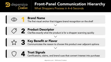
The audit should assess whether the right purchase triggers appear in the right visual order:
- Brand name — immediately identifiable
- Product descriptor — what it is, in plain terms
- Key benefit or flavor — the reason to choose this one
- Trust signals — certifications, claims, awards
One failure pattern shows up repeatedly: product photography dominates the front panel while the brand name is small and buried. The shopper registers the image, can't connect it to a brand, and moves on.
Color System
Color does real work in F&B categories. Research across 20 empirical studies found that cool blue/green packaging generally produces higher perceived healthfulness than warm red/orange packaging. A separate 2024 study found that orange packaging increased purchase intent for indulgent foods, while green increased purchase intent for virtue foods like salads and whole-grain products.
The audit evaluates two things:
- Internal consistency — is your palette applied the same way across all SKUs and touchpoints?
- Competitive differentiation — does your palette stand out within the category, or does it blend into established conventions?
The audit's job isn't to dictate which direction to take. It's to confirm the choice is deliberate, not the result of drift or convention-following by default.
Food Photography and Appetite Appeal
DePersico Creative's philosophy is direct: "To us, photography is design." Food imagery isn't a supplementary element — it's one of the highest-leverage visual investments an F&B brand can make.
Common photographic failures flagged during an audit:
- Lighting problems — poor white balance, harsh shadows, or flat in-camera flash that distorts color and kills appetite appeal
- Plating inconsistency — styling that varies across SKUs, making the line feel disjointed
- Production value gaps — some SKUs shot professionally, others shot in-house, with obvious quality differences
- Missing shot variety — no options for packaging, sell sheets, digital ads, and social media from a single shoot
There's also a risk worth flagging: food imagery that overpromises. When the photo sets expectations the actual product can't meet, purchase intent converts once — and then becomes a return or a negative review. Strong photography earns the sale and protects the repeat.
Typography and Creative Linguistics
Fonts communicate before words do. The typeface choices on your packaging signal brand personality (artisanal, functional, premium, playful) before a shopper reads a single word. The audit evaluates whether those signals align with the brand positioning you intend.
The words themselves carry equal weight. Weak, generic copy ("great taste," "quality ingredients") shows up constantly across packaging reviews. Language in headlines, callouts, and product descriptors functions as a visual element: it takes up space, establishes hierarchy, and either builds appetite or doesn't.
Creative linguistics — choosing the most specific, sensory, compelling language for your product — is a distinct skill the audit should address directly.
How to Conduct a Brand Visual Audit for Your F&B Brand
Most brands don't fail audits because their visuals are bad. They fail because nobody has ever looked at everything at once. This five-step process changes that — moving from raw asset collection through competitive benchmarking to a prioritized action list.
Step 1: Collect All Visual Assets Across Every Touchpoint
Gather every branded item in circulation:
- Primary and secondary packaging for all SKUs
- Sell sheets and trade show materials
- Social media templates and posted content
- Website imagery and e-commerce listing images
- In-store displays and POS materials
- Internal sales templates and presentations — these often reveal inconsistencies that external audiences notice but the brand team overlooks
Step 2: Organize Assets by Visual Element and Channel
Sort assets by category — logo usage, color application, typography, photography style, packaging structure — and then by channel: on-pack, digital, print.
Sorting by element is what makes problems surface. A logo applied three different ways is invisible when you review assets one at a time. Group them by logo usage, and the inconsistency jumps out immediately.
Step 3: Evaluate Each Element Against a Scoring Rubric
Assess each element across four dimensions:
| Dimension | Key Question |
|---|---|
| Consistency | Is it applied the same way everywhere? |
| Clarity | Does it communicate the right message immediately? |
| Shelf Differentiation | Does it stand out in the category? |
| Appetite Appeal | Does it make the product look desirable? |
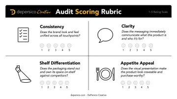
DePersico Creative's SWIFI process — which evaluates Strengths, Weaknesses, and Ideas for Improvement — gives brands a systematic way to convert subjective visual impressions into a structured findings list.
Step 4: Benchmark Against Direct Competitors
Pull packaging and digital assets from 4–6 direct competitors in the same category. Map how they use color, typography, photography, and benefit callouts. Specifically look for:
- Where your brand blends in versus where it stands out
- Any areas where your packaging is visually indistinguishable from a competitor
- Category conventions you're following by default rather than by choice
DePersico Creative conducted a formal competitor comparison review for Yummy Health, evaluating packaging against similar snack products specifically to assess how the brand would register in a competitive shelf context — then made design decisions to ensure it would stop shoppers rather than disappear.
Step 5: Prioritize Findings by Impact and Urgency
Organize findings into three tiers:
- Critical — logo inconsistency across the product line, packaging hierarchy that buries the brand name, photography quality that actively undermines shelf performance
- High-impact — color system improvements that would meaningfully differentiate in the category, copy updates that strengthen appetite appeal
- Lower priority — minor refinements to address over time as resources allow
Without this triage step, audits produce long lists that stall in committee. Tiering forces the team to act on what matters first — and gives lower-priority fixes a place to wait without getting lost.
Common Mistakes F&B Brands Make During a Visual Audit
Most visual audits surface something useful — but these three mistakes consistently limit what brands actually learn from the process.
Reviewing packaging on a screen, not on a shelf. A color scheme that reads as distinctive on your monitor can disappear entirely when surrounded by competitors in the same aisle. Before drawing conclusions, place your packaging in a physical or simulated shelf context — even a photograph of a real planogram works — so you're evaluating it the way a shopper actually sees it.
Treating consistency as the only goal. A brand can be perfectly consistent and still fail to attract shoppers. The audit must assess whether the visual system is compelling, not just uniform. That distinction matters: consistency is a baseline requirement, not a competitive advantage.
Skipping front-panel hierarchy. Many audits focus on logo and color but overlook the structural hierarchy of the front panel. Purchase preference is 96% predictive of directional sales outcomes — and purchase preference starts with whether shoppers can quickly understand what the product is and why to choose it. If the hierarchy is wrong, no other packaging element can make up for it.
Turning Audit Findings Into Action
Redesign vs. Brand Governance
Not every audit finding requires a design intervention. Some of the most common findings — inconsistent logo usage across sales materials, off-brand photography in social posts, typography drift in sell sheets — can be fixed with updated templates and a clear brand standards document.
A full packaging redesign is warranted only when the core visual system is broken: the hierarchy is structurally wrong, the color system fails to differentiate in the category, or the brand identity no longer reflects the product's actual quality or positioning. Use the audit findings to make that determination rather than defaulting to a full rebrand.
Build a Phased Action Plan
The most useful audit outputs include:
- A prioritized list of changes (critical → high-impact → lower priority)
- An estimated scope for each (quick fix, moderate refresh, or full redesign)
- A designated owner and realistic timeline for each item
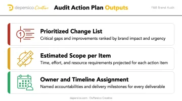
Brands that leave the audit without a concrete plan tend to repeat the same inconsistencies within 12–18 months. The plan is what makes the audit something you actually act on.
When to Bring in a Specialist
For brands whose audit reveals systemic issues — weak food photography, misaligned packaging hierarchy, a visual system that doesn't stand out on shelf — category expertise is what separates a competent execution from the right solution.
A generalist design firm can execute the brief. A firm that works exclusively in food and beverage packaging knows why specific visual choices drive trial in a given category, and what competing brands are doing that yours isn't.
DePersico Creative has worked with brands including Ball Park, Idahoan, Sea Best, J. Skinner, and DaVinci on challenges like these, bringing over 45 years of F&B-specific packaging experience to every engagement. That depth — from photography direction to typography to shelf hierarchy — shapes every recommendation that comes out of an audit.
Frequently Asked Questions
What is a visual brand audit?
A visual brand audit is a structured evaluation of all the design elements a brand uses — logos, colors, typography, photography, and packaging — to assess whether they are consistent, effective, and aligned with the brand's goals. For F&B brands, it specifically evaluates whether those elements drive purchase decisions at the shelf.
What are the 8 visual elements of brand identity?
The core elements are: logo, color palette, typography, photography and imagery style, graphic elements and patterns, packaging design, iconography, and layout/composition. For F&B brands, packaging design and food photography carry the most weight in driving trial and purchase intent.
What are the 7 stages of the branding process?
The general stages are: research, strategy, positioning, identity design, application, launch, and ongoing management. A visual audit typically lives in the ongoing management stage — though it can also inform a repositioning effort when the brand has drifted from its original strategy.
What are the 5 C's of audit findings?
The 5 C's framework covers five dimensions of visual performance:
- Consistency — Are visuals uniform across touchpoints?
- Clarity — Does the brand communicate quickly?
- Cohesion — Do all elements work together?
- Competitiveness — Does the brand stand out in its category?
- Compliance — Are all assets aligned with current brand guidelines?
How often should food and beverage brands conduct a visual audit?
Every 12–24 months as a baseline. Also conduct one when triggered by a key event:
- A new retail account pitch
- A SKU line extension or packaging refresh
- Flat sales that may reflect shelf performance issues rather than product quality
What is the difference between a visual audit and a rebrand?
A visual audit is diagnostic — it identifies strengths and gaps in your current visual system. A rebrand is a design intervention. The audit tells you whether a rebrand is warranted — or whether targeted improvements can do the job.