Here's the problem: most food brands treat "logo design" and "brand identity" as the same thing. They're not. Confusing the two leads to inconsistent packaging across SKUs, weak shelf presence, and a visual identity that can't compete against private label alternatives — which hit a record $271 billion in U.S. sales in 2024.
This article clarifies what each term actually means, how they differ in the food and grocery context, and how understanding the distinction helps food brands make smarter creative investments.
Key Takeaways
- A logo is a single mark — the symbol, wordmark, or combination mark that represents your brand
- Brand identity is the full system: logo, color palette, typography, packaging design, photography, and voice
- For food brands, packaging is where logo and brand identity must work together — it's your shelf salesperson
- Without a surrounding identity system, a logo creates inconsistency across SKUs and limits shelf appeal
- Aligning logo design within a full brand identity system drives trial, repeat purchase, and shelf differentiation
Brand Identity vs. Logo Design: A Quick Comparison
Before getting into the details, here's the distinction at a glance:
| Dimension | Logo Design | Brand Identity |
|---|---|---|
| Scope | Single graphic element | Complete visual and strategic system |
| Primary function | Recognition | Emotional connection and consistency |
| Key components | Mark, wordmark, symbol | Color palette, typography, packaging, voice, photography |
| Timeline | Defined project | Ongoing development |
| Impact on shelf | Visible identifier | Full sensory and emotional purchase experience |

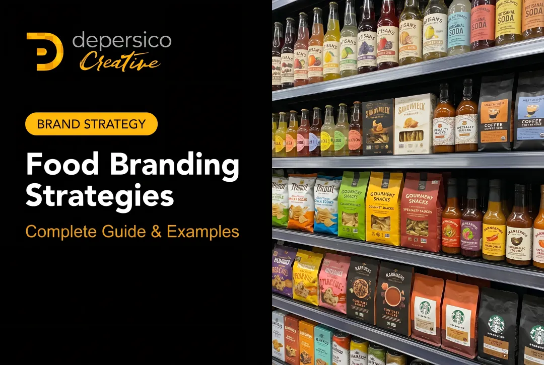
For food brands, this plays out every time a shopper scans a shelf. Shoppers don't consciously evaluate your logo — they absorb color, imagery, typography, copy, and structure in a single glance. Those elements either reinforce one another or quietly work against each other.
A logo anchors the brand identity system. Brand identity gives that logo context and meaning. On a crowded grocery shelf, a strong logo surrounded by a weak identity system still loses to a cohesive brand that communicates a clear promise from top to bottom of the package.
What Is Logo Design for Food Brands?
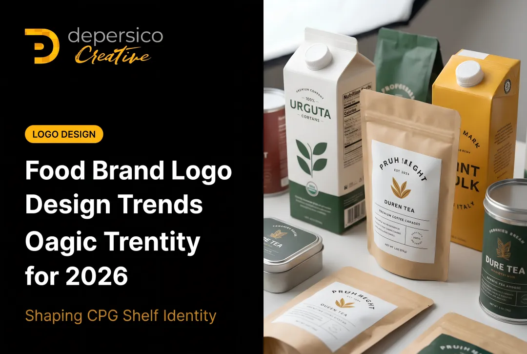
A logo is the recognizable graphic mark that visually identifies your brand — on packaging, sell sheets, trade show materials, and every consumer touchpoint. For food brands specifically, the logo type you choose affects how the mark scales across packaging formats, from a full front panel to a half-inch embossed lid. Five types are most relevant:
- Wordmark — the brand name rendered typographically (think Heinz or Oreo)
- Lettermark — initials or abbreviated name
- Emblem — text enclosed within a badge or crest, common in heritage and artisan food brands
- Combination mark — wordmark paired with a symbol, highly flexible for multi-format use
- Abstract mark — a non-literal geometric symbol that builds recognition over time
What a Logo Does Well
A strong logo performs three functions for food brands:
- Instant recognition — shoppers identify the brand before they consciously process it
- Differentiation — a distinct mark separates the brand from private label competitors on the same shelf
- Visual shorthand — the logo carries quality and personality associations that shoppers form in seconds
Every mark should function as a selling tool. Brand associations need to register within the four-to-six-second window that defines most shelf decisions — which means the logo has to work before a shopper consciously engages with the pack.
That said, a logo is one input in a larger system.
What a Logo Cannot Do Alone
A logo without a supporting brand identity system is an isolated mark with no system behind it. On its own, it cannot communicate:
- Flavor cues or appetite appeal
- Brand story or product origin
- Emotional promise (comfort, indulgence, health, aspiration)
- Consistency across multiple SKUs or packaging formats
A well-designed logo placed on a poorly constructed pack will not stop a shopper. Wrong color, weak typography, and muddy hierarchy undermine the mark before it has a chance to work. The logo creates recognition. The full identity system creates conversion.
What Is Brand Identity for Food Brands?
Brand identity is the complete visual and strategic system that shapes how consumers perceive a food brand at every touchpoint. It includes every designed element that communicates the brand's personality and promise — not just the mark.
The Core Components
Color palette — Color triggers immediate appetite and category associations. Research published in Food Research International found that warm orange packaging increased purchase intention for indulgent foods, while cool green performed better for health-oriented products. Color also signals quality tier: bold color blocks communicate value and accessibility; restrained white space signals premium positioning.
Typography — Typeface carries implicit meaning beyond words. Handwritten fonts suggest artisan or homestyle positioning. Elegant serifs signal restaurant quality. Bold sans-serifs communicate energy and approachability. The wrong typeface undermines even excellent messaging.
Photography and illustration style — Appetite photography is a primary driver of trial on-pack. The visual style — whether styled overhead shots, rustic lifestyle imagery, or clean product-on-white — directly affects how shoppers perceive quality and flavor.

Creative Linguistics as Brand Identity
Visual elements set the stage, but the words seal the connection. Brand voice and on-pack copy are as much a part of brand identity as any visual element. The words "slow-simmered," "farmhouse recipe," and "real cream butter" do specific emotional and logical work — they create cravings and communicate positioning instantly.
DePersico Creative's creative linguistics service is built around this principle: every word on packaging is a deliberate selling tool, not decorative filler. That applies to:
- Brand and product names
- Taglines
- Front-of-pack copy
- Back-of-pack brand stories
Each element is evaluated against four criteria: relevance, uniqueness, simplicity, and memorability.
Packaging as the Central Expression of Brand Identity
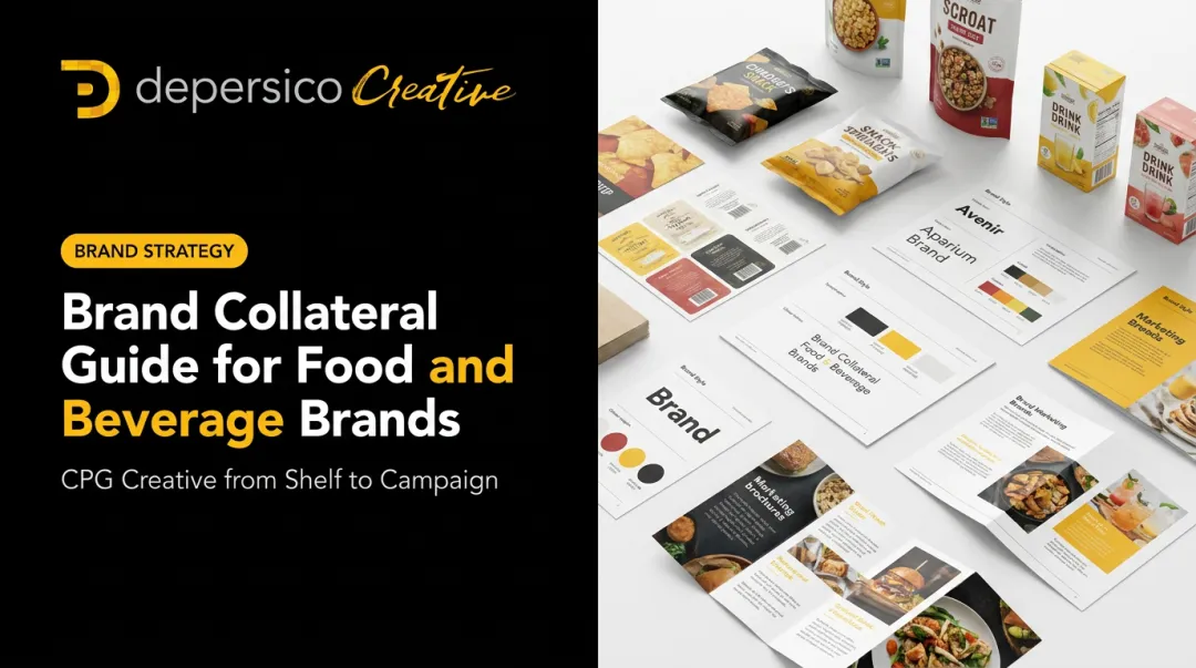
Unlike most industries where the website or storefront is the primary brand touchpoint, for grocery and CPG brands the package is the brand identity in action. Every element — structure, color blocking, imagery, copy hierarchy — must function as a cohesive system.
This is the problem logo design alone cannot solve: consistency across a product line. When Idahoan launched its Steakhouse™ sub-line, the challenge wasn't just a new logo — it was building a packaging system that communicated premium, restaurant-quality positioning across multiple SKUs while maintaining brand family recognition. That required a full identity system, not a mark.
How Brand Identity and Logo Design Differ for Food Brands
Scope vs. Symbol
The logo is one component within the brand identity system. A beautiful logo on poorly constructed packaging won't drive trial — shoppers read the whole pack at once, not just the mark. When DePersico Creative worked with DaVinci® pasta, they didn't just refresh the logo. They built a full competitive analysis grid comparing DaVinci against Barilla, De Cecco, Ronzoni, and five other brands and reconstructed the entire visual system around what the competitive set lacked.
Strategy vs. Creative Execution
Brand identity work starts with strategy (target shopper, competitive shelf set, positioning, emotional promise) before any design begins. Logo design is creative execution of one specific element within that strategy.
Food brands that reverse this order — logo first, strategy second — frequently end up with a mark that doesn't fit the visual language their category demands. DePersico Creative's five-step process places SWIFI brand analysis and product positioning before any visual design work begins.
Recognition vs. Connection
A logo creates recognition: the shopper knows which brand they're looking at. Brand identity creates something deeper. The shopper feels appetite, trust, familiarity, or aspiration — and that feeling is what moves them to pick up the product.
According to NIQ, 72% of U.S. consumers now view private labels as strong alternatives to national brands. Recognition alone doesn't justify premium pricing or protect against private label substitution. Emotional connection , built through a cohesive brand identity system, built through a cohesive brand identity system does.

Fixed vs. Flexible
A logo is relatively fixed and should not change frequently. Brand identity is a system designed to flex across seasonal promotions, new flavor extensions, limited-edition runs, and foodservice formats, without breaking recognition. The logo anchors that flexibility; the brand identity system enables it.
Cost and Investment Framing
A logo redesign is a bounded project. Building or rebuilding a brand identity is a more comprehensive investment that touches packaging, photography, brand guidelines, and positioning. DePersico Creative uses a project-based pricing model scaled to scope, which means both types of engagement are accessible — but food brand owners need to match the investment to the actual business problem, not just the most visible symptom.
Here's a quick way to frame the distinction:
- Logo project: Solves a recognition or visual refresh problem for one specific asset
- Brand identity project: Solves a positioning, shelf performance, or cohesion problem across the entire system
- The test: If you can describe the problem in terms of a single graphic element, it's a logo project. If the problem shows up across packaging, photography, and retail presence, it's an identity project.
Which Does Your Food Brand Actually Need?
When Strategy Must Come First
If a food brand is launching into retail for the first time, the correct sequence is always brand identity strategy first, logo design as part of that system. Starting with only a logo and planning to "build the brand around it later" is one of the most common and expensive mistakes in the food startup world.
J. Skinner® Baking is a useful example. When this wholesale baking company decided to move into premium retail grocery nationally, their existing branding was entirely unsuited for the shelf environment. DePersico Creative built the full brand identity from scratch — positioning strategy, creative linguistics, a new logo using lowercase white handwritten script on an organic brown background, full packaging design, and marketing materials. A logo refresh alone would have been insufficient because there was no consumer-facing story to anchor it to.
When a Logo Refresh Is Appropriate
A targeted logo refresh makes sense when:
- The overall brand identity system is strong and consistent, but the mark has become dated
- The existing logo doesn't scale to new packaging formats or digital thumbnails
- Consumer research shows the mark is no longer connecting with the target demographic
- One or two specific visual problems (complexity at small sizes, poor legibility at distance) are limiting shelf performance
The key diagnostic question: is the strategic foundation sound? If positioning is right, audience is right, and communication is right — but the logo simply looks dated — a refresh may be the efficient path.
When Full Brand Identity Work Is Required
Full brand identity work is the appropriate investment when:
- A new food product is entering a competitive retail category
- The brand is repositioning — from conventional to better-for-you, regional to national, or wholesale to retail
- Private label competition is eroding price premium and the current visual identity can't justify the gap
- Packaging is inconsistent across SKUs with no unified visual architecture holding the line together
Idahoan's Steakhouse™ sub-line illustrates the upside: after DePersico Creative completed a full brand identity engagement — including new positioning, packaging redesign with appetite photography, creative linguistics, and integrated marketing materials — the casserole segment saw a 75% incremental sales increase, with category share growing from 11.6% to 23.1%.

Start with a SWIFI Assessment
Before committing to either investment, DePersico Creative offers a SWIFI (Strengths, Weaknesses, and Ideas for Improvement) visual perception assessment — a structured competitive shelf analysis that evaluates how a brand's current visual identity is performing relative to competitors and private label alternatives.
The assessment covers:
- Visual hierarchy and shelf legibility
- Ingredient claims and brand story differentiation
- Competitor whitespace and design cues that drive trial
Everything is calibrated to the four-to-six-second window shoppers actually use. The result is a clear roadmap — logo evolution, full rebrand, or something in between — before any creative spend begins.
In food retail, the logo is one tool inside a larger system. What matters is knowing which part of that system needs attention — and where the highest-impact investment actually lies.
Ready to evaluate your brand's current shelf presence? Connect with DePersico Creative to discuss what your food brand actually needs — and where the highest-impact investment lies.
Frequently Asked Questions
Is a brand logo the same as a brand?
No. A logo is a single visual element — the mark or symbol that identifies a brand — while a brand is the full perception consumers hold about a company, including its values, quality, and emotional associations. The logo contributes to recognition, but the brand is built across every consumer touchpoint over time.
What are the 4 pillars of brand identity?
Commonly cited pillars include brand positioning, brand personality, visual identity (logo, color, typography, packaging), and brand voice. Frameworks vary by source, but for food brands, visual identity and positioning carry the most weight on a competitive retail shelf.
What are the 5 P's of brand identity?
The 5 P's typically cited are Purpose, Positioning, Personality, Perception, and Presentation, each defining how a brand thinks about itself and communicates to consumers. In food branding, Presentation is where the other four become tangible and visible to shoppers.
What is the 3-7-27 rule of branding?
The 3-7-27 rule suggests consumers need 3 exposures to notice a brand, 7 to remember it, and 27 to develop trust. It's a widely shared heuristic with no verified primary research behind it. What is verified: POPAI found 76% of purchase decisions happen in-store, which is why consistent brand identity across touchpoints matters.
Does a food brand need both a logo and a complete brand identity?
Yes. Food brands competing in retail need both : the logo for immediate recognition and the broader brand identity system to build shelf presence, appetite appeal, and the emotional connection that drives repeat purchase.
How does packaging design fit into food brand identity?
For food and beverage brands, packaging is the single most important expression of brand identity. It's the primary consumer touchpoint and the first impression that determines trial. Every element, from color and imagery to typography and copy, should be built as part of a cohesive brand identity system, with the logo anchoring the design.