Key Takeaways
- Bold, consistent branding from canopy to packaging creates instant recognition before anyone steps closer
- Sampling is your highest-converting tool — how you present it tells shoppers exactly what to expect from the product itself
- Operational flow (where guests sample, browse, and pay) determines whether your booth earns or loses sales
- Well-designed packaging closes sales on its own — especially when your staff can't reach every shopper at once
- Common mistakes like cluttered surfaces and poor lighting kill conversion
Why First Impressions at Food Festivals Are Make-or-Break
Food festivals aren't retail environments. Shoppers in a grocery aisle are already in buying mode — festival attendees are moving, distracted, and making snap decisions about where to slow down amid dozens of competing options.
The Minnesota State Fair's 2024 lineup featured nearly 300 food vendors and 1,600 food items. That's not unusual — it's the scale most major festivals operate at. In that kind of environment, decisions happen while guests move. Your booth needs to register before someone consciously decides to stop.
A 2021 eye-tracking study in the British Food Journal found that upper signage attracted the most attention at food stands, and text drew more attention than images. The practical implication: put your brand name and core offer high, where it's visible from across an aisle, not buried on the table surface where it only matters after someone has already stopped.
What a well-designed booth communicates before a word is spoken:
- Quality — does the setup look intentional or improvised?
- Category clarity — can someone identify what you sell in a glance?
- Brand personality — rustic and artisan, bold and modern, playful and approachable?
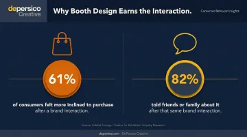
Those signals determine whether someone slows down — and that's the only moment that matters. EventTrack's 2026 experiential marketing research found that 61% of consumers felt more inclined to purchase after a brand interaction, and 82% told friends or family about it. The booth design is what earns that interaction in the first place.
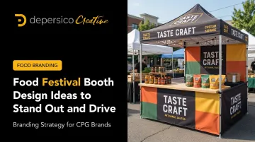
Food Festival Booth Design Ideas That Stop People Mid-Stride
Not every concept fits every food brand. Choose based on your product category, your target customer, and what your packaging already communicates — because the most effective booths treat design as an extension of the brand, not decoration applied on top of it.
Rustic Farmhouse / Farm-to-Table Setup
Weathered wood, burlap runners, mason jars, and handwritten chalkboard menus work particularly well for preserved foods, baked goods, local produce, and artisan sauces. The aesthetic signals homemade authenticity — it tells a story before you say a word.
This look fits a wide range of food categories, but it only works if your packaging matches the visual promise. A rustic booth displaying products in slick, modern packaging creates cognitive dissonance that shoppers feel even if they can't name it.
Bold, Branded Color and Signage
Pick your signature color palette and apply it everywhere: canopy, tablecloth, signage, sample cups, staff aprons. Consistency matters more than complexity. A single color executed across every surface reads as intentional and professional. Two mismatched shades look like a last-minute assembly job.
The most recognizable booths at large trade shows share one trait: they extend package colors directly into booth architecture, creating a unified environment that reads as a brand rather than a vendor table. Your packaging already has a color system — use it as your blueprint.
The payoff is immediate recognition from 30 feet away, which is exactly when a festival attendee decides whether to detour toward your booth or keep walking.
Vertical Display Structures
Most vendors fight for horizontal table space. Think vertically instead. The Specialty Food Association's booth regulations permit displays up to 8 feet in the rear half of a booth — use that height deliberately.
Vertical structures offer three practical advantages:
- Tiered shelving lets you display more SKUs without crowding your work surface
- Hanging signs draw the eye upward, where attention naturally travels first in a crowded space
- Elevated risers make your booth appear larger than its footprint
Live Cooking or Demo Station
A sizzling pan does something static display cannot: it activates smell, sound, and sight simultaneously. That combination draws people in from a distance and converts passive passersby into engaged observers. The moment someone stops to watch, you have a window.
A live demo also telegraphs product quality. Watching fresh assembly communicates care and craftsmanship more convincingly than any sign — and it gives your staff a natural opening to start a conversation instead of waiting for one.
Themed or Seasonal Decor
Rotating themes — harvest tones in fall, bright citrus colors in summer — signal freshness and attention to detail. More practically, they create photo moments. When a visitor photographs your booth and posts it, your brand name should appear somewhere in the frame. That earned visibility costs nothing beyond the design effort you already invested.
Sensory and Interactive Elements That Drive Foot Traffic
A 2026 qualitative study in the International Journal of Event and Festival Management found that sight, sound, touch, scent, and taste interact to create memorable event experiences and influence emotion and recall. The more senses your booth activates, the longer people stay — and the stronger the brand memory they carry home.
Sampling Strategy
EventTrack identifies free samples as the top reason consumers engage with B2C brand experiences. At a food festival, sampling is your most direct path to purchase. But presentation matters as much as the product itself.
- Use branded sample cups or vessels so your logo is visible at the moment of consumption
- Plate samples neatly — a well-presented bite signals quality; a generic cup of crumbled food says the opposite
- Rotate offerings mid-event to give returning visitors a reason to stop back ("have you tried the new one?")
- Keep gloves on, the station tidy, and serving tools visible — food safety regulations require it in most jurisdictions, and it builds trust either way
Social Media Photo Moments
A branded selfie wall, hashtag board, or Instagram-worthy plating station turns every visitor into a potential amplifier. The key detail: your brand name must be legible in the photo. A beautiful backdrop with no brand attribution is free content for the platform, not for you.
Keep the setup simple. An overcomplicated photo station creates a bottleneck — and a line that discourages people from stopping at all.
Sampling converts visitors on the spot. A photo moment extends that reach well beyond the event, putting your brand in front of audiences who never walked past your booth.
Simple Interactive Engagement
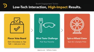
Low-tech interaction tools keep people at your booth longer and make you easier to remember and recommend:
- Flavor vote boards ("Dark Chocolate vs. Sea Salt — cast your vote")
- "Pick your favorite" blind taste challenges
- Spin-a-wheel sampling games with minor prizes
None of these require elaborate setup. A 30-second interaction that ends with a laugh or a strong opinion gives visitors something to mention when their friends ask where they ate — and that word-of-mouth is often worth more than any signage.
Why Your Product Packaging Is One of Your Booth's Most Powerful Design Tools
At a food festival, your packaging isn't waiting on a retail shelf. It's stacked on a table, handled by curious shoppers, and evaluated in seconds by people who are already making comparisons to five other booths they've just passed.
That makes packaging a critical extension of your booth's visual identity — not an afterthought.
What strong booth packaging does:
- Sells when your staff is occupied with another customer
- Reinforces the brand story your signage started
- Drives impulse purchases through clear, crave-inducing imagery and messaging
- Creates a cohesive visual system that looks intentional, not assembled
Consider the contrast: two products on the same table, same price point. One has bold color, a clear product name, and appetizing photography. The other has a stock label and generic font. Only one gets picked up, and in most cases, only one gets bought.
That gap comes down to brand consistency. When your canopy color matches your label, your apron matches your sample cups, and your signage uses the same typography as your package, visitors sense the cohesion even if they can't name it. That's what separates brands that look professional from ones that look assembled the night before.
For food brands preparing for events, this is exactly where packaging strategy pays off. DePersico Creative's SWIFI brand assessment process helps brands identify where current packaging may be working against them before those gaps show up at a festival, where every missed impression costs a sale. Packaging designed to communicate product value in seconds reduces the burden on staff and lets the product do its own selling.
If you've invested in product quality but haven't yet matched it with packaging that reflects that quality, reviewing your packaging before your next event is worth the time.
Booth Layout and Operational Flow That Keeps Lines Moving
A visually compelling booth that's confusing to navigate will lose sales. Physical flow matters.
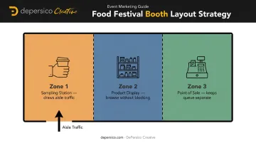
The three-zone layout that works:
- Front edge — sampling station. This is your hook. Samples draw people in from the aisle; position them where passing foot traffic can access them without committing to entering.
- Middle — product display. Once someone has sampled, they need somewhere to browse without being in the way of incoming visitors.
- Back or side — point of sale. Keep the point of sale away from the sampling queue so a customer paying doesn't block three people who want to try something.
A few practical details that get overlooked:
- Visible pricing. When customers have to ask "how much is this?" the line slows and staff attention splits. Price tags and menu boards readable from two steps away keep everything moving. Many festivals require posted pricing as a condition of your booth permit — check your event guidelines early, because visible prices are good operations regardless.
- Storage out of sight. Boxes, coolers, and restocking supplies crowding the visible booth area undermine the professional appearance you've built.
- Demo zone clearances. Open-flame or live cooking demonstrations typically require a minimum 3-foot setback or hazard barrier under local fire and event safety codes. Plan that clearance before you design the decor around it.
Common Mistakes That Undermine Food Festival Booth Design
Most of these mistakes are avoidable with planning — they typically come from underestimating how differently a booth reads to a stranger versus its owner.
Watch for these four errors — each is common and each is fixable before the event starts:
- Cluttered table surfaces with no visual hierarchy. When everything competes for attention, visitors won't focus on anything. Use risers to create levels and leave breathing room between products.
- Mismatched branding elements. A hand-painted sign, a banner in different fonts, and packaging in unrelated colors prevent visitors from forming a coherent brand impression — and that ambiguity reads as low quality.
- Ignoring lighting. In shaded or evening settings, poor light makes food look unappetizing regardless of how good it actually is. A warm LED strip under a canopy costs very little and changes everything.
- The "dead hours" trap. A booth that looks polished at 10am and depleted by 2pm tells late-afternoon visitors the brand doesn't care. Build mid-event resets into your staffing plan — restocking and straightening displays is part of the experience.
Frequently Asked Questions
What makes a food vendor booth stand out at a crowded festival?
Bold, consistent visual branding combined with multi-sensory engagement (live demos, aroma, sampling) and cohesion from canopy to packaging. Booths where every element speaks the same visual language draw more attention and hold it longer than setups that look generic or mismatched.
How much should I budget for food festival booth design and decor?
Space fees vary widely: the 2025 Maryland Folk Festival charged $1,150 for a standard food vendor space before decor or equipment. A functional DIY setup with branded tablecloths, printed banners, and tiered risers can come in under $500. Quality signage and packaging design pay off across multiple events, making them worth prioritizing over single-use decor.
How do I choose the right booth theme for my food brand?
Start with your existing brand identity and product category. A farm-to-table hot sauce brand shouldn't adopt a sleek minimalist aesthetic if the packaging tells a rustic story — the disconnect confuses visitors. The booth theme should feel like a natural extension of what's already on your label.
What signage works best for outdoor food festival booths?
Large-format banners visible from 30+ feet, printed on weather-resistant material with high-contrast colors and clean, readable fonts. Include a tagline that communicates your product's value in one line — don't make someone read to understand what you sell. Test your sign at the actual viewing distance before the event.
How can my product packaging help my booth perform better at events?
Packaging functions as a silent salesperson the moment staff turn their attention elsewhere. Strong shelf appeal (bold color, clear messaging, appetizing imagery) drives impulse purchases from browsers who haven't been pitched. Consistency between packaging and booth design makes the brand feel established and trustworthy.
What are the most effective ways to engage festival visitors at my booth?
Free sampling is the highest-impact tactic, followed by live demonstrations that activate multiple senses at once. Social media photo moments extend your reach beyond the event footprint. Simple interactive elements like taste challenges or vote boards increase dwell time and give visitors a reason to recommend you.