The salsa didn't get worse. The brand stopped communicating its value.
Rebranding a food product isn't about chasing trends or swapping in a new logo. It's about making sure your packaging does its actual job — stopping a shopper mid-aisle, communicating quality and flavor in seconds, and earning the reach-and-grab. On a crowded grocery shelf, a few seconds of confusion is enough to lose a sale permanently.
This guide covers the clearest signals that a rebrand is overdue, the three types of food rebranding, a step-by-step process for executing one well, and why packaging sits at the center of every successful food brand refresh.
Key Takeaways
- 90% of CPG packaging redesigns fail to produce meaningful sales impact — making strategy essential before any creative work begins
- Losing shelf recognition is the single biggest risk: Tropicana's 2009 redesign caused a 20% sales drop in seven weeks
- A brand refresh updates visual elements; a full rebrand changes positioning, voice, and the name
- Strong food packaging communicates brand, flavor, benefit, and appetite appeal — all within seconds
- Test packaging before printing to catch costly errors — then lock in brand guidelines to prevent drift
When Does a Food Brand Need a Rebrand?
The Most Common Triggers
Most food brands don't wake up one day and decide to rebrand. The need builds gradually — a slide in sales velocity, a new competitor stealing shelf space, a buyer conversation that doesn't go well. Common triggers include:
- Packaging that no longer fits consumer expectations — clean label, health-forward, and premium design cues have shifted significantly. NielsenIQ data shows clean-label products grew 8% in a single year, and packaging that doesn't reflect this shift looks dated next to brands that do
- Declining shelf performance — when a competitor with similar quality but stronger packaging consistently outsells you, the product isn't the problem
- Expanding into new retail channels — moving from farmers' markets or DTC into national grocery means packaging must carry the entire brand story, because zero relationship exists between your brand and that shopper
Product-Specific Triggers
Not every trigger comes from the competitive shelf. Some are internal:
- A reformulation or ingredient upgrade that the current packaging still doesn't mention
- A new SKU that makes the existing design system look inconsistent across the line
- A move from regional to national distribution where packaging must work without any supporting word-of-mouth
When NOT to Rebrand
Redesigning because you're bored with the packaging, or because a competitor recently launched something bold, is not a strategy — it's a fast way to erase equity you've spent years building. Research published in the Journal of Retailing and Consumer Services found that familiarity, not perceived modernity, is the strongest predictor of purchase intent among shoppers evaluating redesigned packages. Brand equity built over years can disappear in a single packaging cycle if the change strips away the visual cues shoppers rely on.
Types of Food Product Rebranding
Not every brand needs a full overhaul. Choosing the right level of change is as important as the redesign itself.
| Type | What Changes | Best For |
|---|---|---|
| Cosmetic Refresh | Color palette, typography, logo refinement | Brands with strong equity who need modernization without risk |
| Partial Rebrand | Messaging, claims hierarchy, positioning shift | Brands repositioning for a new audience or competitive response |
| Full Rebrand | Visual identity, brand voice, positioning, sometimes the name | Brands with negative associations, category pivots, or fundamental product changes |
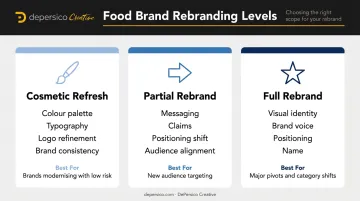
Cosmetic refreshes carry their own risks. Shelf recognition is hard-won and easy to break — even small changes need careful testing. The difference between "modernized" and "unrecognizable" is sometimes a single font change or a shifted color value.
Legacy products often use a partial rebrand to reframe their positioning — surfacing a short ingredient list, adjusting the claims hierarchy, and signaling "better-for-you" without abandoning brand equity. Post Shredded Wheat took this approach by simplifying packaging, emphasizing clean ingredients, and unifying the master brand across the line while using color to differentiate varieties.
Full rebrands are the highest-stakes move — and the highest-reward when done right. HA! Snacks (formerly Macro Snacks) overhauled everything: name, positioning, messaging, and visual identity, shedding a narrowly diet-focused image in the process. The results:
- 30% increase in social media engagement
- 115% increase in online conversion
- Retail distribution the brand had previously been denied
The Real Risks of Getting Food Rebranding Wrong
The most cited cautionary tale in food packaging remains Tropicana's 2009 overhaul. The brand replaced its iconic orange-with-a-straw image with a glass of juice, stripped away the other visual identifiers, and rotated the logo. Tropicana Pure Premium unit sales fell 20% in the seven weeks following the redesign, according to Information Resources Inc. data reported by Ad Age. Shoppers told the brand the new carton looked like a store brand. Some couldn't distinguish Tropicana varieties from each other. PepsiCo reversed course within weeks.
The takeaway isn't that bold redesigns are wrong. The orange and straw weren't decoration — they were functional recognition cues shoppers used to find the product on shelf. Removing them didn't make the product feel premium. It made it invisible.
Beyond lost recognition, food rebranding carries additional risks:
- Confuses shoppers when a product looks like a new or different item — especially dangerous across line extensions
- Oversells quality the product can't deliver on first taste, setting up immediate buyer disappointment
- Compounds financial exposure through reprinting across SKUs, updating retailer planograms, and re-educating buyers — costs that multiply fast if the redesign underperforms
How to Rebrand Your Food Product: A Step-by-Step Process
Step 1: Assess Your Current Brand's Strengths and Weaknesses
Before changing anything, understand what your packaging is currently communicating — and what it's failing to communicate.
A structured brand assessment should evaluate:
- Shelf readability — How does the package read at 3–5 feet, under fluorescent retail lighting?
- Visual hierarchy — Does the brand name land first, or does a shopper see visual noise?
- Typography legibility — Do font choices read clearly, or do they look attractive only at close range?
- Color blocking — Does the palette draw the eye, or does it blend into category competitors?
- Appetite appeal — Does the product photography create desire, or does it look flat?
- Competitive differentiation — Does the package own recognizable visual territory, or could it belong to any brand in the category?
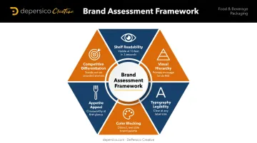
DePersico Creative's SWIFI process — Strengths, Weaknesses, and Ideas for Improvement — is a structured visual perception assessment built for exactly this purpose. It evaluates all of the above through the lens of how shoppers actually make decisions at retail, providing a strategic foundation before any creative work begins.
Step 2: Define Your Positioning and Target Consumer
Positioning drives every creative decision that follows. Key questions to answer before touching any design:
- What emotion or need does this product fulfill?
- What does the target consumer look like today versus when the brand launched?
- Where does the brand authentically live within current consumer tensions — indulgence, health, convenience, sustainability?
Consumer trends in food shift faster than most brands update their packaging. 82% of global consumers want more transparent food labels, while 62% are skeptical of health claims — which means positioning must be specific and credible, not just label-deep.
Step 3: Research the Competitive Shelf Landscape
A retail audit — walking the actual shelf where your product lives — reveals things no brief can tell you. Look for:
- Visual category patterns — What colors, typographic styles, and photography treatments dominate?
- Whitespace opportunities — Where is there visual territory no competitor has claimed?
- Pricing tier signals — Premium brands typically use cleaner layouts, restrained color palettes, and matte or textured finishes. Value brands use bolder color contrasts and prominent size/price cues. Your redesign must align with the correct tier, or shoppers will misread your product's quality level
Blending into the category is the death of impulse purchase. If your brand looks like the three products next to it, shoppers who don't already know you will skip right past.
Step 4: Develop Messaging and Creative Concepts
Visual identity and strategic language have to work together — neither carries the shelf alone.
On the language side: the specific words and descriptors on a package carry most of the persuasive load before a shopper reads past the headline. Terms like "slow-simmered," "hand-crafted," or "restaurant-style" activate appetite appeal and communicate quality before any benefit copy is processed. DePersico Creative refers to this as creative linguistics — choosing the most compelling words and phrases that create craving and connection at a glance.
On the design side: the concept phase resolves the hierarchy problem. A good concept establishes a clear brand block at shelf, defines flavor and variant communication, and introduces appetite-forward photography or illustration that makes the product look irresistible from across the aisle.
Step 5: Test Before You Print
Packaging errors in food are expensive. Reprinting across a product line, re-educating retail buyers, and managing old-versus-new inventory transitions all cost real money.
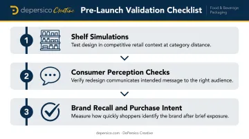
Pre-launch validation should include:
- Shelf simulations — place the new design in a competitive context to see how it performs at category distance
- Consumer perception checks — does the redesign communicate what it's meant to communicate, to the right audience?
- Brand name recall and purchase intent — can shoppers identify the brand quickly after brief exposure?
Pay particular attention to food photography during validation. A product image can stimulate hunger and drive purchase intent — but only when it looks appetizing and matches shopper expectations. Flat or poorly styled photography undercuts even strong structural design.
Step 6: Build Your Brand Guidelines
Once the new direction is locked, document everything. Without written standards, multi-SKU lines drift — new flavors, line extensions, and co-packer variations gradually erode the visual identity you just rebuilt. Brand guidelines for a food brand should cover:
- Logo usage and clear space rules
- Color specifications (Pantone, CMYK, RGB, HEX)
- Typography hierarchy and approved fonts
- Photography style and food styling standards
- On-pack copy standards and approved claims language
This documentation protects the investment. Every new SKU, product extension, or packaging update that follows should be measured against these guidelines — otherwise, visual drift erodes the identity that was just established.
Packaging Design: The Heart of Any Food Brand Refresh
A food shopper isn't researching your product before they buy it. They're moving through an aisle, half-distracted, scanning shelves packed with competitors. Your packaging has seconds to register brand, communicate flavor, signal quality, and trigger desire — before they've read a single word.
Visual Hierarchy in Practice
A well-structured food package guides the eye in a specific sequence:
- Brand name — recognizable and readable at shelf distance
- Flavor or variant — instantly clear, not buried in small type
- Key claim or benefit — lands in a glance without requiring a second look
- Appetite appeal — photography or illustration that creates an emotional response
When hierarchy fails, the package becomes visual noise. Shoppers don't pause to decode it; they reach for something else.
The Role of Food Photography
The difference between generic stock imagery and professionally styled food photography shows up in purchase intent. A flat, poorly lit product shot communicates low quality before a shopper reads a single word. Compelling food photography — the kind that makes someone genuinely hungry — signals quality and flavor instantly.
This is why DePersico Creative maintains an in-house test kitchen and photography studio. When styling, lighting, and photography happen inside the same creative process designing the package, the imagery integrates with the visual hierarchy rather than being bolted on at the end.
Color Psychology in Food
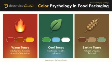
Color choices in food packaging are strategic decisions, not aesthetic preferences:
- Warm tones (red, orange, yellow) suggest indulgence, richness, and appetite stimulation
- Cool tones (green, blue, white) suggest freshness, health, and lightness
- Earthy tones (brown, kraft, muted green) suggest natural, organic, and artisanal quality
The wrong palette doesn't just look off — it misrepresents the product. A premium pasta sauce in discount-style color blocking signals value tier, regardless of what the label says. Research confirms that color-food category congruence directly affects purchase intent.
Managing Brand Architecture Across a Product Line
Multi-SKU rebrands introduce a specific challenge: each variant must be visually distinct while the brand reads as a unified family. Color coding by flavor, consistent master-brand placement, and a shared typographic system are the primary tools — but poor line architecture is one of the most common and costly mistakes in food rebranding.
Getting this balance wrong costs more than aesthetics: confused shoppers either grab the wrong SKU or skip the brand entirely. Auditing your line architecture before a rebrand — not after — is where that risk gets caught.
Launching Your Refreshed Food Brand
Internal Launch First
Before the new packaging reaches a single shelf, key stakeholders, sales reps, and retail buyers should see it. A clear presentation that explains what changed, why it changed, and what the new identity communicates helps internal teams sell it confidently. Buyers who understand the strategic rationale behind a rebrand are better equipped to give it the right placement.
External Rollout Strategy
From there, coordinate the transition carefully across every customer-facing touchpoint:
- Time the packaging changeover to minimize the window where old and new packaging sit on shelf simultaneously — shopper confusion during this period is a real risk
- Use digital channels (social media, email, website) to introduce the new look and frame it positively for existing customers
- Prepare retail-facing materials — sell sheets, updated brand decks — that reflect the new visual identity
Measuring Success After Launch
Once the new packaging is live, tracking the right signals tells you whether the rebrand is doing its job. Measure these before and after:
- Sales velocity: The clearest indicator — are units moving faster at the same or better margin?
- Shopper feedback and social sentiment: Qualitative signals that reveal whether recognition and perception have shifted
- New distribution gains: Did the refresh earn placement in channels or retailers that passed before?
- Positioning alignment: Are shoppers responding to the product as more premium, more relevant, or better matched to the target demographic?
Frequently Asked Questions
What is an example of a rebrand?
Tropicana's 2009 packaging overhaul is the most-cited cautionary example — the brand replaced its iconic orange-with-a-straw image, lost 20% in unit sales within seven weeks, and reversed the decision. A positive example is Dunkin' dropping "Donuts" from its name in 2019 to signal a broader beverage-forward identity, successfully modernizing without abandoning brand recognition.
What is the 3-7-27 rule of branding?
The 3-7-27 rule describes brand exposure thresholds: roughly 3 impressions make a consumer aware of a brand, 7 to remember it, and 27 to build loyalty. The takeaway is practical — each inconsistent touchpoint can reset that progress, which is why coherent branding across packaging, digital, and retail matters.
Is it legal to rebrand a product?
Yes. Rebranding is legal, but new names and logos must clear existing trademarks — the USPTO recommends a full clearance search before finalizing any mark. Any claims on food packaging (nutritional, health, or organic) must also meet FDA guidelines for nutrient content, health claims, and structure/function statements.
What is the difference between a brand refresh and a full rebrand?
A brand refresh updates select visual elements — logo, colors, typography — while preserving the brand's core identity and recognition. A full rebrand is a complete overhaul of visual identity, positioning, and messaging, often triggered by a major strategic shift, a new target audience, or the need to move past significant negative associations.
How long does it take to rebrand a food product?
Timelines vary by scope. A cosmetic packaging refresh typically takes 2–3 months. A full brand overhaul — covering strategy, design, photography, print-ready files, and launch materials — generally runs 6–12 months, especially when factoring in retailer lead times and inventory transitions.
How much does it cost to rebrand a food product?
Costs depend on scope and the agency's specialization. A food-focused partner handling strategy, design, photography, and print production costs more than a general design firm — but delivers work built for the shelf. DePersico Creative uses project-based pricing so brands of any size can budget predictably, without hourly billing surprises.