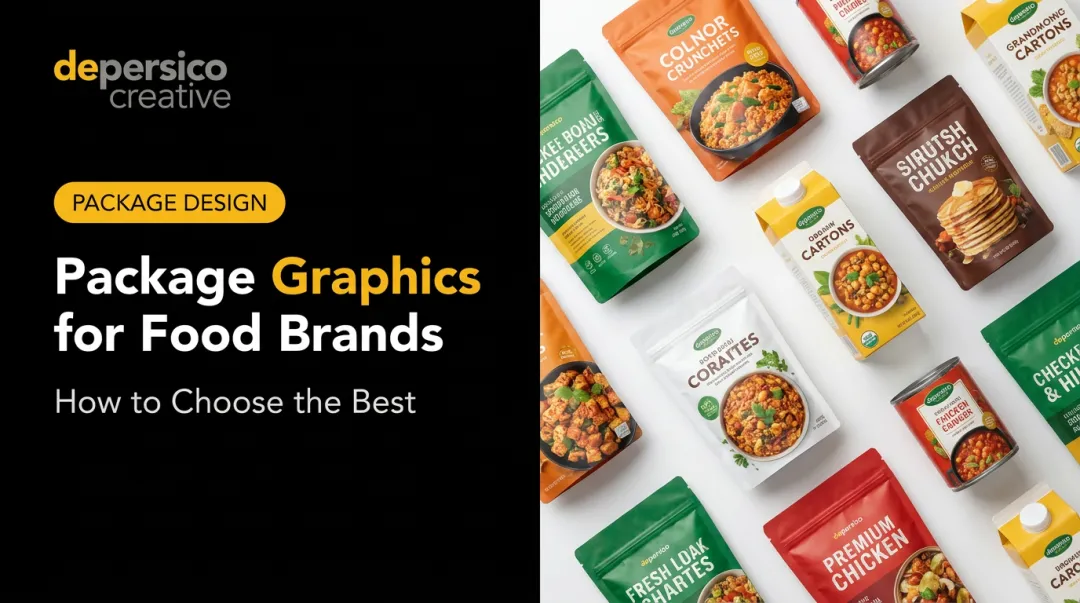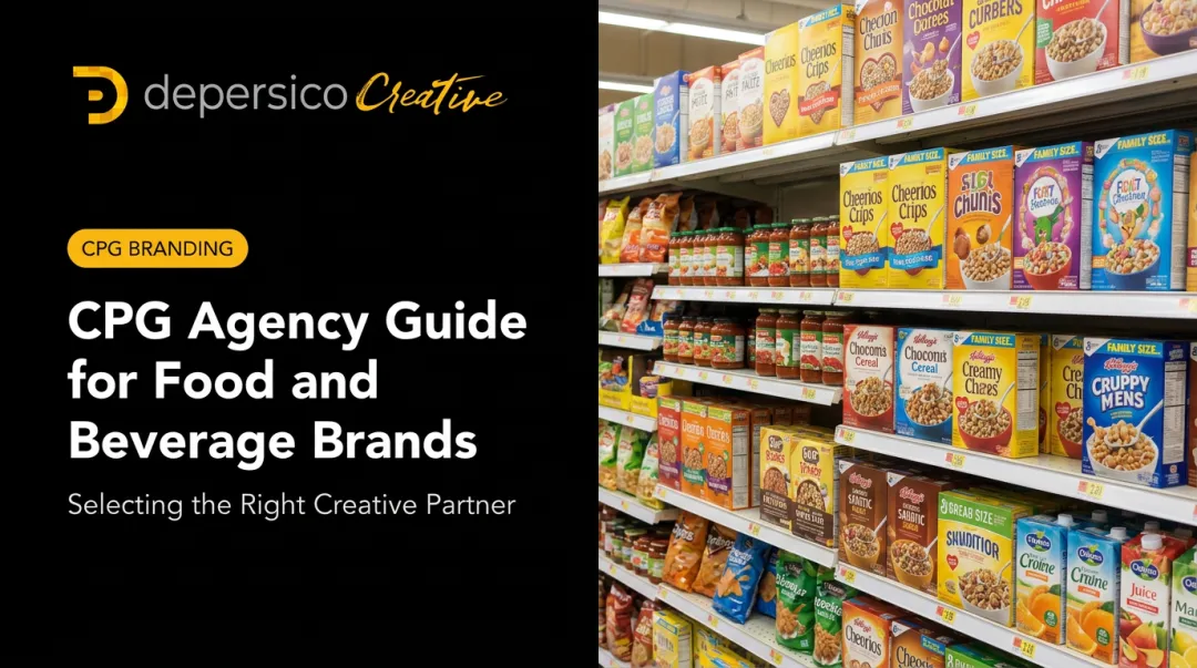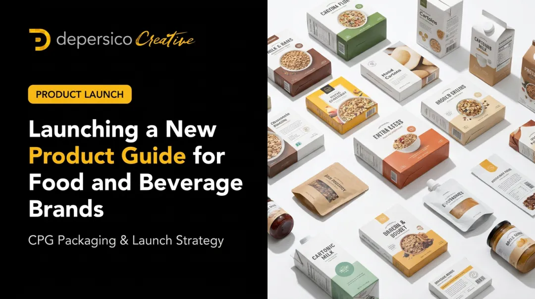
This means your package isn't decoration. It's a sales tool working without you in the room.
According to POPAI's 2012 Shopper Engagement Study, 76% of grocery purchase decisions are made in-store — meaning the shelf is where most buying happens, and packaging is the only salesperson present.
This post covers the key elements of a strong packaging strategy, six proven tactics that drive trial and loyalty, and how to evaluate whether your current packaging is actually performing.
Key Takeaways:
- 76% of grocery purchase decisions happen in-store — packaging is your primary sales tool
- Appetite appeal must come before information — shoppers feel before they read
- Color, typography, and photography each signal price point and brand values independently
- Language on-pack is as powerful as visuals — specific, sensory words outperform generic claims
- A structured packaging audit reveals gaps that sales data alone won't catch
Why Packaging Is Your Brand's Silent Salesperson
In a matter of seconds — often before a shopper takes a single step toward the shelf — packaging has already communicated quality, flavor, trust, and differentiation. No words exchanged. No demo required.
And the emotional layer hits first. Before a consumer reads a single word of copy, they've already responded to color, image, and overall composition. That gut reaction — whether it's craving, comfort, or instant skepticism — lands before rational evaluation begins. Claims, ingredients, and price all get weighed after the emotional response has already set the tone.
Packaging Shapes Perception Before the First Bite
Consider how packaging sets expectations across categories:
- Frozen meals — a cluttered, low-contrast label signals cheap. A clean layout with a styled hero shot signals restaurant-quality.
- Snack foods — bold color and playful typography signal fun and indulgence. Muted earth tones signal better-for-you.
- Condiments — glass versus plastic already communicates premium versus everyday before a shopper reads the label.
Shoppers internalize these signals instantly. Willingness to pay, perceived quality, and purchase intent are all shaped before the product is ever tasted.
The Compounding Value of Strong Packaging
Great packaging doesn't just win the first sale. It builds the kind of visual recognition that earns repeat purchases over time. A consistent, recognizable presence across the shelf creates trust — and shoppers gravitate toward what feels familiar. That familiarity is built one shelf impression at a time.
The Key Elements of a Winning Food and Beverage Packaging Strategy
Visual Hierarchy and Shelf Impact
Effective packaging must be engineered for where it will actually live: on a shelf surrounded by competitors. That means every design decision — from font size to image placement — needs to be made with the competitive set in mind.
Winning brands on shelf share three consistent design strengths:
- Consistent color and design across SKUs creates a visual footprint larger than any single product
- The package reads clearly from five feet away, not just in a designer's presentation
- One hero element — usually the product image — anchors the eye before anything else is processed
The most common mistakes: too much information fighting for attention, no clear hierarchy between brand name and product descriptor, and designs that look polished in isolation but disappear at retail.
Color Psychology in Food Packaging
Color carries meaning before language does. A few consistent patterns from packaging research:
- Green signals health and natural ingredients — though a 2024 study found green packaging rated higher for healthiness but slightly lower for consumption willingness, particularly in dairy categories where blue is the familiar cue
- Black is increasingly used to communicate premium positioning — research on organic pasta packaging found black perceived as more premium than other tested colors
- Cool, lighter, less-saturated palettes produce healthier perceptions, per a 2023 systematic review of 35 studies
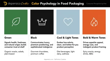
The strategic opportunity: study your category's color conventions, then make a deliberate choice to align or break from them. Impossible Foods moved to bold red packaging in 2024 specifically to compete visually with animal meat products — a calculated disruption of plant-based packaging norms.
Typography, Photography, and Structural Design
Typography communicates personality before a word is read. Hand-lettered serifs suggest artisan craft, bold block fonts signal intensity and indulgence, and clean sans-serifs read as modern and health-forward. Regardless of style, legibility at distance always comes first.
Food photography drives appetite appeal more directly than almost any other packaging element. A 2022 study found larger food images on packages increased purchase likelihood. But the image quality matters as much as the size — a flat, poorly lit product shot actively undermines the premium positioning a brand is trying to signal.
Structural design — resealable closures, easy-pour spouts, portion-friendly sizing — communicates convenience and directly affects repeat purchase. In an Amcor survey of 1,500+ consumers, 78% said they would buy more canned food if cans were easier and safer to open. Packaging that frustrates consumers creates brand switching.
6 Proven Packaging Strategies to Drive Trial and Loyalty
Strategy 1: Lead with Visual Appetite Appeal
The first job of food packaging is to trigger a craving — not to inform. Shoppers feel before they think, and the visual layer is responsible for that initial emotional response.
What makes food imagery crave-worthy versus generic:
- Action and texture — a cross-section of a burger showing layers, steam rising from pasta, a cookie with a visible pull
- Lighting that flatters — warm, directional light that creates depth and contrast
- Styling that's honest but elevated — the product should look as good as or better than what a consumer will actually experience
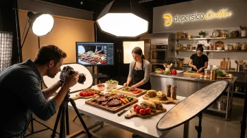
This is why DePersico Creative operates a fully equipped test kitchen and studio. Professional food photography integrated into the packaging design process — not sourced from stock — is the difference between packaging that moves product and packaging that sits.
Strategy 2: Use Creative Language That Creates Desire
The words on a food package work as hard as the visuals. The right phrase stops a shopper. Generic copy blends in.
Specific, sensory language outperforms broad claims every time:
| Weak | Strong |
|---|---|
| "Smoky flavor" | "Slow-smoked for 12 hours" |
| "Made with real ingredients" | "Real butter. Nothing else." |
| "Great taste" | "Crispy outside. Warm inside." |
DePersico Creative calls this creative linguistics — developing the most effective and compelling words and phrases that create a strong appeal and connection with a product. Unlike standard copywriting, it's a discipline built on competitive intelligence, consumer psychology, and 45+ years of food and beverage category experience.
The process starts with a competitive audit, then identifies the exact positioning gap a brand can own through language.
Strategy 3: Align Packaging with Brand Identity and Positioning
When packaging doesn't match what a brand actually is, shoppers sense the disconnect — and walk past it.
Premium brands need premium cues:
- Matte finishes over gloss
- Restrained color palettes
- White space used deliberately
- Refined, minimal typography
Value brands need to signal accessibility:
- Bold, energetic design
- Strong product visibility
- Clear price and quantity communication
When a startup brand launches with packaging that looks like it belongs in a specialty retailer but sells in a discount grocery, the disconnect erodes trust before the product gets a fair shot. DePersico's work with clients from startups to national names like Campbell's and Kellogg's demonstrates that alignment between packaging and positioning isn't optional — it's foundational.
Strategy 4: Tell Your Brand Story on the Package
Modern consumers want to know who makes their food and why it matters. FMI research found that 81% of U.S. grocery shoppers consider transparency important or extremely important — both in-store and online.
The package is the place to deliver that transparency. Effective brand storytelling on-pack includes:
- Origin callouts — where ingredients come from, how they're sourced
- Founder or family narratives — brief, honest stories that humanize the brand
- Mission statements — especially effective for better-for-you and values-driven brands
- Back-panel copy — the most underused real estate in food packaging
RXBAR made its ingredient list the design. By placing "12 egg whites. 6 almonds. 4 cashews. No B.S." front and center, the brand turned transparency into its primary differentiator — and built a business acquired by Kellogg's for $600 million.
Strategy 5: Design for the Category — Then Differentiate
Before breaking category rules, a package must follow enough of them to be found. Shoppers navigate stores by pattern recognition — they know what a protein bar looks like, what a frozen entree looks like, what a premium olive oil looks like. Violating those conventions too aggressively creates confusion.
The process:
- Map the category — study what colors, image types, label layouts, and fonts dominate
- Identify what's universal — the conventions you must meet to be considered (format, primary descriptor location)
- Find the gap — what no competitor is owning visually or verbally
- Differentiate there — make one or two deliberate departures from the norm
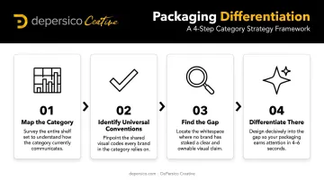
The J. Skinner Baking project from DePersico Creative's portfolio shows this in practice. A distinctive organic brown background and handwritten white script signaled premium and artisanal, standing apart from the bright, busy packaging typical in that section — while still clearly reading as a baked good.
Strategy 6: Consider Size Variety and Trial Formats
Lowering the barrier to first purchase drives new customer acquisition. A smaller package reduces both financial and psychological risk — especially in competitive categories where shoppers already have an established loyalty.
Key considerations for trial formats:
- The trial package must have the same visual impact as the full-size — don't treat it as a secondary SKU
- A clear visual or verbal connection to the full-size product aids conversion
- Consider pairing trial formats with a redemption offer for the full-size purchase
The caveat: smaller isn't always better for volume. Research has shown that smaller package sizes can reduce total purchase volume in some categories. The goal of a trial format is new customer acquisition, not volume replacement — keep that objective clear in the design brief.
How to Evaluate and Improve Your Current Packaging Strategy
Many brands discover their packaging is underperforming not through sales data, but through an honest visual audit — stepping back and asking hard questions about how the package actually looks at shelf.
The Self-Audit Questions Every Brand Manager Should Ask
- Does my package stop a shopper in three seconds without context?
- Does it communicate what the product is AND why it's worth buying — immediately?
- Is the appetite appeal strong enough to create a craving before the consumer reads anything?
- Is my brand story visible without hunting for it?
- Does the design look distinct next to my top three competitors, or does it blend in?
If any of these answers are uncertain, the packaging warrants a structured review — and that's exactly where SWIFI comes in.
The SWIFI Assessment Process
DePersico Creative uses a proprietary process called SWIFI — Strengths, Weaknesses, and Ideas For Improvement — to evaluate packaging performance for food and beverage clients. Rather than a general design opinion, SWIFI produces a structured audit across five dimensions:
- Visual identity — does the design communicate brand character at a glance?
- Messaging clarity — is the core benefit immediately readable?
- Appetite appeal — does the product look craveable before a shopper reads a word?
- Brand positioning signals — does the package signal the right tier and personality?
- Competitive differentiation — does it stand out from the three closest competitors on shelf?
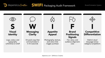
This structured lens surfaces issues that internal teams routinely miss. When you know a product well, it's nearly impossible to see it the way a stranger in a grocery aisle does — and that gap is where packaging loses sales.
Common Mistakes Food and Beverage Brands Make with Packaging
The most frequent packaging pitfalls DePersico Creative encounters:
- Overcrowding the design: trying to communicate everything leads to communicating nothing. Shoppers scan; they don't read.
- Low-quality or unappetizing food photography — this single element can undermine every other design investment
- Inconsistent visual language across a product line: when SKUs don't share a visual identity, the brand block disappears and shelf presence collapses
- Trend-chasing without identity: adopting a popular design aesthetic that doesn't reflect the brand or resonate with its actual consumer
That last mistake carries a particular danger during packaging refreshes. Brands often try to modernize by adopting category conventions — and end up looking like every other product on the shelf. The Tropicana redesign of 2009 is the textbook example: replacing the iconic orange-with-straw image with a generic glass of juice caused shoppers to lose recognition of the brand entirely, prompting a rapid reversal within weeks.
A refresh done right makes a brand more recognizable, not less. The goal is distinctiveness within the category — not conformity to it.
Frequently Asked Questions
What are packaging strategies?
Packaging strategies are the deliberate decisions brands make about how to design, message, and present their product at retail. They cover visual identity, brand storytelling, consumer psychology, and shelf performance — all aimed at driving trial and building loyalty.
What are the 5 P's of packaging?
The 5 P's are a teaching framework covering Protection, Preservation, Presentation, Promotion, and Portability. Each addresses a different function of packaging — from keeping the product safe to communicating brand value at shelf.
What are the 4 C's of packaging?
The 4 C's — Consumer, Cost, Convenience, and Communication — guide decisions around who the package is for, what it should cost to produce, how functional it needs to be, and what message it must deliver.
What are the 7 types of packaging?
Common food and beverage packaging types include flexible pouches, rigid containers, glass jars, metal cans, paperboard cartons, shrink wrap, and multi-layer laminates. The right format depends on shelf life requirements, distribution method, and brand positioning.
How often should a food brand update its packaging design?
Reliable triggers include plateauing sales, a new competitor entering the category, a positioning shift, or packaging that no longer reflects the product inside. Targeted updates to photography, typography, or front-panel copy can improve shelf performance without committing to a full redesign.