Introduction
Most shoppers don't realize how quickly they've already made up their minds. According to POPAI's 2012 Shopper Engagement Study, 55% of supermarket purchases are completely unplanned — decided in the aisle, in the moment, based on what catches the eye.
That split-second moment is where packaging earns its keep.
For food and beverage brands, packaging isn't a finishing touch applied after the real work is done. It's the brand's most direct point of contact with the shopper: communicating quality, triggering appetite, and either closing the sale or ceding it to the product sitting next to it.
All of that happens before a single line of copy is consciously read.
This article breaks down exactly how packaging influences consumer behavior, what happens when it falls short, and how brands can treat it as the strategic sales driver it is.
Key Takeaways
- 55% of supermarket purchases are unplanned, made at shelf based on what packaging communicates in seconds
- Color, typography, and visual hierarchy shape perception before rational evaluation begins
- Consistent packaging builds brand recognition — and recognition builds the trust that drives repeat purchase
- Food imagery and specific language create appetite; generic copy and stock photos leave sales behind
- Weak packaging suppresses sales of excellent products — when a great product underperforms, the problem is almost always communication
Packaging as a Purchase Driver: The Real Story
Before a shopper reads the back panel, compares prices, or picks up a product, the packaging has already made its case. In food and beverage, that happens fast — and the visual, linguistic, and tactile signals on the package are doing the selling.
A 2018 Ipsos survey of 2,002 US adults found that 72% agreed packaging design often influences their purchase decisions. That's the majority of American shoppers making up their minds based on what they see — before a single bite.
What Makes Food and Beverage Uniquely High-Stakes
In most product categories, packaging communicates function. In food and beverage, it goes further — it has to simulate the experience of eating or drinking the product before purchase. A shopper deciding between two sauces on a crowded shelf is asking, on some level: Which one looks like it tastes better?
That question is answered entirely by packaging. The brand that answers it more convincingly wins the sale — regardless of what's actually inside either box.
Several factors make this category especially unforgiving:
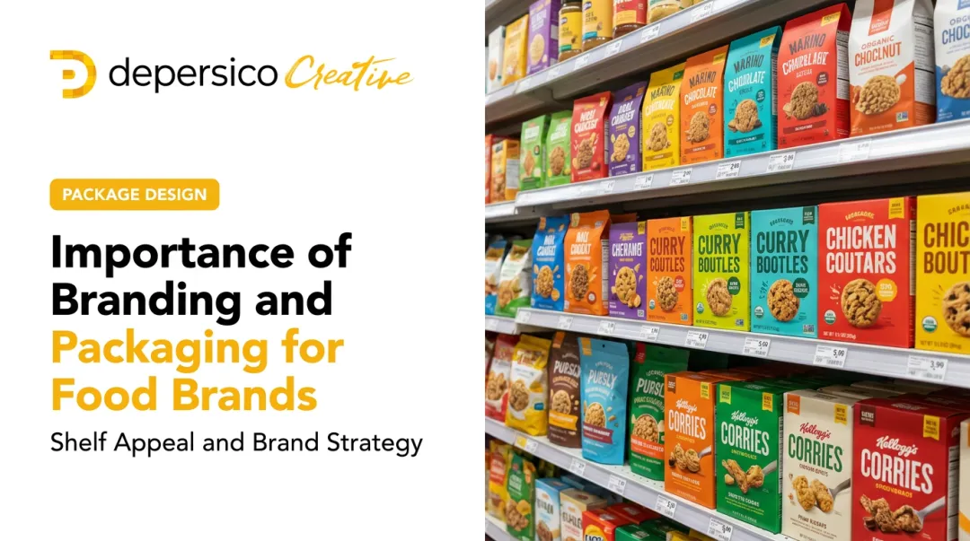
- Shelf decisions happen in 4-6 seconds, with no salesperson to fill the gap
- Taste and quality can't be sampled — packaging has to carry that perception
- Competitors are inches away, often with near-identical products
- First-time buyers have no loyalty to anchor their choice
This is why DePersico Creative — a food and beverage packaging agency with over 45 years of experience — frames packaging not as design work, but as a strategic selling tool. Their focus: creating packaging that compels a purchase decision within seconds of shelf exposure.
How Packaging Shapes Consumer Behavior
Packaging doesn't just contain a product — it drives the decision to buy it. Visual design, emotional resonance, and the words on the panel each measurably affect trial rates, repeat purchases, and brand loyalty.
Visual Appeal and Color Psychology
Color is the first signal the brain registers, before text is read or the product is touched. In food and beverage, specific color choices carry real consequences for how a product is perceived.
A 2024 study published in Frontiers in Nutrition found that color and food type interact in meaningful ways: orange packaging raised purchase intent for indulgent foods (scoring 5.98 vs. 4.80 for green), while green packaging raised intent for health-oriented foods (6.06 vs. 4.18 for orange). The takeaway isn't a universal color rule — it's that color must be chosen in the context of what the product is and who it's for.
Typography and visual hierarchy work alongside color to guide the eye. When the most compelling selling point — the flavor, the benefit, the differentiator — sits at the top of the visual hierarchy with appropriate weight and contrast, shoppers register it within the shelf window. When layout is cluttered or poorly sequenced, the eye moves on without fully processing the product's value.
This matters most at new product launches and competitive shelf resets, where a brand has no existing recognition to fall back on. Visual design must do all the work of first impression and purchase trigger simultaneously.

Emotional Connection and Brand Storytelling
Shoppers don't just buy products — they buy products that feel consistent with who they are. Packaging that taps into nostalgia, lifestyle aspiration, or values alignment creates an emotional shortcut to preference.
Retro design aesthetics trigger positive memory associations. Craft-positioned packaging — handwritten type, textured substrates, simple layouts — conveys authenticity and community. These choices signal to consumers whether a brand belongs in their life.
The compounding effect matters just as much as the first impression. When packaging design language is cohesive across SKUs and consistent over time, consumers develop what amounts to a recognition reflex — they reach for the familiar product even when cheaper or newer alternatives are present. Packaging earns that loyalty incrementally, one shelf appearance at a time.
DePersico Creative's work with J. Skinner® Baking illustrates this directly. The brand was repositioned from wholesale commodity to premium retail through packaging built around artisanal storytelling: a handwritten script logo, organic brown backgrounds, transparent windows that let the product speak, and evocative copy describing each pastry with specific sensory language.
The result was 210–340% sales growth — achieved by changing what the packaging communicated, not by changing the product itself.
A provenance labeling study on food packaging found that origin information substantially influences product evaluation and willingness to pay, particularly for animal-based foods. It functions as an emotional credibility cue — proof that the brand has a story worth trusting.
Language, Food Imagery, and Appetite Appeal
The words on food packaging are not filler. They're a selling tool, and the difference between strong and weak copy is the difference between a craving and indifference.
Specific, sensory language — "slow-smoked," "hand-crafted," "bold and smoky" — creates appetite before the product is opened. Generic descriptors like "great taste" or "premium quality" fail to compel trial even when the visual design is strong, because they give the shopper's brain nothing concrete to simulate.
DePersico Creative calls this discipline creative linguistics — crafting the specific words and phrases engineered to create appetite and connection. It's distinct from standard copywriting because it's engineered for the 4–6 second shelf window, not for reading.
Food photography operates on a similar principle. Appetite-appeal imagery — product styled to look plated, fresh, and ready to eat — triggers the brain's simulation of consumption before purchase. A shopper who can almost taste the product from the packaging is far more likely to put it in the cart.
Simmonds and Spence's 2017 review confirmed this effect, finding that food images on packaging are salient stimuli capable of promoting hunger and desire, directly affecting purchase behavior and quality expectations. Transparent packaging windows that show the actual product produce similar effects — giving the consumer visual confirmation of what they're buying.
When Idahoan® commissioned DePersico Creative to redesign the Steakhouse™ line, the strategy combined restaurant-quality food photography, warm earthy colors, and creative linguistics reinforcing a premium dining experience in a convenient format.
The result: a 75% incremental sales increase and casserole segment share growth from 11.6% to 23.1%.

What Happens When Packaging Falls Short
Weak packaging can sink a product that's genuinely good — not because shoppers rejected it, but because it never got a fair shot on the shelf.
The most common failure mode in food and beverage is misdiagnosing the problem. A brand sees slow trial rates and assumes the product needs reformulation, pricing adjustment, or more promotional spend. The actual failure is a communication failure at the point of sale: packaging that doesn't earn the sale regardless of what's inside.
The Most Common Packaging Failures
- Visual clutter that overwhelms the shopper instead of guiding the eye to a clear selling point
- Generic stock photography that conveys no appetite appeal and signals low investment in the product
- Vague brand messaging that fails to differentiate the product from the shelf around it
- Weak copy that describes the product rather than creating desire for it
- Inconsistent design across SKUs that prevents recognition from building over time
The business impact compounds quickly. Lost trial means fewer repeat buyers, which drops shelf velocity, which erodes retailer confidence. At that point, reduced shelf space or outright delisting becomes a real risk.
What makes this particularly costly is that weak packaging creates a false read on the product itself. Buyers and retailers see poor sell-through and conclude the product lacks demand — when the actual problem is the packaging never communicated its value.
How to Get the Most Out of Your Packaging
Effective packaging improvement starts with an objective assessment of how a current design performs in competitive context — not in isolation, and not based on internal preference.
DePersico Creative's SWIFI process (Strengths, Weaknesses, and Ideas For Improvement) is built on this principle. It's a structured, perception-based packaging audit that identifies what a design is currently communicating versus what it should be communicating — evaluated against the competitive shelf environment the product actually lives in.
Packaging as an Integrated System
The most important principle in packaging strategy: visual design, creative linguistics, and food photography must be developed as a unified system, not as sequential decisions made by separate teams.
When these elements are designed together, the result is packaging that communicates a single, clear, compelling message within seconds:
- Color and layout reinforce the copy
- Photography aligns with the emotional positioning
- Typography supports the brand story

When they're developed in isolation, the packaging pulls in different directions — and shoppers move on.
Even the strongest individual element can't compensate for a system that doesn't cohere.
When to Review and Reassess
Packaging is not a one-time decision. The competitive shelf shifts, consumer demographics change, and retail channels evolve. Brands should proactively re-evaluate packaging performance when:
- Entering a new retail channel or distribution territory
- Expanding to a new consumer demographic
- Responding to significant competitive shelf changes
- Launching a new SKU or line extension
- Noticing sustained underperformance that isn't explained by product quality or pricing
The goal is staying ahead of the gap between what the packaging communicates and what the market requires. For an established brand like Bob's Red Mill, a recent refresh addressed exactly this: a 200-SKU portfolio needed clearer shelf navigation, consistent color families, and stronger dietary callouts — while preserving the heritage equity loyal customers recognized.
GoodPop's 2021 redesign followed a similar trigger, aligning shelf identity with an evolving product line. The brand reported 40% year-over-year sales growth in the period that followed.
Conclusion
In food and beverage, packaging is the single most immediate point of contact between a brand and its consumer. It triggers emotion, communicates value, and earns — or loses — trial in a matter of seconds at shelf, making it one of the most direct sales investments a brand can make.
Strong packaging builds brand recognition with every shelf appearance. It turns first-time buyers into repeat customers. Over time, it creates the kind of habitual buying that sustains long-term growth. That only happens when packaging is treated as an ongoing strategic practice — analyzed, refined, and updated as the market evolves — not a one-time decision made at launch and never revisited.
The brands that win at shelf understand this. They treat packaging as a living asset, not a sunk cost. For food and beverage brands looking to sharpen shelf performance — whether launching a new product or refreshing an existing one — that strategic discipline is where the work begins.
Frequently Asked Questions
How quickly do consumers decide whether to buy a food product based on its packaging?
The decision window at shelf is measured in seconds, not minutes. POPAI's supermarket research found that 55% of purchases are completely unplanned, made in the aisle based on what registers in the moment. Packaging that doesn't communicate clearly and compellingly within that window loses the sale.
What is the most important element of food and beverage packaging design?
Effective packaging integrates color, typography, copy, and imagery into a unified system — no single element outweighs the others. In food categories specifically, first-impression visual impact and appetite appeal are critical: the packaging must simulate the experience of the product before purchase.
Can poor packaging hurt a product even if the quality of the food inside is excellent?
Yes, consistently and measurably. Consumers can't experience product quality until after purchase, so packaging must earn that first trial. High-quality products with weak packaging routinely underperform — not because of what's inside, but because the design fails to communicate it.
How does packaging design drive impulse purchases in food and beverage?
Color draws attention first, followed by appetite-triggering imagery and specific, sensory copy that creates craving. These elements work together to convert an unplanned stop in the aisle into a purchase — which is exactly what accounts for more than half of all supermarket buying decisions.
How often should a food or beverage brand update or redesign its packaging?
The right trigger is a market event, not a calendar. Entering a new retail channel, launching a line extension, or facing significant competitive shelf changes all warrant a packaging review. Any changes should be evolutionary enough that loyal customers still recognize what they've come to trust.