For food brands, this moment hits differently. Unlike most product categories, packaging is often the only brand interaction that happens before purchase. There's no salesperson explaining the value, no demo, no trial. Just a few seconds of visual real estate on a shelf crowded with competitors who've been investing in their presentation.
A redesign, then, is not a cosmetic decision. It's a commercial one — with real risk if done carelessly and real upside if done right.
This post covers what food brand owners need to know: how to distinguish a refresh from a redesign from a full rebrand, which warning signs tell you action is overdue, how to time a redesign strategically, and how to execute one without losing the shelf recognition you've spent years building.
Key Takeaways
- A refresh updates visual details; a redesign restructures the visual system; a full rebrand changes the fundamental identity — each fits different circumstances
- In food, packaging is the primary brand touchpoint, making these decisions higher-stakes than in most categories
- Warning signs like visual obsolescence, competitive displacement, and fragmented SKU families signal when redesign is necessary
- Timing a redesign around category resets, new retail channel entries, or SKU launches maximizes return
- The strongest redesigns are research-led, preserve key equity signals, and are executed with a clear rollout plan
Refresh, Redesign, or Rebrand? Understanding the Spectrum for Food Brands
The three terms get used interchangeably, but they mean very different things — particularly in a food context where packaging continuity directly affects repeat purchase behavior.
Brand Refresh
A refresh makes subtle updates to typography, color tone, or layout without disrupting shelf recognition. Think: cleaning up a logo for better legibility at small sizes, or sharpening photography without altering the overall look. Core visual equities — the dominant color block, the mascot, the pack shape — stay intact.
Kellogg's 2019 cereal refresh is a useful reference point. Landor enlarged the wordmark and retained characters like Tony the Tiger. The result: packaging reportedly became 70% easier to find and raised purchase intent by 50%. The strategy was sound; the shelf communication just needed sharpening.
Brand Redesign
A redesign is more substantial — updated color palette, restructured packaging hierarchy, revised messaging, potentially a new logo treatment — while retaining the brand name and core identity. This is the right move when a brand has genuinely evolved: new product tiers, a broadened audience, or a shift upmarket that the current packaging no longer reflects.
Full Rebrand
Reserved for situations where the brand name, positioning, target audience, or core values are fundamentally changing. For established food brands, this is rare and carries the highest risk of losing accumulated shelf equity.
Why the Distinction Matters on the Shelf
Choosing the right scope isn't just semantics — it determines how much shelf equity you're risking. Loyal shoppers navigate grocery aisles by visual memory, reaching for products based on:
- Color block — the dominant background hue that signals the brand from 10 feet away
- Logo placement — the expected position buyers' eyes go to instinctively
- Pack shape — the silhouette that triggers recognition before the name is read
Changes that are too dramatic can make a product effectively disappear to its most reliable buyers.
The Tropicana case makes this concrete. When the brand launched a redesign in January 2009, changing several recognition cues simultaneously, Pure Premium unit sales fell 20%. A peer-reviewed analysis of 120 weeks of Nielsen grocery data estimated $27 million in lost sales. Tropicana reversed course within weeks.
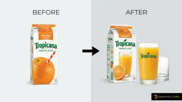
Removing multiple recognition cues simultaneously — without testing — breaks the shopper's retrieval pattern. That's the real risk, regardless of whether the creative work is strong.
Warning Signs Your Food Brand Packaging Needs a Redesign
Most brands don't notice packaging problems until sales data forces the conversation. These four warning signs show up earlier — and they're worth recognizing before a competitor capitalizes on them.
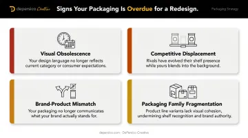
Visual Obsolescence
Packaging created more than 7–10 years ago often carries design conventions — illustration styles, font choices, photo treatments — that now read as dated to modern grocery shoppers. This matters because shoppers equate the visual quality of packaging with the perceived quality of the product inside. An outdated package signals an outdated product, regardless of what's actually in it.
Competitive Displacement
Pull up a shelf photo of your category. If your packaging no longer commands visual attention in that competitive set, the design gap is tangible. Shoppers make decisions fast — your packaging needs to interrupt their eye pattern before anything else can happen.
The problem is that familiarity distorts perception. Brand owners often can't see their own packaging the way a stranger at shelf does. DePersico Creative's SWIFI process (Strengths, Weaknesses, and Ideas for Improvement) addresses this directly — placing your packaging alongside competitors in the same competitive grid a shopper encounters and evaluating which elements earn attention versus which cause your product to disappear into the surrounding noise.
Brand-Product Mismatch
When packaging communicates one thing (traditional, indulgent) but the product or company direction has shifted (better-for-you, premium), there's a disconnect. Shoppers resolve that confusion by choosing a competitor whose packaging tells a clearer story.
Packaging Family Fragmentation
Expansion creates fragmentation risk. When SKUs, flavors, or sub-categories accumulate over time without design oversight, the result is a packaging family that doesn't look like a family:
- Some items look five years older than others
- Label styles conflict across the product line
- New additions look like they belong to a different brand entirely
Retail buyers notice this fragmentation before shoppers do, and it makes effective merchandising harder to execute.
When Is the Right Time to Redesign? Triggers Food Brands Should Watch
Getting the timing right on a food brand redesign determines whether that investment pays off — or gets buried under operational chaos and missed retail windows.
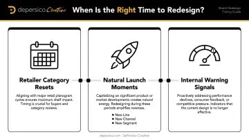
Retailer Category Resets
When retailers reorganize shelf space for a new planogram cycle, they're making decisions about which products get prime placement. Arriving at a category review with updated, compelling packaging signals that your brand is investing in its shelf presence. Missing that window can mean waiting an entire cycle before the new design gets evaluated for placement.
There's no universal reset schedule — each retailer operates on its own category review calendar. The practical move is to build your redesign timeline backward from each target retailer's submission deadlines, production lead times, and inventory conversion requirements.
Natural Launch Moments
These are the cleanest opportunities for a redesign:
- New product line launch — all packaging enters the market with a unified, updated identity
- New retail channel entry — moving from regional to national, or from grocery to club/mass
- New consumer segment — targeting younger buyers, health-focused shoppers, or a different occasion
In each case, the redesign enters the market as something new — there's no legacy shelf position to disrupt, and retailers evaluate it on its own merits.
Internal Signals That Can't Be Ignored
Often the clearest signal comes from inside the business:
- The brand team feels reluctant showing packaging to prospective retail buyers
- Sales velocity is declining without a pricing or distribution explanation
- Competitors whose packaging launched two years ago already feel more current
- The packaging doesn't reflect where the brand actually is today
None of these are minor cosmetic concerns. Each one affects how buyers and shoppers perceive the brand — and the longer they go unaddressed, the harder it becomes to recover lost shelf position and consumer trust.
How to Execute a Food Brand Redesign: A Step-by-Step Approach
Step 1: Audit Your Current Brand Equity Before Changing Anything
The most costly mistake in food packaging redesign is changing elements that shoppers already use to find the product. Before any creative work begins, identify which visual components carry genuine recognition value — color block, logo mark, character, typography — and which are simply legacy baggage.
DePersico Creative describes this as retaining "equities that matter, such as a distinctive color block, character element, or shape language, while modernizing typography, appetite cues, and composition. The goal is evolution that feels fresh, not foreign."
Their SWIFI analysis puts this into practice: every visual cue gets evaluated for what job it's doing before a decision is made about whether to keep, evolve, or replace it.
Step 2: Define Concrete Strategic Objectives
A redesign without clear objectives becomes an expensive creative exercise. Before developing concepts, answer these questions:
- Is the goal to compete in the natural/better-for-you segment?
- To trade up to a premium positioning?
- To unify a fragmented packaging family?
- To prepare for a new retail channel?
Clear answers to these questions drive every creative decision downstream — and keep the brief tight enough to actually execute against.
Step 3: Develop Creative Concepts Rooted in Food Truth
In food packaging, appetite appeal is a sales driver. How well a package makes food look craveable directly affects whether a shopper reaches for it. Photography, color psychology, and information hierarchy all contribute to that instant desire.
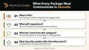
DePersico Creative's approach is specific: every package must answer four questions a shopper asks at shelf — all within seconds:
- What is this?
- What will I experience?
- What do I want from this category?
- What does this product offer that others don't?
Creative linguistics — the precise words and phrases that create immediate connection — matter as much as the visual execution.
Step 4: Test Concepts With Real Shoppers Before Finalizing
Two things need to be tested, in this order:
- Stopping power — does the new design get noticed in a realistic competitive shelf context?
- Clarity — do shoppers immediately understand what the product is and why they should buy it?
Practical approaches include shelf simulation tests (new designs placed in a mocked-up store shelf alongside actual competitors), consumer preference studies, and focus groups with the target demographic. Testing on isolated presentation boards misses how the design actually performs in context.
Step 5: Plan the Rollout to Protect Loyal Shoppers
Even a strong redesign can confuse loyal customers if the transition isn't managed. Key rollout considerations:
- Use on-pack transitional messaging ("New Look, Same Great Taste") during the changeover period
- Coordinate timing with retail partners so the new packaging doesn't compete with existing inventory at shelf
- Update all brand touchpoints simultaneously — website, e-commerce listings, social media — to avoid a fragmented brand presence during the transition
Common Mistakes Food Brands Make During a Redesign
Three mistakes show up repeatedly — and each one is avoidable.
Changing too much at once. Loyal customers navigate by visual memory. A radical color change or logo departure can make the product invisible to its most reliable buyers. Preserve at least one or two anchor equity elements — the dominant color, the logo mark, or the pack structure.
Letting internal preferences override shopper reality. Executives develop strong design opinions based on personal taste, not shelf behavior. What looks compelling on a presentation slide may perform completely differently surrounded by twenty competing products. Evaluate every direction through the shopper's lens, not the conference room's.
Working with a design partner unfamiliar with food retail. A general creative firm may produce a beautiful design that fails at execution. Print production specifications, die lines, retailer compliance, and FDA labeling rules — including sesame allergen declarations updated in 2023 — are food-specific expertise, not general design skills. No matter how good it looks in a PDF, a design that's non-compliant or can't survive prepress won't make it to shelf.
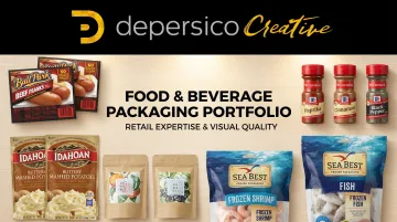
Choosing an agency with deep food retail experience closes this gap. DePersico Creative has spent 45+ years working exclusively in food and beverage packaging — with brands like Ball Park, Idahoan, Sea Best, and McCormick — because shelf dynamics are a discipline, not a transferable skill.
Frequently Asked Questions
What is brand redesign?
A brand redesign is a strategic update to a brand's visual identity — logo, packaging, color palette, typography, and messaging — intended to realign the brand with its current goals and audience. For food brands specifically, it's how a product stays competitive on shelf without abandoning the recognition it's already built with shoppers.
What is the difference between rebranding and redesign?
A redesign updates visual and messaging elements while preserving the existing brand identity and name. A full rebrand involves a more fundamental transformation — potentially including a new name, new positioning, and a redefined target audience. In short: a redesign refines what's working, while a rebrand starts from a different strategic foundation.
How often should a food brand redesign its packaging?
Rather than following a fixed schedule, food brands should monitor category competition, retailer feedback, and sales velocity data as triggers. Evidence-based signals — declining recognition, portfolio confusion, changed positioning, or a new retail channel — are more reliable indicators than any calendar benchmark.
What are the 5 C's of branding?
The 5 C's of branding — Clarity, Consistency, Character, Connection, and Credibility — serve as foundational principles for how a brand communicates and positions itself. When evaluating food packaging for a redesign, they're a practical checklist: is the product clear at a glance, consistent across SKUs, and credible enough to earn trial?
How do you redesign a food brand without losing loyal customers?
Preserve the visual equity elements shoppers use to find the product — dominant color, logo mark, or structural pack shape. Use transitional on-pack messaging to signal the change, and coordinate the rollout with retail partners so loyal shoppers are guided to the new look rather than surprised or confused by it.