Introduction
Shoppers make in-store product selections in less than six seconds, according to NIQ. Six seconds — and your packaging photography is doing most of the talking.
For CPG brands, that window is everything. Your food advertising photography isn't decorative — it's the first (and often only) conversation your product has with a potential buyer. It appears on packaging, digital ads, in-store displays, and social media simultaneously. Weak photography doesn't just look bad — it costs you sales.
This guide covers the photography strategies that matter most for CPG brands: lighting techniques that make food irresistible, food styling and composition principles built for retail, how to plan a multi-use shot matrix, and the mistakes that undermine brands on shelf.
Key Takeaways
- Shoppers decide in under six seconds; your photography must trigger a craving before they read a word
- Soft, directional lighting creates texture and depth; flat lighting destroys appetite appeal
- The "hero product" concept ensures only the most visually perfect specimen gets photographed
- Plan each shot for its final format — on-pack, digital ad, and e-commerce all have different requirements
- Photography planned separately from packaging design produces visual conflict, not a unified brand impression
Why Food Advertising Photography Is a CPG Brand's Most Powerful Sales Tool
Most people treat editorial food photography and advertising food photography as the same discipline. They're not.
Editorial food photography — the kind you see in food magazines and recipe blogs — tells a story. It can be moody, imperfect, and slow to reveal itself. That works when a reader is spending four minutes with a spread.
Advertising food photography for CPG brands has one job: compel a purchase decision. The image must be product-centric, technically precise, and engineered to communicate quality and craving simultaneously — because the shopper won't give it more than a glance.
The "Silent Salesperson" on the Shelf
On a retail shelf packed with competitors, the product image is often the only element a shopper evaluates before picking something up. According to an Ipsos poll of 2,002 US adults, 72% said packaging design can influence their purchase decisions. The photo isn't supporting the sell — it is the sell.
The Psychology of Appetite Appeal
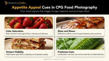
This isn't subjective. Research on visual design cues confirms that specific visual elements trigger measurable neurological responses:
- Color saturation — saturated reds can increase perceived flavor intensity and sweetness
- Gloss and sheen — signals freshness and moisture, but can also suggest richness
- Texture visibility — rough, crunchy, or layered textures communicate flavor complexity
- Freshness cues — condensation, steam, bright greens, and clean cuts all register as "fresh" before the brain consciously processes them
CPG brands that leave these cues to chance are handing those purchase decisions to competitors who don't.
Why CPG Photography Is Different from Restaurant or Social Media Work
A restaurant photo only needs to look good on Instagram at full screen. CPG food photography must function at three scales simultaneously:
- Macro — close-up ingredient or product detail for packaging
- Mid-range — lifestyle or serving suggestion for advertising
- Thumbnail — e-commerce listings where the image is 200 pixels wide
Technical quality and versatility aren't optional. They're the baseline.
Lighting Techniques That Make Packaged Food Look Irresistible
Lighting is the single most controllable variable in food photography, and it has an direct impact on appetite appeal. Get it right, and food looks fresh, textured, and desirable. Get it wrong, and the most carefully prepared hero product looks flat and unappetizing.
Natural Light vs. Controlled Studio Lighting
Both have legitimate uses — the choice depends on brand positioning and production goals.
- Natural light creates an authentic, warm feel that suits clean-label, farm-fresh, or artisan brands. It reads as honest and unmanufactured, which can reinforce natural ingredient messaging
- Controlled studio lighting delivers precise, repeatable results — critical when a CPG brand has multiple SKUs that must look visually cohesive across an entire product line
For most CPG packaging projects, studio lighting wins on consistency alone. A brand with six SKUs can't afford six slightly different lighting moods.
The Direction and Quality of Light
Professional food photographers consistently identify soft, diffused side lighting as the most universally flattering approach for food. Here's why angle matters:
- Side lighting rakes across the surface of food, creating gentle shadows that reveal texture — the crunch on a cracker, the char on a protein, the glaze on a pastry
- Overhead or direct flash flattens food, eliminating the textural shadows that make it look three-dimensional and fresh
- Back lighting can create a beautiful rim glow around liquids and translucent ingredients, but requires careful fill control to avoid underexposure
Key Light and Fill Light for CPG Shots
Most professional CPG setups use a two-light system:
- Key light — creates definition, highlights texture, and establishes the primary visual direction
- Fill light — controls shadow depth, preventing the image from going too dark or too flat
The ratio between these two communicates different things. Deeper shadows suggest richness and indulgence — fitting for premium or craft products. A brighter fill creates an airy, fresh feel suited to light, healthy, or natural positioning. Neither is objectively correct; both are strategic choices.
Controlling Reflections on Packaging
Reflective packaging — sauces, dressings, bottles, beverage cans — creates a specific challenge. Without proper control, the product image shows the photographer, the ceiling, and the studio lights instead of the product.
Tools for managing this:
- Reflectors and bounce cards redirect and soften light to eliminate hotspots
- Flags block light from hitting specific areas of the packaging surface
- Polarizing filters on the lens reduce surface glare
This is one of the most common reasons CPG product shots look amateurish when produced outside a proper studio environment.
Color Temperature and White Balance
Fluorescent ceiling lights produce a yellow-green color cast that makes food look unappetizing. Shooting in an office, warehouse, or under mixed ambient light without correcting white balance will result in images that look unhealthy — regardless of how well the food is styled.
Any lighting setup for CPG food photography must be color-balanced to match the brand palette and produce accurate, appetizing tones.

Food Styling and Shot Composition for CPG Advertising
The Hero Product Concept
Professional food photographers don't photograph the first item that comes out of the package. They photograph the best one — after preparing, testing, and often discarding multiple candidates.
A 2016 Guardian report on commercial food stylists documented cases where stylists prepared five or six specimens of the same dish to obtain one hero. CPG brands should build that expectation into their production budget and timeline. Arriving at a shoot with one unit of product is not a photography strategy.
Selecting the Right Angles and Framing
Camera angle changes how a product communicates, not just how it looks.
| Angle | Best For | Why It Works |
|---|---|---|
| 45-degree | Most packaged goods | Shows both the top and the face naturally |
| Straight-on | Beverages, sauces, bottles | Height and label design are visible |
| Overhead (flat lay) | Ingredients, spreads, dishes | Works for context shots, weak for standalone packs |
The overhead angle is often overused on social media and can make packaged products look two-dimensional. For most CPG advertising, the 45-degree angle is the workhorse because it reflects how shoppers actually see products on a shelf.
Negative Space and Graphic Design Integration
Composition isn't just about the food — it's about what surrounds it. Leaving intentional negative space around the hero product gives graphic designers room to add:
- Brand name and logo
- Product callouts ("Now with 30% More Protein")
- Flavor descriptors
- Certifications and claims
Photographers who don't understand the downstream packaging layout will frame shots that leave no room for these elements. The result is a layout where the photo and the text compete rather than collaborate. Photographers need the final package template before they frame a single shot.
Food Styling Techniques for CPG Products
Practical food styling is less glamorous than it sounds — and more specific than most brands expect:
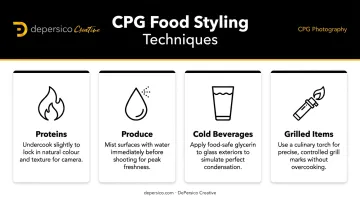
- Proteins are often slightly undercooked to preserve color and juiciness under studio lights, which generate heat and accelerate cooking
- Produce gets misted with water to create freshness cues that read clearly on camera
- Cold beverages rely on glycerin or corn syrup on the outside to simulate condensation, which evaporates quickly under lights
- Grilled proteins get controlled grill marks or browned edges applied with a culinary torch
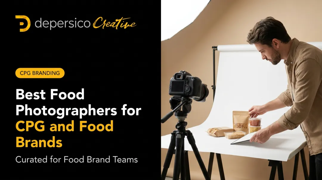
Agencies like DePersico Creative handle this preparation before a single shot is taken, using a fully equipped on-site prep kitchen and in-house food styling team that covers everything from recipe-level preparation to plating and multi-angle testing.
For brands like Sea Best and J. Skinner, that means photographing shrimp with visible crunchy breading or danishes with exposed moist pecan filling — craveable details that communicate product quality in a single frame.
Props, Surfaces, and Ingredient Call-Outs
Props should reinforce brand personality without ever upstaging the product:
- Rustic wooden boards and linen work well for natural, farm-fresh, or artisan brands
- Clean marble and white surfaces reinforce premium and minimalist positioning
- Bold-colored surfaces and playful props fit snack and fun-forward brands
Ingredient call-outs — raw tomatoes, fresh herbs, visible spices arranged around the packaged product — are effective for clean-label or natural-positioned products. They signal freshness and quality at a glance, before a shopper reads the ingredient list. These arrangements are most powerful when they mirror claims on the label, creating visual proof of the product's contents.
Shooting Images That Work on Packaging, Ads, and Digital
Planning a Shot Matrix Before You Shoot
The most expensive photography mistake CPG brands make is attempting to adapt one shot type across all uses. A packaging hero shot and an e-commerce thumbnail serve different functions and require different compositions.
A planned shot matrix for a CPG product launch should produce:
- Packaging hero shots — high-resolution, clean background, isolated product sized to the package face dimensions
- Lifestyle and serving suggestion images — product in context, with plating or occasion cues
- Ingredient close-ups — textural detail shots that highlight quality
- Digital variants — square and vertical crops sized for e-commerce listings and social formats
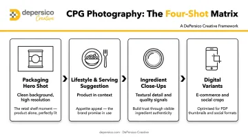
Planning all of these before the session — not adapting afterward — is what makes a single shoot day cost-efficient.
Technical Requirements by Format
Different formats have genuinely different requirements. Three standards to know before you shoot:
- Print/packaging: Adobe identifies 300 ppi as the minimum for high-quality print
- Amazon listings: Amazon's product listing guidelines require a minimum 500 pixels on the longest side, pure-white background (RGB 255,255,255), and product filling roughly 85% of the frame
- Retail/GS1: GS1 standards specify 900 x 900 to 2400 x 2400 pixels at 300 ppi
An image built for e-commerce will not serve packaging without reshooting or significant compromise. Knowing the end formats before you shoot is what keeps those reshoots off the budget.
The Case for Integrating Photography and Packaging Design
When brands handle photography separately from packaging design, the two elements often compete visually rather than working together. A photo can be technically excellent and still fail on-pack — composed without accounting for where the brand name sits, how the claim callout overlays, or what color the panel background uses.
DePersico Creative handles both photography and packaging design in-house, which means photo composition is planned in direct coordination with the package layout from the start. The result is a cohesive system where the photo and package design were built together — not forced together after the fact. For brands heading into retail distribution, that integration is what prevents expensive reshoots and compromised layouts. Shooting tethered to a monitor during the session also helps — so compositions can be reviewed at actual scale and framing issues caught before post-production, when fixes cost far more.
Common Food Photography Mistakes CPG Brands Make
Using Generic Stock Photography
Shoppers recognize stock food photography — and it erodes brand trust. Stock images communicate that a brand couldn't be bothered to photograph its own product, which raises obvious questions about confidence in that product. For a CPG brand where the packaging image is the primary sales tool, stock photography is a credibility problem, not a cost solution.
Skipping Professional Food Styling
Poorly styled food communicates low product quality before the consumer ever tastes it. Uncontrolled browning, uneven portions, inconsistent garnishes, and wilted produce all register — even subconsciously — as signals about the product inside the package. A professional food stylist isn't a luxury; it's a quality control requirement.
Inconsistent Lighting Across a Product Line
When a brand's three SKUs were photographed in three different sessions with three different lighting setups, they look like three different brands on shelf. Consistent lighting, color temperature, and shooting conditions across an entire product line are what create the visual cohesion that makes a brand recognizable from ten feet away.
Shooting Photography Before the Package Design Is Finalized
When photography is produced first — without the final label template or package layout — the resulting images rarely fit cleanly into the design. Common failure modes include:
- Photo composition too centered to accommodate a logo
- Cropping that leaves no room for product claims
- Lighting that conflicts with the package's color palette
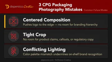
The fix is either a reshoot or a compromised design, and neither is a cheap problem to solve.
Over-Retouching Beyond What the Product Can Deliver
Heavy digital manipulation creates a specific legal and commercial risk. Burger King's Whopper litigation (where plaintiffs alleged the advertised burger appeared approximately 35% larger than what was actually served) illustrates the exposure that comes from representing a product beyond what it delivers. Class certification was ultimately denied in 2025, but the litigation ran for years and created real reputational cost.
Beyond legal exposure, the commercial consequence is just as damaging. Consumers who buy a product based on the packaging image and find the contents look nothing like it rarely buy again.
Frequently Asked Questions
How much does a professional food photographer cost for CPG work?
Day rates for CPG food photography typically range from a few hundred dollars for emerging talent to several thousand for experienced studio photographers with full styling crews. The more useful frame: photography is a small line item relative to packaging production and retail distribution costs. Images that drive shelf pick-up pay for themselves.
What's the difference between food advertising photography and editorial food photography?
Editorial photography is story-driven and designed for magazines or blogs. Advertising photography is product-centric, technically structured, and built to compel a purchase. CPG brands need the advertising approach — imagery that communicates quality and craving within seconds, not imagery that rewards a slow read.
Do CPG brands need a professional food stylist?
Yes. A food stylist ensures the hero product looks its best under studio conditions, where lighting intensifies color, temperature accelerates wilting, and minor imperfections become glaring at high resolution. Skipping this step is one of the most visible ways a CPG brand undersells its product.
How many photos does a CPG brand need for a product launch?
At minimum: a packaging hero image, a lifestyle or serving suggestion shot, a close-up texture shot, and e-commerce and social variants. Building a shot matrix before the session captures all of these in one day, which is significantly more cost-efficient than returning for a second shoot.
Can CPG food photography be done with natural light?
Natural light can produce beautiful results for certain brand aesthetics. But a professional studio with controlled lighting gives CPG brands the consistency and repeatability needed across an entire product line, especially when multiple SKUs must look cohesive on the same shelf. An in-house studio setup — like the one DePersico Creative operates — also makes reshoots and line extensions faster to execute without rebuilding the lighting environment from scratch.
How does food photography affect CPG product sales?
The packaging image is often the single most influential factor in a first-time purchase decision. Strong photography drives higher shelf pick-up rates, creates stronger first impressions, and shapes perceived product quality before the consumer ever opens the package. That perception carries forward into repurchase behavior.