Introduction
Walk down the cereal aisle of any grocery store and the sensory experience hits immediately: dozens of boxes, stacked floor to ceiling, each one competing with color, characters, claims, and photography. Shoppers don't browse this aisle — they scan it, and they do it fast.
According to NielsenIQ, most shoppers look at a product for just 13 seconds before deciding. In a category this saturated, that window is everything.
Cereal box design is one of the highest-stakes creative challenges in food packaging — not for aesthetics, but because the box has to sell. A package that catches the eye is only half the job. The one that actually moves product is the one built around strategy, not just style.
This article covers the specific design elements, creative approaches, and strategic thinking behind cereal packaging that genuinely wins at shelf — from color psychology and typography to audience targeting and the warning signs that your current packaging is quietly costing you sales.
Key Takeaways:
- Shoppers decide in 13 seconds — every design element must earn its place
- Color, hierarchy, and imagery work together to stop shoppers and convert them
- Kids' and adult cereals require fundamentally different visual languages
- The words on your box are a design element, not an afterthought
- Declining sales often signal a packaging problem before anything else
Why Your Cereal Box Design Is Your Brand's Most Powerful Sales Tool
The cereal box is the brand's only salesperson on the shelf. No pitch, no demo, no second chance. It either earns the sale in seconds or loses it to the box next door.
An Ipsos survey of over 2,000 US adults found that 72% agree package design influences their purchase decisions. That's not a marginal effect — that's the majority of shoppers actively responding to how a product looks before they've read a single claim.
Stopping vs. Converting: Two Different Problems
Most cereal brands accomplish only one of the two things effective packaging must do:
- Stop the shopper — visual disruption that interrupts the scan
- Convert the shopper — emotional resonance, appetite appeal, and clear messaging that drives the purchase
A box with an eye-catching color might stop someone. But if the front panel is cluttered, the benefit unclear, or the food photography underwhelming, that attention evaporates. The box did half the job and lost the sale anyway.
DePersico Creative frames this as the core challenge of shelf design: packaging must Create Cravings and Inspire Trial simultaneously.
Creating a craving triggers an appetite response before the rational mind engages. Inspiring trial means communicating enough value, trust, and differentiation that a first-time buyer puts the box in their cart.
The Shelf Is Already Crowded
Those two jobs — stopping and converting — have never mattered more. The US ready-to-eat cereal market generated $10.83 billion in the 52 weeks ending October 2025, even as physical box volume fell from nearly 2.5 billion units in 2021 to 2.1 billion in 2025 — a decline of more than 13%. Dollar value is holding; volume is contracting. Competition for the same shopper dollars is intensifying, and every SKU on the shelf is fighting harder for less overall purchase frequency.
In that environment, packaging isn't a cost of doing business. It's a competitive weapon.
The Core Elements That Make a Cereal Box Design Irresistible
Color Psychology That Triggers an Emotional Response
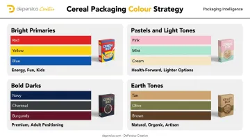
Color is the first signal a shopper receives — processed before any text is read. Different palettes communicate entirely different brand promises:
- Bright primaries — energy, fun, kids
- Pastels and light tones — health-forward, lighter options
- Bold darks — premium, adult positioning
- Earth tones — natural, organic, artisan
The selection can't be arbitrary. One study found that warm orange packaging raised purchase intent for chocolate cereal, while cool green raised it for whole-grain cereal — shoppers respond to color-product alignment even when they can't name why. The palette must match both the audience and the product's actual positioning. A "natural" cereal in glossy neon packaging sends contradictory signals that shoppers register immediately, even if they can't articulate why.
Color does the heavy lifting at a distance. Typography takes over once a shopper steps closer.
Typography That Commands Attention at Distance
Typeface hierarchy on a cereal box front panel follows a clear priority sequence:
- Brand name — largest, most prominent, legible at shelf distance
- Flavor or variety descriptor — second read, scannable, distinct from the brand
- Supporting text — benefits, certifications, claims — none of which should compete visually with the top two
Font style carries meaning beyond aesthetics. Rounded letterforms communicate playfulness and approachability; serif type signals heritage and trust. Bold display fonts convey energy or confidence. The wrong choice doesn't just look off — it signals the wrong shopper entirely.
Once the hierarchy is set, imagery becomes the closer.
Appetite-Inducing Food Photography and Imagery
Food photography is one of the strongest purchase drivers on cereal packaging. A bowl photographed to look fresh, vibrant, and genuinely delicious can trigger a physical craving response. Poor photography — overly processed, flat lighting, unappetizing bowl composition — actively undermines purchase intent.
Shoppers can't taste or sample a product before buying — they rely entirely on visual cues to decide whether something looks worth trying. This is why photography execution matters at every level, from lighting to bowl composition to the way ingredients are styled. DePersico Creative runs a fully equipped test kitchen and studio built specifically to produce that kind of appetite appeal.
Effective cereal photography typically combines:
- A hero bowl shot with real, styled product
- Ingredient callouts that signal freshness and quality
- Composition that communicates the eating occasion (morning energy, family breakfast, etc.)
Visual Hierarchy and Front-Panel Organization
The front panel must accomplish four things at once: brand recognition, flavor identification, key benefit communication, and appetite appeal. Attempting all four without a clear hierarchy produces clutter — and clutter is invisible on a crowded shelf.
A useful benchmark: every front-panel element should earn its place in 4–6 seconds. If a claim, badge, or graphic doesn't advance the primary message or the shopper's decision, it doesn't belong there. DePersico applies this standard across every package review — it's the filter that keeps front panels clean and persuasive.
Common front-panel mistakes:
- Trying to communicate too many benefits simultaneously
- Placing certifications or badges so prominently they compete with the brand name
- Photography that decorates rather than creates appetite
- Flavor descriptors that are too small to read at shelf distance
Structural Format and Finishing Touches
Physical finish choices communicate quality before a shopper reads a word. Research shows matte packaging can increase perceptions of naturalness compared to glossy alternatives — especially relevant for health-positioned or organic cereals where a glossy finish might inadvertently signal artificiality.
Premium finishing techniques — spot UV, foil, embossing — add tactile and visual signals that justify higher price points and attract a different shopper segment. When the physical package signals quality before the shopper reads a single claim, the price point becomes easier to justify — and the purchase decision easier to make.
Creative Cereal Box Design Ideas That Win on the Shelf
These aren't trends to copy. They're strategic approaches, each suited to a different target audience, shelf environment, and brand personality.
Bold Minimalism — Let the Shelf Clutter Work for You
A cereal aisle full of busy, colorful boxes creates an unexpected opportunity: clean design becomes visually disruptive. A front panel with strategic white space, one strong visual, and restrained typography can stop a scanning eye precisely because it looks different from everything around it.
This approach works best for health-focused, natural, or adult cereals where premiumness and confidence are the message. Minimalism communicates confidence without requiring loud visuals to get there.
Character-Driven and Mascot-Based Packaging
Branded mascots create instant emotional connections, particularly with children. A strong character also becomes brand equity that compounds over time: shoppers recognize the character before they read the name, and that recognition drives habitual purchase.
Research from Cornell University found that cereal characters positioned to make direct eye contact with shoppers, placed at children's eye level (roughly 23 inches from the floor), increased brand trust, connection, and purchase choice. Character consistency across a product line builds this recognition over time.

Interactive Packaging That Extends Engagement Beyond Breakfast
Interactive features give children and their parents a reason to choose a specific box and come back to it:
- Back-panel puzzles and activity pages that keep kids occupied at the table
- QR codes linking to digital games or brand content
- Augmented reality features that turn the box into an interactive experience
General Mills' Lucky Charms linked a 2022 QR code to a browser-based AR game, creating an engagement layer that lasted well beyond breakfast. A child who connects a cereal box to a game they enjoy becomes a repeat purchase driver — loyalty built through the package itself.
Limited-Edition and Seasonal Packaging to Create Urgency
Regular packaging creates habitual purchase. Limited-edition packaging creates a reason to act now: the buy-it-before-it's-gone psychology that standard shelf presence can't achieve.
Seasonal and limited-edition cereal packaging also generates social media attention and attracts buyers who wouldn't normally engage with the brand. General Mills demonstrated this with limited-edition collectible cereal boxes featuring entertainment collaborations in 2024, turning the package into the marketing story.
Transparent Windows and "See Inside" Design Elements
Cut-out windows or partial transparency let shoppers see the actual product, texture, and color, a trust-building tool particularly valuable for premium, artisan, or health-forward cereals where visual quality is a selling point.
DePersico Creative applied this approach in their work with J. Skinner® pastries, pairing a transparent panel with professional food photography to give shoppers two layers of product visibility. The window showed the real product; the photography showed it at its best. For cereal, window shapes can themselves become design elements: grain shapes, spoon cutouts, or bowl silhouettes that reinforce brand personality while revealing what's inside.
Designing for Your Audience: Kids' Cereals vs. Adult Cereals
The design intent differs completely between these two audiences. Confusing them weakens both.
The Two Design Languages
| Element | Kids' Cereal | Adult Cereal |
|---|---|---|
| Color | Bright primaries, high contrast | Restrained, earth tones, or bold monochromes |
| Typography | Rounded, playful, energetic | Clean, structured, readable |
| Imagery | Characters, animation, games | Lifestyle, ingredient close-ups, health claims |
| Key benefit | Fun, taste, characters | Protein, fiber, whole grain, low sugar |
| Back panel | Puzzles, games, activities | Recipes, nutrition detail, brand story |
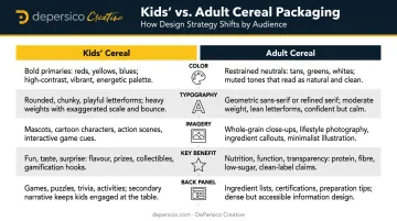
Research confirms child-targeted cereals are shelved roughly 23 inches from the floor — at a child's eye level — while adult cereals are positioned around 48 inches. The shelf placement reinforces the design strategy: kids' packaging must capture a child's attention from below; adult packaging must earn a parent's trust at their eye level.
The Dual-Audience Reality
Most family cereal purchases involve two decision-makers: the child who notices the box, and the parent who approves or rejects it based on health claims, price, and brand trust. The most effective family cereal designs satisfy both without compromising either.
A well-executed dual-audience design typically splits the work across the box:
- Front panel: Visual energy and character appeal aimed at the child
- Health callouts: Protein, fiber, and ingredient claims positioned for the parent's scan
- Back panel: Structured information (nutrition, brand story) that supports the adult purchase decision
Collapsing both messages into a single visual register usually produces packaging that resonates with neither audience.
The Power of Words: How Creative Linguistics Elevate Cereal Packaging
The written words on a cereal box are as much a design element as color or imagery. The right phrase creates desire before a shopper consciously registers what they've read — and the wrong one neutralizes an otherwise strong visual.
Research on front-of-pack protein labeling found that a single benefit-forward nutrient claim on cereal packaging increased both perceived healthfulness and purchase intention — demonstrating that language choices directly move buying behavior, not just brand perception.
The Types of Language That Move the Needle
Benefit-forward language ties the product to a specific, measurable outcome:
- "Packed with whole grains" outperforms "nutritious" — specific beats generic
- "20g protein per serving" is concrete; "high in protein" leaves shoppers guessing
Sensory words such as "toasted," "golden," "crispy," and "crunchy" trigger appetite responses before the first bite. They set an expectation that a good product then confirms.
Aspirational phrases anchor the product to a morning ritual rather than a nutrition checklist:
- "Fuel your morning" speaks to identity
- "A healthy breakfast" describes a category
DePersico Creative treats this discipline — a discipline they call Creative Linguistics — as a dedicated part of the packaging process, developed alongside visual design rather than applied at the end. A tagline written after the box is designed is an afterthought. Language developed with the design is a selling tool.

Language Placement Is Strategy
Choosing the right words is only half the equation. Where those words live on the box determines whether a shopper actually sees them.
Which claims appear at the top of the front panel, which become secondary callouts, and how benefit panels are structured all affect how quickly and completely a shopper absorbs the message. A health-focused shopper scanning for "high protein" needs that claim in prime front-panel real estate — not buried below the flavor descriptor. Hierarchy applies to words as much as it applies to images.
How to Know If Your Cereal Box Design Is Failing
Packaging failure is rarely obvious. It usually looks like a product problem.
Warning Signs to Watch
Performance signals:
- Flat or declining sales in a category that isn't collapsing
- Low trial rates from new shoppers despite steady promotions
- Marketing spend that isn't converting at the shelf
Retail signals:
- Buyer pushback during line reviews
- Lost shelf placements or repositioning to lower-visibility spots
- Competitors that "read faster" or communicate a clearer value proposition
Brand alignment signals:
- Your target audience has shifted, but the packaging hasn't
- The design feels dated relative to current shelf standards
- Your own team says "we've outgrown this look" — if that's the internal perception, it's almost certainly the shopper's perception too
Start With a Structured Assessment Before Redesigning
DePersico Creative uses its proprietary SWIFI process (evaluating a brand's Strengths, Weaknesses, and Ideas for Improvement) before any redesign begins. The assessment compares packaging against its competitive set in real shelf context, evaluating visual hierarchy, messaging clarity, ingredient claims, and the cues that drive trial in that category.
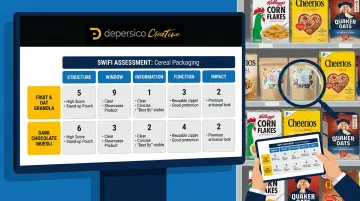
The SWIFI process answers one critical question before significant investment: is a full redesign necessary, or will targeted adjustments move the needle? That distinction keeps brands from spending more than they need to — or less than the problem requires.
Frequently Asked Questions
What makes a cereal box design appealing?
Appealing cereal packaging combines color psychology that matches audience expectations, a clear visual hierarchy that communicates brand and benefit within seconds, appetite-inducing food photography, and language that creates desire. No single element is sufficient — the combination is what stops a shopper and converts them.
Where can I find inspiration for creative cereal box designs?
Start by studying what's winning in your own competitive set at the actual shelf, not just online. A food packaging specialist who understands your category's visual dynamics will produce more relevant direction than general design inspiration sources.
What are good slogans for a cereal box?
Effective cereal slogans are short, sensory, and specific. They create appetite, communicate a key differentiator, or connect to a morning occasion. The best ones are developed in direct relationship with the visual design, so the words and images reinforce the same message — not developed separately and forced to fit.
How important is color psychology in cereal box design?
Color is typically the first visual signal a shopper processes — communicating energy, health, premiumness, or playfulness before any text is read. It's one of the highest-leverage decisions on the front panel precisely because it works below conscious awareness, influencing how shoppers interpret everything else on the package.
Should I redesign my cereal box if sales are declining?
Declining sales can have multiple root causes, but packaging is often a direct contributing factor — especially if the competitive landscape has evolved around you. Start with a structured packaging audit before committing to a full redesign. Understanding whether the problem is packaging-specific, messaging-related, or something else saves significant time and investment.
How do kids' cereal box designs differ from adult cereal designs?
Kids' packaging leads with characters, bright colors, and interactive elements pitched at a child's eye level. Adult packaging leans on clean design, health claims, and lifestyle imagery built to earn a parent's trust. Mixing these conventions typically means the box resonates with no one.