The Gap Between a Great Product and a Great Brand
Walk into any grocery store and pick a category — protein bars, pasta sauce, frozen meals. Within seconds, you've already eliminated most options without reading a single ingredient. That's not shopping; that's visual filtering, and it happens faster than most founders realize.
Having a great product is not enough. On a crowded retail shelf, a shopper makes a purchase decision in a matter of seconds — often without tasting, touching, or reading the full label. According to POPAI's supermarket study of 2,400 shoppers, 76% of purchase decisions are made in-store — meaning your packaging carries almost the entire sales burden.
This guide covers what CPG startups need to get right before stepping into their first buyer meeting or retail shelf:
- What "retail-ready" actually means — beyond the operational checklist
- How to build brand positioning before touching a single design file
- Designing packaging that communicates value in under five seconds
- Crafting on-package messaging that compels trial
- Food photography as a strategic investment
- Getting your product into actual stores
Key Takeaways
- Retail-ready means your brand sells itself — no salesperson, no explanation needed
- Positioning strategy must come before any visual design work begins
- Visual hierarchy on packaging determines what shoppers notice, and in what order
- Benefit-led language outperforms feature-led copy on the front panel
- Start with regional proof of velocity before pursuing national distribution
What "Retail-Ready" Actually Means for a CPG Brand
Most founders interpret "retail-ready" as a compliance checklist: UPC code, Nutrition Facts panel, proper allergen disclosure. Those are necessary — but nowhere near sufficient.
Retail-ready means your brand can sell itself without a salesperson present.
When a buyer reviews your product, they're not just checking the label for regulatory compliance. They're evaluating:
- Shelf impact — does this product stop a shopper in a category that's already crowded?
- Consumer targeting — is it immediately obvious who this is for?
- On-pack story — does the package communicate a reason to buy within seconds?
- Proof of demand — is there evidence real consumers will choose this over what's already there?
The DTC and farmers market channels are forgiving. You're present to explain, sample, and tell your story. Retail strips all of that away. A shopper walking past your shelf facing has 4–6 seconds to register your brand and decide. Most walk past without a second look.
That gap between founder confidence and shopper reality is what DePersico Creative calls "ugly baby" syndrome. After 45 years working with CPG brands, they've seen it repeatedly: founders love the product, but the packaging fails to communicate that value to a stranger at the shelf.
Build Your Brand Positioning Before You Design Anything
Positioning is the strategic foundation that every other decision — design, messaging, photography — must be built on. Without it, visual choices become guesswork. With it, every element of your packaging has a clear job to do.
Identify Your Target Consumer
Many early-stage founders make the mistake of trying to appeal to everyone. The result is packaging that resonates with no one — neutral enough to avoid alienating any shopper, but too generic to actually pull anyone in.
Your packaging must speak directly to one person: the specific shopper whose mindset, values, and purchase triggers align with what your product actually delivers. Go beyond demographics. Ask:
- What occasion is driving this purchase?
- What does this person believe about food, health, or indulgence?
- What would make them pick your product up instead of reaching past it?
The answers to those questions — not color preferences or logo styles — are what define your target consumer.
Define Your Category and Competitive Differentiation
Before finalizing any creative direction, study the shelf your product will actually live on. Ask what competitor packages look like, which claims have been repeated so often they've gone invisible ("all-natural," "made with real ingredients"), and where the visual and verbal white space is that your brand could credibly own.
DePersico Creative's SWIFI methodology — Strengths, Weaknesses, and Ideas for Improvement — is specifically built for this analysis. The process evaluates a brand's existing packaging against its competitive set, mapping visual hierarchy gaps, messaging weaknesses, and category territory competitors haven't claimed.
Differentiation must be rooted in product truth, not just a design style. The real question is why a shopper should choose your product over the one next to it — and the answer has to come from what your product actually delivers.
Articulate Your Brand Story in One Sentence
If you can't state your brand's reason for being in a single, compelling sentence, your packaging will struggle to communicate it in the 4–6 seconds it gets.
This constraint is useful. Distilling to one sentence forces the clarity that all subsequent creative decisions depend on. It becomes the filter through which design, messaging, and photography choices get evaluated — if something doesn't serve that sentence, it doesn't belong on the front panel.
The one-sentence test also exposes weak positioning early — before it costs you in design revisions, wasted photography, or shelf underperformance.
Make Your Package Work as a Salesperson on the Shelf
For a CPG startup, the package is often the only salesperson in the store. It must attract attention, communicate the benefit, and close the sale — in seconds.
The Tropicana redesign failure illustrates what happens when aesthetics override strategy. Packaging Digest reports that Tropicana's 2024 bottle had only 13% committed consumer preference versus 31% for the prior carafe among 1,035 juice shoppers, with Circana-tracked year-over-year sales declines reaching 19% by October 2024. Stripping away a brand's most recognizable visual equities — even in favor of a "cleaner" look — can cost more than it gains.
The Visual Hierarchy That Drives Trial
Effective packaging isn't designed from a blank canvas — it's designed around a hierarchy of what the shopper processes and when:
- First impression (brand name/logo) — recognizable from a distance, distinctive within the category
- Second impression (key benefit or claim) — reinforces why this product is worth picking up
- Third impression (secondary detail) — confirms the decision with supporting information
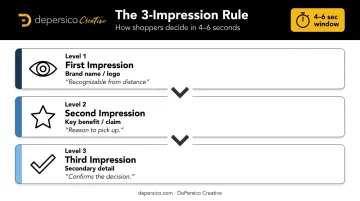
Color, typography scale, and negative space all work together to create this flow. Standing out doesn't always mean being loud — it means being unmistakably distinctive for your category. Research published in PMC found that warm colors improved purchase intention for indulgent foods while cool colors performed better for healthier products — meaning color choices should reflect both category context and consumer expectation, not just brand preference.
Conduct a Shelf Perception Audit
Before any packaging goes to print, place a physical mock-up next to competitor products in a real or simulated shelf set. Ask a stranger — not a colleague or family member — what they notice first.
A structured shelf perception audit measures what actually happens, not what you intended to communicate. At minimum, it should cover:
- Distance visibility: Is the brand name readable from 10 feet away?
- Differentiation: Does the package stand out within the competitive set, or blend in?
- Benefit clarity: Can a cold shopper identify what the product is and why they should care within 4–6 seconds?
- Purchase trigger: Does the overall impression create appetite or curiosity?
If you want a professional benchmark before committing to production, DePersico Creative's SWIFI process runs this exact kind of competitive visual assessment — evaluating your packaging against the full category shelf set before any design is finalized. The output is a Product Opportunity Assessment: a structured comparison that maps what your brand communicates against what shoppers actually perceive, and pinpoints what needs to change before print.
Craft On-Package Messaging That Compels Trial
The words on a package are as strategically important as the visuals. The right phrase makes a shopper pick up the product; the wrong one lets them walk past.
Lead With Benefit, Not Feature
There's a clear distinction between features and benefits that most early-stage brands get wrong:
- Feature: "Made with 12g of protein"
- Benefit: "Fuel your morning without the crash"
Shoppers aren't evaluating nutritional specs — they're making fast, emotionally driven decisions about whether a product fits their life. The front-of-pack headline should answer one subconscious question: What does this do for me?
The feature belongs on the back panel or in a callout. The benefit earns the front.
Use Creative Linguistics to Build Appetite Appeal
Word choice on packaging isn't copywriting in the traditional sense. It's closer to sensory design — selecting specific words and phrases that trigger a response before the shopper consciously processes them.
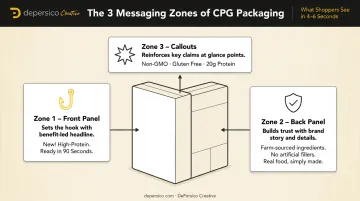
This is the foundation of creative linguistics — identifying language that connects quickly with shoppers, then applying it at every level of the package. The front panel sets the hook, the back panel builds trust, and callouts reinforce key claims where shoppers look most.
These layers must work together. A compelling front claim paired with dry, generic back-panel copy undermines the entire purchase case. DePersico Creative's creative linguistics service focuses specifically on this layered approach, mapping the right language to the right moment of shopper engagement.
Claims, Callouts, and Compliance
Packaging claims like "gluten-free," "organic," or "non-GMO" can be meaningful purchase triggers. The 2025 IFIC Food & Health Survey found that 41% of consumers looked for "natural" claims, while 30% each looked for organic and non-GMO designations.
But claims carry regulatory weight:
| Claim | Federal Requirement |
|---|---|
| Gluten-free | Less than 20 ppm gluten; ingredient restrictions apply |
| Organic | At least 95% certified-organic content to use USDA seal |
| Non-GMO | No specific federal certification; must not be misleading |
| Keto-friendly | No federal definition; general false/misleading rules apply |
Work with a regulatory specialist before finalizing any claim. A non-compliant label caught after printing means costly reprints — and one flagged by a buyer can cost you the shelf placement entirely.
Food Photography and Visual Presentation That Sells
High-quality food photography is not an optional upgrade for a retail-ready brand. It appears on the package itself, on sell sheets presented to buyers, on the brand website, and across retail media. It's one of the highest-leverage investments a CPG startup can make.
Two distinct types serve different purposes:
- Hero product photography — clean, optimized shots designed for packaging, e-commerce listings, and retail imagery. The product is the subject.
- Lifestyle photography — aspirational, context-driven imagery that shows the product in use. More relevant for website, social media, and brand storytelling.
Professional food photography, shot in a properly equipped studio with category-appropriate props, lighting, and food styling, communicates product quality before a shopper reads a single word. Research published in 2025 found that classically composed food images increased both perceived healthfulness and purchase intention, with perceived quality as the mediating factor.
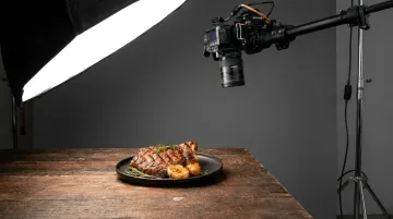
That quality signal only holds when photography, packaging, and brand strategy stay visually consistent. Sourcing these elements from different vendors at different times is one of the most common ways CPG startups undermine their own shelf appeal.
DePersico Creative operates a fully equipped test kitchen and photography studio for food and beverage clients. Handling photography, packaging design, and brand strategy under one roof keeps the brand voice consistent from concept through shelf.
How to Get Your CPG Product Into Retail Stores
Once the brand is retail-ready, the outreach process begins. Most startups underestimate how relationship-driven the retail buyer world actually is. Polished packaging and a strong sell sheet are table stakes: necessary, but not enough on their own to stand out.
Build a Sell Sheet That Does the Work
A strong CPG sell sheet functions as a leave-behind that makes the case for your brand when you're not in the room. It should include, on a single page:
- Hero product image (professionally photographed)
- Positioning statement and key claims
- SKU lineup with suggested retail pricing
- Case pack details and unit economics
- Velocity data, DTC proof of demand, or compelling consumer reviews
- Clear contact information
Buyers review a high volume of brands between line reviews. With that level of competition, a cluttered or under-designed sell sheet signals that the brand isn't ready to be a reliable retail partner.
Start Small and Build Proof of Velocity
National distribution before regional proof is a common and costly mistake. Buyers at major chains want to see sell-through data — evidence that real shoppers choose your product repeatedly, not just once.
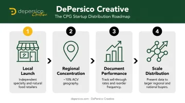
The more defensible path:
- Launch in independent specialty retailers, natural food stores, or regional chains
- Build velocity in a concentrated geography (roughly 10% ACV in one region before expanding)
- Document sell-through rates and reorder frequency
- Use that data to make the case for broader distribution
Tap Into Trade Shows and Broker Networks
Trade shows offer direct access that cold outreach rarely matches. Natural Products Expo West drew more than 64,000 attendees and 3,000 brands in 2025, while the Summer Fancy Food Show brought approximately 8,100 buyers that same year.
Joining CPG founder communities and building relationships with brokers who already have buyer relationships can compress timelines considerably. Both channels work best when the brand materials — packaging, sell sheet, and photography — are already polished.
Frequently Asked Questions
What are CPG startups?
CPG (Consumer Packaged Goods) startups are early-stage companies creating products sold in retail packaging — food, beverages, snacks, or household goods. They typically aim to scale from direct-to-consumer or regional sales into broader retail distribution.
What makes a product "retail-ready"?
Retail-ready means two things: the product meets a retailer's operational requirements (proper labeling, UPC, compliant packaging), and the brand can attract and convert shoppers on shelf without any additional sales support present.
How important is packaging design for a CPG startup?
Packaging is typically the first and only point of contact between the brand and a retail shopper. For most startups, it's the single highest-leverage brand investment — because without shelf pull, nothing else matters.
How do I get my CPG product into retail stores?
Getting into retail requires four things:
- A retail-ready brand identity and strong sell sheet
- Documented proof of consumer demand (sales data or reviews)
- Relationships with buyers through trade shows, brokers, or distributors
- A regional footprint — starting local makes the strongest case to larger buyers
What is the difference between DTC and retail branding for CPG?
DTC branding can rely on website copy, email sequences, and social media to tell a brand story across multiple touchpoints. Retail packaging must communicate the full brand value proposition in a few seconds, with no supporting context. The package does all the work on its own.
How long does it take to build a retail-ready CPG brand?
Timelines vary based on formulation, regulatory review, packaging production, and buyer calendars. Founders should expect several months minimum for brand strategy, design, and production. Rushing this process is the most common cause of expensive redesigns once a product is already on shelf.