NIQ reports that most shoppers view a product for just 13 seconds before deciding — a window that demands packaging do the selling, storytelling, and credibility-building simultaneously.
This guide covers how to match design to noodle type, deploy Japanese visual language strategically, write copy that creates cravings, brief food photography correctly, and sidestep the mistakes that sink otherwise good products.
Key Takeaways
- Each noodle type — ramen, udon, soba, somen — has a distinct visual identity that should drive design decisions
- Color, typography, and imagery must work as a system, not as individual choices
- Sensory-specific copy ("silky," "slow-simmered," "umami-rich") outperforms generic descriptors on pack
- Professional food photography separates premium shelf presence from commodity appearance — stock imagery rarely closes that gap
- Quality tier must read instantly on shelf — when aesthetics and price point don't match, shoppers move on
Why Japanese Noodle Packaging Design Matters More Than You Think
The US instant noodle market reached 5.151 billion servings consumed in 2024, per the World Instant Noodles Association — a figure that reflects just how embedded noodles have become in American food culture. Within that volume, Japanese-style products face a specific challenge that most packaged food categories don't: consumers arrive with cultural expectations already formed.
Someone picking up a ramen pack isn't evaluating it from a neutral starting point. They've eaten at ramen restaurants, watched cooking content, scrolled through food photography. They have a mental image of what "real" Japanese ramen looks and tastes like — and packaging that fails to meet that image reads as cheap or inauthentic before a single noodle is cooked.
Packaging as the Only Salesperson
There's no tasting station. No staff explanation. In a grocery aisle, the package is the entire sales pitch. In a matter of seconds, it must signal:
- Flavor profile and regional style (tonkotsu vs. shoyu vs. miso)
- Quality tier relative to competing products on the shelf
- Preparation simplicity — or complexity, if that's the selling point
- Cultural credibility that validates the purchase decision
This is why packaging for Japanese noodle products isn't just a design exercise. It's a strategic business decision. Brands that treat it as an afterthought leave purchase decisions to chance. Brands that approach it deliberately — with a coherent visual system, intentional cultural signals, and copy that triggers appetite — convert browsers into buyers.
The sections below break down exactly how to use that visual vocabulary — what to borrow from Japanese design tradition, what to avoid, and how to make every element on the package earn its place.
Know Your Noodle: Matching Package Design to Product Type
Before any design decisions are made — colors, typography, imagery, finish — the most fundamental question is: which noodle? Ramen, udon, soba, and somen each carry distinct consumer perceptions and flavor associations that should shape every element of the package.
Ramen Packaging
Ramen has the broadest mainstream recognition among US consumers, which gives brands more design flexibility — but also means the competitive set is crowded. Effective ramen packaging typically leans into:
- Deep reds, rich blacks, and amber gold tones that evoke steaming broth and late-night noodle-shop energy
- Heavyweight type with explicit flavor callouts — tonkotsu, shoyu, miso, shio — that signal specificity over generic "ramen"
- A steaming bowl front and center with visible noodle texture and layered toppings, appetite first
The US premium instant-noodle segment has grown at a 15% CAGR compared to 10% for the base segment (2015–2024). Ramen shoppers will pay more when the packaging earns that price point at a glance.
Udon and Soba Packaging
These two categories call for distinctly different visual approaches.
Udon (thick, chewy wheat noodles) benefits from:
- Warmer, earthy tones — cream, warm beige, soft brown
- Clean Japanese minimalism that signals simplicity and comfort
- Less visual complexity than ramen; udon's appeal is its satisfying simplicity
Soba tells a different story. Because buckwheat carries natural health associations, soba packaging suits a more artisanal, health-adjacent aesthetic:
- Muted greens, natural kraft textures, organic imagery
- Heritage cues that communicate traditional Japanese preparation
- Note: "gluten-free" claims require product-level substantiation; buckwheat's intrinsic properties don't automatically extend to finished soba products that may contain wheat flour
Fresh or refrigerated noodle packaging adds additional functional requirements — shelf-life communication, premium quality signals, and preparation speed — that must be built into the layout hierarchy from the start.
Instant vs. Premium Dry Noodle Tiers
The quality tier must be visually legible before a shopper reads a single word of copy:
| Tier | Design Signals |
|---|---|
| Mass-market instant | High contrast, bold flavor callouts, energetic color, busy graphics |
| Premium dry noodle | Restrained palette, artisan typography, generous white space, minimal clutter |
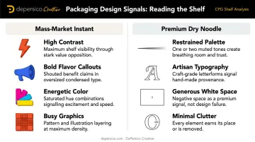
Getting this wrong creates a pricing disconnect shoppers feel immediately. Premium minimalism on a value product reads as cold or sparse. Busy instant-noodle graphics on an artisan SKU undermine the price tag before the shopper reads a word.
The Visual Language of Japanese Noodle Packaging
Japanese design tradition — rooted in concepts like ma (meaningful negative space and interval) — offers food brands a distinct visual vocabulary that creates shelf differentiation when applied with intention. Japan House describes ma as the interval or pause that gives surrounding elements meaning, a principle that translates directly into packaging design: what you don't fill is as strategic as what you do.
Color Strategy
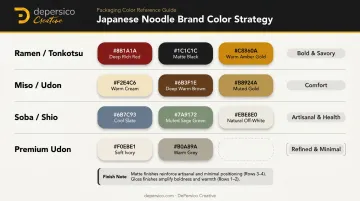
Color does two jobs simultaneously: it communicates flavor identity and it differentiates the brand within its competitive set. A working palette framework for Japanese noodle products:
- Deep red + black + amber → bold, savory ramen; tonkotsu or shoyu broth
- Warm cream + brown + gold → miso or tonkotsu; comfort positioning
- Cool slate + green + natural white → soba or light shio; health-adjacent, artisanal
- Soft ivory + warm grey → premium udon; clean, minimalist, refined
Before finalizing a palette, audit the actual shelf at major US retailers. Color gaps — hues no competitor currently owns — represent the clearest visual differentiation opportunity for a new entrant.
Typography
Japanese characters used selectively on English-market packaging signal cultural authenticity through visual texture alone — something no English typeface can replicate. One or two carefully chosen kanji or hiragana elements — a brand name component, a preparation term, a region name — add credibility without creating a readability barrier.
The risk runs in both directions. Overloading packaging with untranslated Japanese text alienates shoppers unfamiliar with the script. Zero Japanese script, conversely, can make a product read as generic "Asian food" rather than specifically Japanese.
For English typefaces, the goal is visual coherence with Japanese script — not contrast against it:
- Clean modern serifs and geometric sans-serifs both work well
- The test is whether the pairing feels considered rather than accidental
- Avoid novelty "Asian-inspired" fonts, which undermine authenticity
Imagery and Illustration Style
Three main approaches, each suited to different brand positioning:
- Traditional Japanese illustration (ukiyo-e motifs, brush strokes, wave patterns) → heritage and artisan craftsmanship positioning; effective when the brand story centers on tradition
- Modern flat design → trend-driven, younger consumers; works well for brands building social media presence alongside retail
- Photorealistic food photography → appetite appeal as the primary purchase driver; the strongest tool for premium positioning when executed at professional quality
Both approaches work because they're rooted in a specific brand story rather than generic cultural shorthand. Momofuku's packaging draws on its professional-kitchen identity — custom type resembling handwriting on masking-tape labels — to build authenticity from within. Sun Noodle's redesign made different choices: flavor-specific color palettes, bold lettering, comic-style illustration, and a side window showing the actual noodles, a nod to Japanese grocery staples translated through a brand-specific visual system.
Matte vs. gloss finish, foil stamping, and embossing layer additional quality signals on top of surface graphics. Matte finishes consistently read as premium; high-gloss reads as conventional. These choices belong in the strategic brief alongside color and typography — not left to the printer's default.
Copywriting and Creative Language That Creates Cravings
The words on a Japanese noodle package are as strategically important as the visuals. The right phrase triggers a craving in the same 13-second window as the design.
Sensory-Specific Language
Generic descriptors — "delicious," "authentic," "flavorful" — are invisible to shoppers. They appear on every product in the aisle and go unnoticed. Effective copy for Japanese noodle products engages multiple senses:
- "Silky" → communicates noodle texture without explanation
- "Slow-simmered" → implies time, care, and depth of flavor
- "Umami-rich" → specific enough to signal expertise; widely understood among US consumers post-ramen boom
- "Deeply savory" → flavor direction without requiring cultural translation
- "Hand-crafted" → artisan positioning without overclaiming
DePersico Creative's "creative linguistics" methodology is built on exactly this principle: finding the specific words and phrases that build immediate consumer connection. The goal is copy that creates a mental taste experience before the package is even opened.
Copy Hierarchy on Pack
Every element of packaging copy has a job. The hierarchy, from most to least prominent:
- Brand name: memorable, easy for US consumers to pronounce, and visually distinctive on shelf
- Product type + flavor descriptor: "Hakata-Style Tonkotsu" does more work than "Pork Flavor" — specificity signals credibility
- Benefit or occasion callout: "Ready in 3 Minutes" or "Restaurant-Quality at Home" addresses the purchase motivation directly
- Back-panel brand story: for shoppers who turn the package over, this is the opportunity to deepen connection and justify the price point
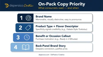
Establish this hierarchy before adding any decorative design element. Everything else — illustration, pattern, color blocking — exists to support the hierarchy, not compete with it.
Balancing English and Japanese Copy
Brief Japanese phrases or provenance callouts add authenticity when used selectively. A region name ("Hokkaido") or a concept ("Shokunin Craftsmanship") carries storytelling depth that English alone can't replicate. The rule: Japanese copy should function as an accent that deepens the story for interested shoppers, not as a translation challenge for the primary English-speaking audience.
A few ways this plays out in practice:
- Region callouts ("Hokkaido," "Kyushu") function like an appellation — they signal origin without requiring explanation
- Craft concepts ("Shokunin," "Tare") reward curious shoppers while remaining invisible to those who skim
- Japanese script used decoratively (not as primary communication) adds visual texture and cultural authenticity
Food Photography on Japanese Noodle Packaging
For ramen and other broth-based Japanese noodles, the hero food image is often the single most powerful element on the front panel. A well-executed photograph of a steaming bowl — glistening broth, layered toppings, visible noodle texture — triggers appetite appeal that illustration rarely achieves at the same intensity.
What Makes Noodle Photography Work
The specific techniques that separate effective Japanese noodle photography from generic food shots:
- Controlled steam — visible steam signals heat and freshness; this requires timing and technical setup on set, not post-production effects
- Broth color and clarity — the visual depth of the liquid is a direct quality cue; both lighting angle and bowl selection determine how the broth reads on camera
- Topping arrangement — chashu pork, a halved soft-boiled egg, nori, sliced green onion; each element placed to create visual layering, not just filled in
- Noodle lift shots — pulling noodles from the broth mid-frame shows texture and strand separation, a widely used technique that signals handcrafted quality
This work requires a professional food photographer with food styling expertise. Stock photography cannot deliver the specificity that signals premium quality — the wrong bowl shape, off-color broth, or generic toppings will register immediately with shoppers who know what ramen actually looks like.
Our in-house food photography studio and prep kitchen — with professional food stylists on staff — is set up specifically for this kind of work. Broth-based dish photography, with its demands on liquid rendering and precise topping placement, is a consistent part of what we do.
Photography Must Work at Two Scales
The photography brief must address every context where the image will appear:
- Full package size (physical shelf) — the image must communicate flavor and quality from arm's length, where color and steam read first
- Thumbnail scale (online retail) — key visual elements must remain legible at small sizes; overly complex arrangements collapse into visual noise
- Social and digital shelf — product imagery pulled from packaging often appears in brand social content and digital ads, so the hero shot needs to hold up cropped and reframed

Design the packaging layout and brief the photography simultaneously. Deciding the hero image after the layout is set — or vice versa — creates avoidable problems with aspect ratio, safe zones, and text overlay.
Common Japanese Noodle Packaging Design Mistakes to Avoid
The Cultural Costume Problem
Layering Japanese visual elements — chopsticks, cherry blossoms, Mount Fuji, red lanterns — onto a package without a coherent design system creates packaging that reads as clichéd. Shoppers who regularly buy Japanese or Japanese-inspired products recognize the difference between authentic design sensibility and a checklist of visual tropes.
Authenticity comes from a considered application of Japanese design philosophy — negative space, restrained color, refined typography — not from the volume of cultural imagery on the surface. Momofuku and Sun Noodle both demonstrate this: their visual identity is grounded in specific, brand-native stories rather than generic symbols.
Readability and Hierarchy Failures
Packaging that uses competing fonts, buries the brand name, or makes flavor identification difficult fails the shelf test before a shopper can engage with any of its other qualities. The three-second shelf test is simple: can a shopper identify the brand, the product type, and the flavor from three feet away within three seconds? If not, the hierarchy needs to be rebuilt before any decorative design work continues.
Common culprits:
- Multiple decorative fonts competing for attention
- Flavor descriptor smaller than brand flourishes
- Background illustration that competes with foreground text
- Inconsistent visual weight across SKUs in a product line
The Quality Signal Mismatch
Premium Japanese minimalism — muted palette, generous white space, refined typography — on a product priced at $1.99 creates confusion. Busy, high-contrast mass-market graphics on a $12 artisan dry noodle product do the same damage in the opposite direction. Both misalignments undermine the brand's credibility and suppress sales performance.
Price-to-packaging alignment is the fix: the visual language on your package should match both what the product is and what a shopper expects to pay for it. Before any design work begins, that match needs to be confirmed — not assumed.
Frequently Asked Questions
What is the primary packaging of noodles?
The format varies by product type: instant noodles use bag-type or cup-type packaging, dry noodles typically use sealed bags or paperboard boxes, and fresh noodles often use vacuum-sealed formats. Across all formats, the package design is what triggers the purchase decision at retail — so format choice and visual execution need to work together.
What is packaged ramen called?
Bag-format packaged ramen is commonly called "instant ramen" or "packet ramen." The cup or bowl format is called "cup noodles" or "cup ramen." In Japan, these products are broadly referred to as インスタントラーメン (insutanto ramen), with the formal category term 即席めん (sokuseki men) also in use.
How do you make Japanese noodle packaging stand out on grocery store shelves?
Differentiation comes from a unified visual identity — a distinctive color palette, a clear flavor hierarchy, and food photography that triggers appetite appeal — combined with packaging copy that communicates authenticity and quality within seconds. Before designing, map what color systems, typography styles, and imagery cues competitors already own on-shelf — then design into the open space.
What design elements communicate authenticity in Japanese noodle packaging?
Selective use of Japanese typography (kanji or hiragana), provenance callouts (region names, preparation methods), restrained color palettes rooted in Japanese design sensibility, and imagery that reflects actual Japanese visual culture rather than generic "Asian food" tropes. Specificity in every element — not volume of cultural symbols — signals authenticity.
Should Japanese noodle packaging include Japanese characters?
Yes, selectively. One or two Japanese script elements — a brand name component, a preparation term, or a regional reference — add authentic visual texture and cultural credibility for US consumers. Overloading the pack with untranslated text reduces accessibility. Used well, Japanese script functions as a credibility signal; used excessively, it alienates shoppers who can't read it.
What food photography style works best for ramen packaging?
Close-up hero bowl shots with visible steam, rich broth color, and carefully styled toppings perform best — they trigger appetite appeal immediately. Professional food styling, not stock imagery, delivers the specificity that justifies a premium price and separates the product from commodity competitors.