Introduction
Your cookbook images will sit on someone's kitchen shelf for years. They'll appear in gift bags, press kits, and influencer unboxings. And yet, most food brand founders treat the photo shoot like a last-minute logistics problem rather than the brand asset it actually is.
That's a costly mistake. NIQ research found that optimized visual design generates an average 5.5% lift in forecasted revenue — and that's just packaging. Cookbook photography extends that visual system into consumers' homes.
The images you produce for a cookbook must work as hard as your label design. They communicate quality, reinforce brand personality, and often pull double duty across retailer sell sheets, brand decks, and social campaigns. Get them wrong, and you've funded a creative project that actively undermines your brand equity.
This guide covers what food brand founders specifically need to know: how to make every shot earn its place in your brand system.
Key Takeaways
- Cookbook photography must match your brand identity: colors, props, and tone should feel continuous with your packaging
- Print-ready files require 300 dpi, RAW format shooting, and CMYK-aware color correction
- Lighting, food styling, and props aren't decorative — they communicate brand personality directly
- High-quality cookbook images can be repurposed across sell sheets, social media, and retail presentations
- A studio that handles both photography and brand design eliminates the most common alignment failures
Why Cookbook Photography Is a Brand Investment
For a food brand, a cookbook is a physical piece of brand storytelling — one that lives in a consumer's home, gets passed between friends, and shows up in press packages and media kits.
The problem is that many founders treat cookbook imagery as a separate creative universe — different aesthetic, different vibe, different everything. Then consumers pick up the cookbook, look at the photography, and feel no connection to the product they saw on the shelf. That disconnect erodes trust without anyone quite knowing why.
Lucidpress found that organizations with consistent branding estimate 10–20% higher revenue compared to those with inconsistent visual presentation. That consistency compounds across every channel where your brand appears.
The Repurposing Argument
One overlooked reason to invest seriously in a cookbook shoot: the images don't have to live only in the cookbook.
Strong, high-resolution assets produced at print quality can feed:
- Retailer sell sheets and trade presentations
- Brand decks for investor or buyer meetings
- Social media campaigns (high-res source files downsize well)
- On-pack photography for future packaging updates
- Website and e-commerce product listings
HubSpot's State of Marketing data shows 48% of social media marketers already share repurposed content across platforms. A well-planned cookbook shoot can supply an entire year of marketing assets from a single production budget.
The Evergreen Requirement
That repurposing value only holds if the images age well. Unlike social posts, cookbook photography can't be swapped out when trends shift. A moody, high-contrast shoot that felt current in year one looks dated by year three — and the cookbook keeps circulating regardless. Timeless, brand-aligned photography serves you longer than anything chasing the aesthetic of the moment.
Getting the Technical Basics Right for Print-Quality Photos
This is where most founders make expensive mistakes. The requirements for print differ significantly from what works on Instagram, and the errors don't reveal themselves until files are already submitted.
Camera and File Format
Professional DSLR or mirrorless cameras are the baseline for print-quality cookbook work. Shoot in RAW format, not JPEG. RAW files retain all captured data, giving you full post-processing control over exposure, white balance, and color. Those adjustments are destructive — or simply impossible — in a compressed JPEG.
Resolution benchmark: Both IngramSpark and Amazon KDP specify a minimum of 300 DPI/PPI for color print images. Files shot or exported below this threshold will appear soft in print even if they look sharp on a screen.
Shoot slightly wider than you think you need. Full-page spreads require additional frame space — called "bleed" — around the dish so the layout designer has room to work without cropping into the food.
The RGB-to-CMYK Problem
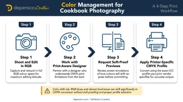
This trips up almost every founder who's managed their own shoot. Your camera captures in RGB. Your monitor displays in RGB. But commercial printers use CMYK — and according to Adobe, converting between these modes permanently remaps color values, pushing out-of-gamut colors into the printable range in ways that often look darker and less vibrant than expected.
The fix:
- Shoot and edit in RGB (standard practice)
- Work with a designer who understands print color management
- Request soft-proof previews before finalizing files
- Work with your printer's specific CMYK profile, not a generic one
Editing
Adobe Lightroom is the standard tool for food photography post-processing. Used correctly, it enhances without over-processing — a common trap with heavy Photoshop retouching. Key capabilities that matter for cookbook work:
- Luminance, vibrance, and clarity controls add dimensionality to food without artificial-looking edits
- Radial and linear gradient masks let you brighten specific areas — the top of a dish, a sauce pool — without affecting the full frame
- Output sharpening set for glossy paper preserves detail at the print stage
Export final files at 300 DPI. eBook versions need lower resolution but can be derived from the same source files, so a single well-shot RAW covers both formats.
Lighting, Styling, and Props: Making Food Look Craveable
Lighting Fundamentals
The single most flattering light source for food is soft, directional natural light coming from the side — typically a north-facing window. It creates gentle shadows that reveal texture and depth in a way overhead kitchen lighting never can. Always turn off overhead kitchen lights during a shoot; they compete with your main light source and introduce color casts.
Natural light works well for warm, approachable brand aesthetics. The limitation is consistency — clouds move, seasons change, and a shoot running 8 hours in natural light means your first dish and your last dish won't match.
Continuous studio lights or strobes solve this. They hold steady all day, let you control direction and intensity, and work regardless of weather or window orientation. White bounce boards fill shadows; black boards deepen them. Most working cookbook photographers use a combination of both approaches depending on the brand's aesthetic goals.
Food Styling Discipline
Getting the lighting right is only half the equation — what happens on the plate matters just as much. Fresh food photographs differently than food that's been sitting, and some dishes change within seconds of plating. Pizza with bubbling cheese, sauces with a sheen: these have a window measured in moments. The food stylist and photographer have to coordinate closely, with a clear sequence established before the shoot starts.
A strong food stylist brings more than plating skill. They know:
- Which ingredients hold up under hot studio lights and which collapse
- How to sequence perishable elements so the hero dish is shot fresh
- When something that looks fine to the eye will read flat or dull on camera
- How to build depth and height so the shot has visual interest from every angle
Props as Brand Expression
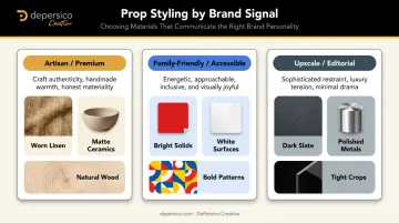
Props are a direct extension of brand positioning — and the wrong choices can undercut an otherwise well-executed shoot. Plateware, textiles, surfaces, and backgrounds aren't decorative afterthoughts; each one sends a signal to the viewer before they read a single word.
Consider what signals different choices send:
- Worn linen + matte ceramics + natural wood → artisan, craft-forward, premium
- Bright solids + clean white surfaces + bold patterns → family-friendly, accessible, energetic
- Dark slate + polished metals + tight crops → upscale, restaurant-adjacent, editorial
Props that are too reflective, too patterned, or simply mismatched pull attention away from the food. Build a focused prop kit tied to your brand's existing color palette and visual personality — don't default to whatever's available.
Aligning Cookbook Photography with Your Brand Identity
The visual through-line between your packaging and your cookbook imagery is something consumers feel even when they can't articulate it. A clean, minimal package aesthetic paired with busy, cluttered food photography creates dissonance. A bold, colorful brand paired with muted, understated shots does the same.
Before any creative decisions are made, establish a mood board that references:
- Your existing packaging palette and typography
- Your marketing photography (if you have it)
- The tone of your brand voice
- Your target consumer's lifestyle and aspirations
This document should be shared with the photographer, food stylist, and prop stylist before day one. Without it, you get three creative professionals making independent aesthetic decisions that may or may not align with your brand.
This is where agencies like DePersico Creative, which handles both food photography and brand design under one roof, offer a structural advantage. When the same team that built your packaging visual identity directs your cookbook imagery, the communication gaps that routinely emerge when photography and design are handled separately disappear. Color choices, prop direction, and tone are all grounded in the same strategic foundation from the start.
Not every founder can work with a single integrated team — and that's fine. When vendors are separate, the creative brief carries more weight. Put your brand standards in writing and distribute them to every member of the shoot team before pre-production begins.
Building Your Shoot Team and Managing Costs
Core Roles
A full cookbook production team typically includes:
- Photographer — captures images, manages retouching
- Food stylist — handles cooking, plating, and timing of perishable elements
- Prop stylist — sources and arranges surfaces, plateware, and textiles
- Photo assistant — manages lighting setup and breakdown between shots
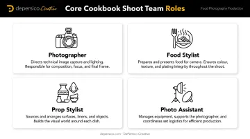
On tighter budgets, roles consolidate. The food stylist may handle props. The cookbook author may handle cooking while the photographer focuses on styling. These trade-offs are workable, but they slow production and raise the risk of styling inconsistency across a full shoot day.
Cost Management Strategies
Specific day rates vary by market, experience, and project scope — your best source is direct quotes from photographers and stylists in your target market. There are real ways to manage costs without sacrificing quality:
- Shoot in a well-lit private space rather than renting a commercial studio
- Work in smaller markets outside major cities where day rates are lower
- Reduce total shot count by being strategic about which recipes truly need photography
- Borrow props from ceramicists or small makers in exchange for photo credits
- Batch similar setups — dishes with the same color palette or surface can be shot sequentially without full set changes
The Full-Service Alternative
Building a freelance team from scratch requires significant coordination. You're managing schedules, aligning creative direction between independent contractors, and hoping everyone interprets the brief the same way.
The alternative is working with a studio that brings photography, food styling, and brand design capabilities in-house. DePersico Creative's West Chester facility includes a working test kitchen and photography studio, so recipe execution, styling, and image capture happen in one controlled environment.
For food brand founders who also need packaging design or marketing materials from the same shoot, that integration means assets are built to work together from the start — not reconciled after the fact.
Frequently Asked Questions
What camera settings should I use for cookbook photography?
Shoot in RAW format using a DSLR or mirrorless camera, with output at 300 DPI for print. RAW preserves all image data for post-processing, which is essential when making the color corrections needed for accurate print reproduction.
Do I need to hire a professional food stylist for my cookbook shoot?
For a branded cookbook, yes. A professional food stylist understands how to sequence perishable dishes, maintain visual consistency across a full production day, and make food look its best under studio lighting — a distinct skill set from cooking well.
How is cookbook photography different from food photos I post on social media?
Print requires 300 DPI resolution and CMYK-aware color management — neither matters for screen display. Cookbook compositions must also account for layout bleed and print trim, and stay visually compelling for years rather than a news-feed moment.
Should my cookbook photography match my product's packaging design?
Yes. Visual consistency between cookbook imagery and packaging reinforces brand recognition and consumer trust. A shared mood board referencing your packaging palette, typography, and tone should guide all creative decisions before the shoot begins.
How many photos do I need for a branded cookbook?
Most publishers aim to photograph 50–100% of recipes, with production days typically covering multiple dishes per setup. The final count depends on your budget, cookbook length, and how extensively you plan to repurpose the images.
What is the biggest technical mistake food brand founders make in cookbook photography?
Shooting in JPEG on automatic settings without accounting for RGB-to-CMYK color conversion. Files that look accurate on screen often appear noticeably darker and less vibrant in print — a problem that can't be fully corrected once files are submitted for production.